There’s something about Minimalism that simply never goes out of style. And, minimal homes occupy a soft spot in my heart! Minimal architectural designs will always leave you with a warm feeling in your heart, an intense admiration for the attention to detail, and the delicate touches each structure consists of. They’re simple but smartly designed spaces that radiate an aura of warmth and calmness. And we’ve curated some of our favorite minimal homes for you! From a minimal white home with flower petal-inspired walls to a minimalist home on the beach – these exquisite minimal architectural designs make for perfect living spaces that’ll put your mind, heart, and soul at ease!
1. The Vagabundo Flex
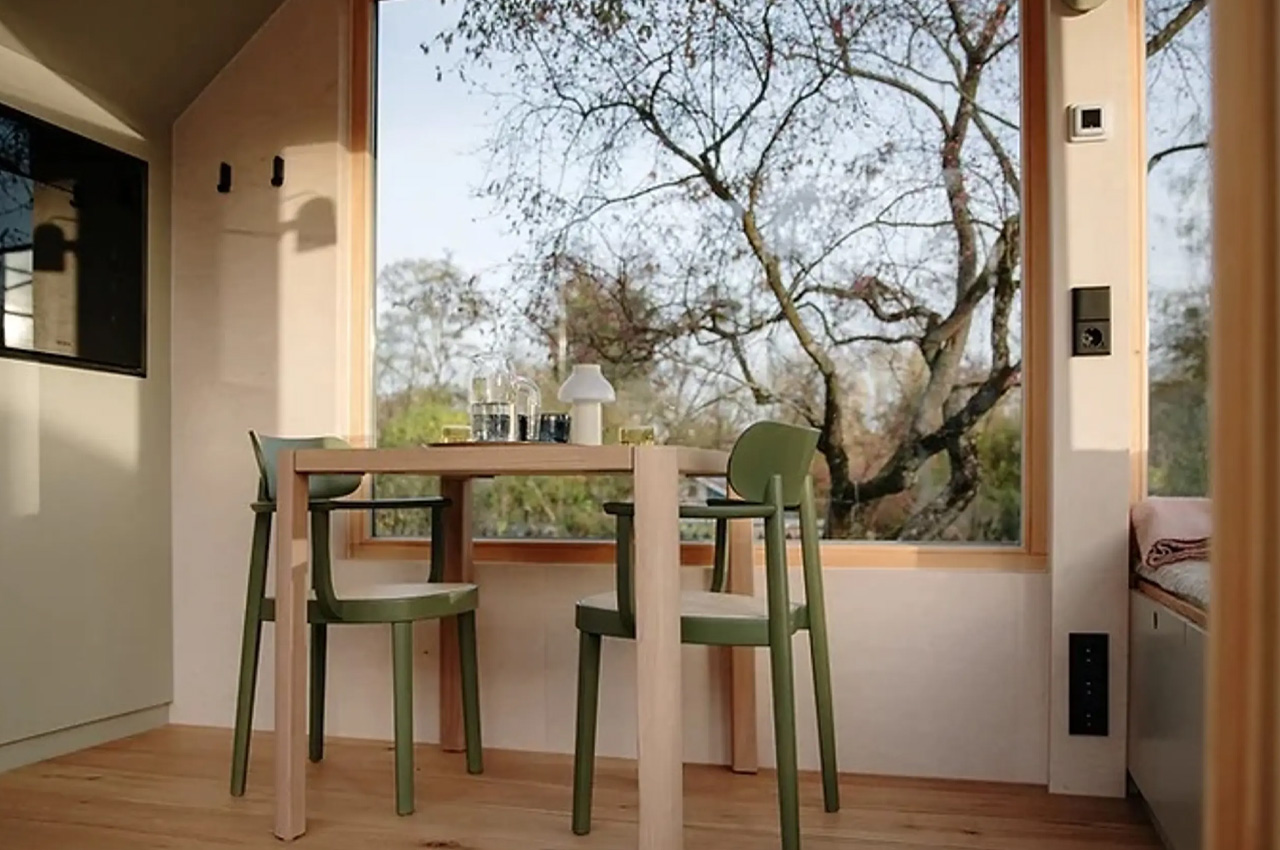
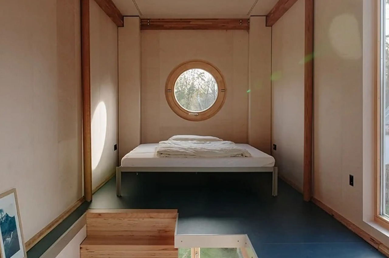
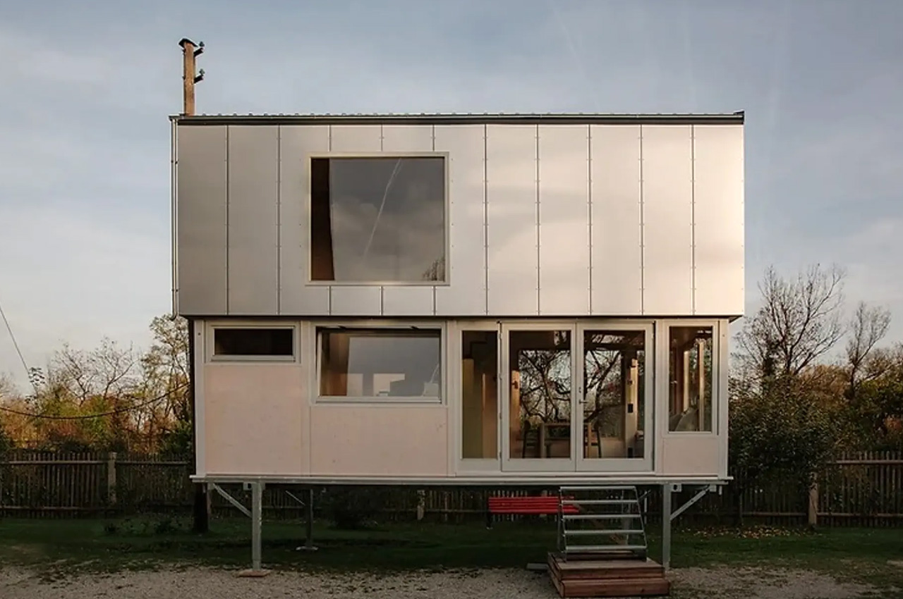
The Vagabundo Flex is quite a special and unique tiny home, since it extends over two levels, owing to an ingenious automated lifting system, that improves the comfort and functionality of the dwelling. The tiny home was built using timber framing, wood fiber insulation, double-glazed wood aluminum windows that have been laminated with safety glass, and three-layer fir wood for the interior paneling.
Why is it noteworthy?
The Vagabundo Flex’s innovative and unique design supports the roof in rising to an impressive height of 20.3 ft, in turn creating a spacious interior that occupies 300 square feet. Vagabundo’s ingenious solution is designed to ensure that bulky elements do not disrupt the aesthetics and beauty of the home.
What we like
- The bulky elements have been smartly concealed in the corners and tucked away in cupboards
- The tiny home has been amped with all the essential amenities, as well as massive panoramic windows and timber furnishings
What we dislike
- Heavily priced
2. The Casa Pátios de Pétalas
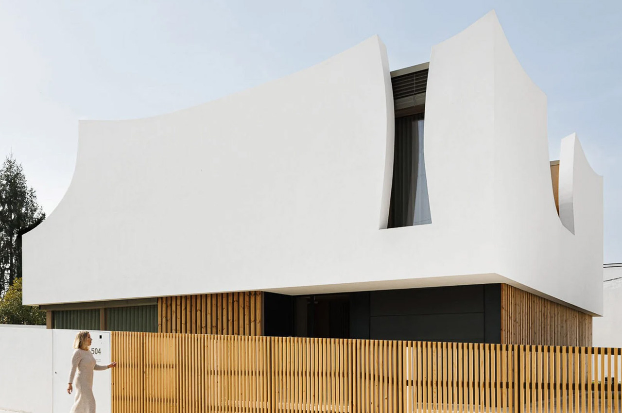
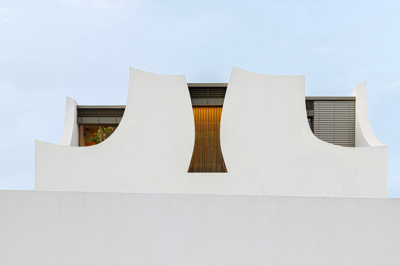
Created by Portuguese studio Sandra Micaela Casinha Atelier, the Casa Pátios de Pétalas is a clean white and minimal home with an organic shape that is inspired by flowers.
Why is it noteworthy?
The home is marked by curved white walls and was designed for a family with a young daughter. Nestled in the Gondomar neighborhood in the east of Porto, the home is informed by mother nature and utilizes a limited material palette.
What we like
- The upper story features fluid white rendered walls that bring to mind the image of petals
- The interiors of the home feature curved walls, that create physical and visual links between the various living spaces
What we dislike
- There is no option for customization of materials
3. The Strandhouse
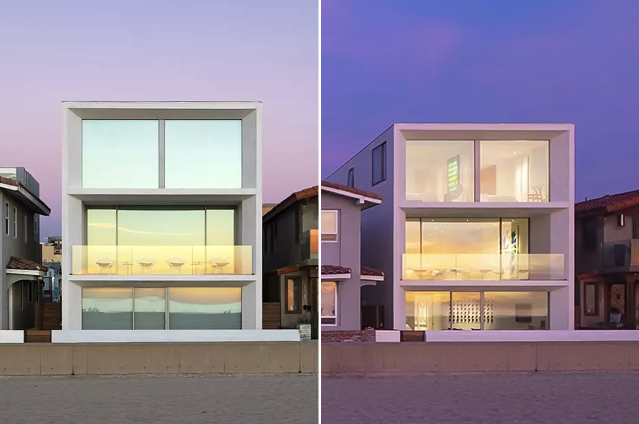
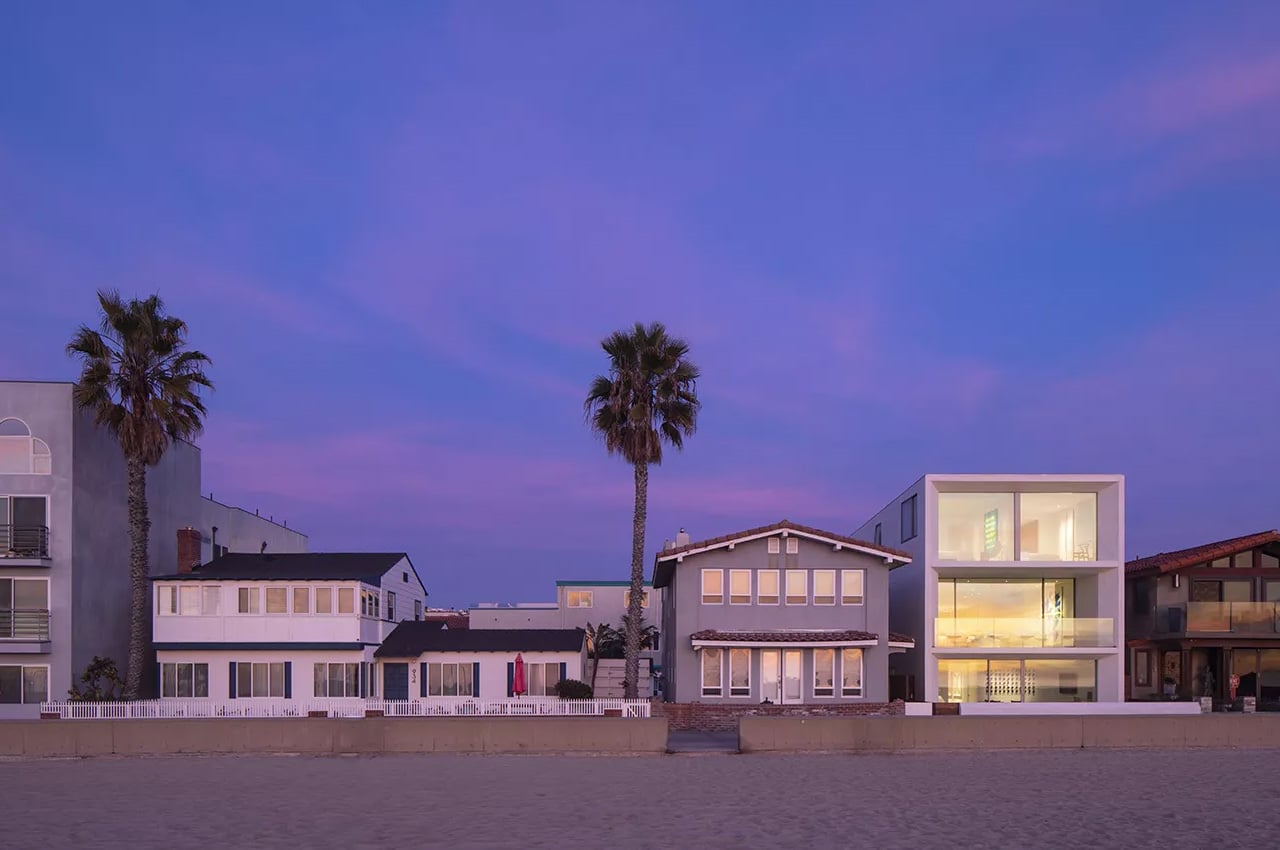
Designed by Los Angeles-based architecture studio XTEN, and called the Strandhouse, this Hermosa Beach house is the epitome of minimalist architecture and truly celebrates the beauty of its seaside location.
Why is it noteworthy?
The home was created by the practice founder Monika Haefelfinger and partner Scott Utterstrom as an excellent specimen of beachside living for the coastal Southern California region in a minimalist and contemporary form.
What we like
- The home is marked by large openings, minimalist aesthetics, clean geometries, and subtle decor work, resulting in a space that feels expansive and spacious
What we dislike
- The exterior of the home could be considered too boxy for some
4. Mini
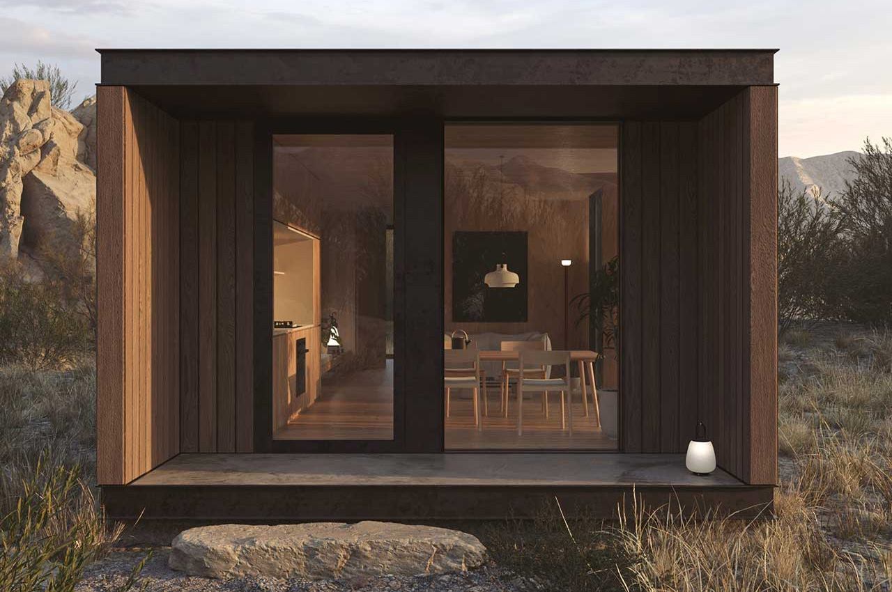
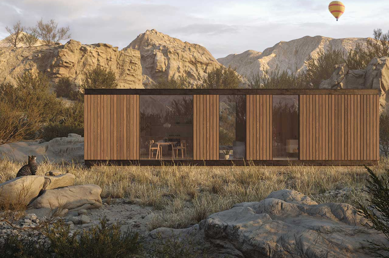
Designed by Bologna-based firm STUDIOFEM, this beautiful 484 square-foot home is called the Mini – a name that does it justice quite rightly in appearance, but not in character.
Why is it noteworthy?
The home features a rectangular structure that has been clad in dark brown vertical panels. The box-like form of the home is quite cute to look at it, and the wooden facade gives the home a rather rustic yet cozy look.
What we like
- The floor-to-ceiling windows help sustain a connection between the interiors and landscape, giving the impression that the inside of the home is larger than it seems
What we dislike
- Designed to be a rectangular structure, the house does not allow for any exterior space (like a terrace) for the user to have
5. Snowfall House
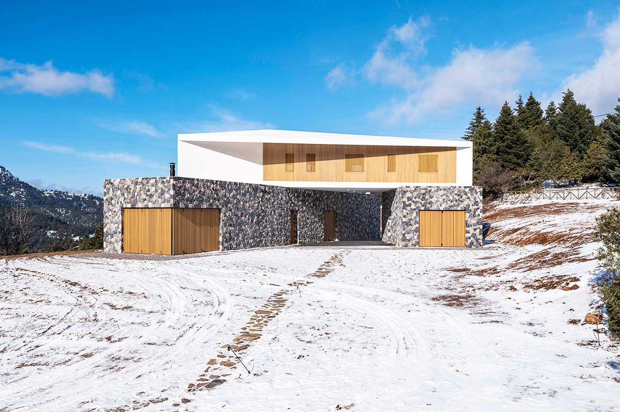
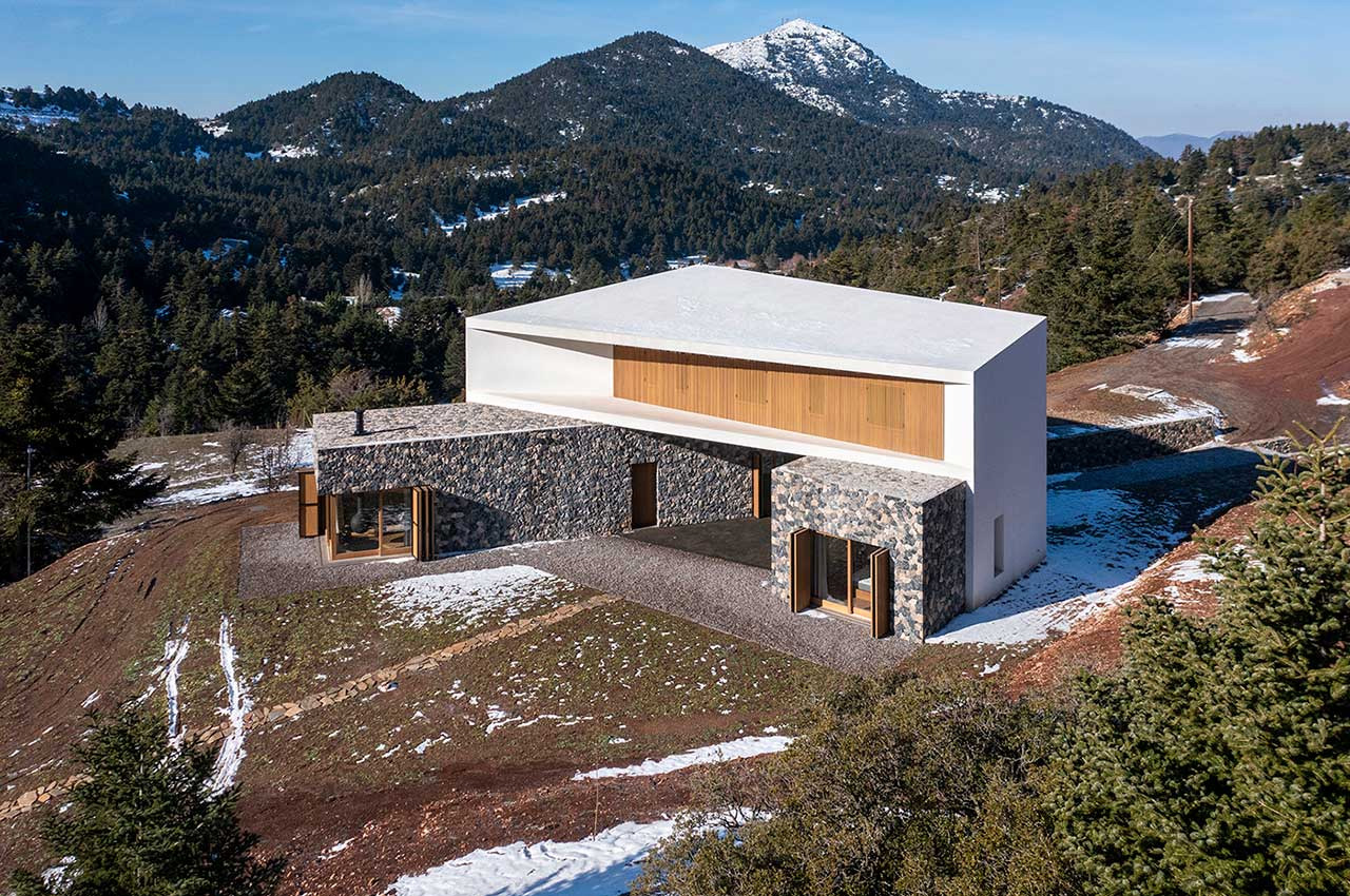
Located in the Helmos mountains in Kalavryta, Greece is the Snowfall House. Placed on 4000 square meters of land and near the Kalavryta ski center, the intriguing home was designed by Design Over The Norms.
Why is it noteworthy?
The home is blessed with stunning views of the forest, and natural light streams into it throughout the day. It consists of three volumes, with two of them functioning as the base.
What we like
- Materials such as wood and stone were used in the construction of the home, to perfectly capture the natural rocky textures of the region
What we dislike
- The home perfectly merges with its natural surroundings, and may not be visible to birds, causing them to crash into it
6. McGee’s Tiny Home
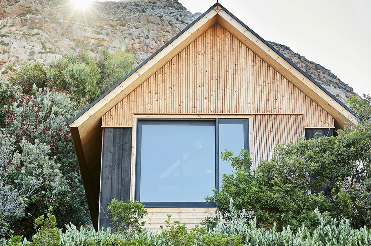
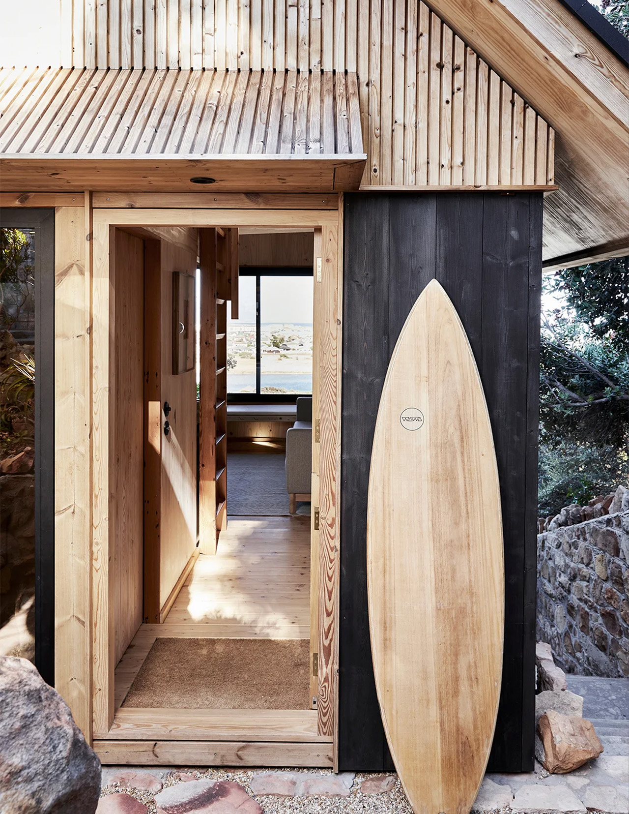
Nestled at the bottom of a rocky hillside, and surrounded by cypress trees and buchus is this lovely little home built by architect Alexander McGee. The tiny wooden cabin occupies 390-square-foot of space and overlooks Muizenberg, one of Cape Town’s best-known surfing spots.
Why is it noteworthy?
The stunning view can be enjoyed owing to the windows seat that has been added to the space. It was designed by architect Alexander McGee and is located next to his South African home.
What we like
- No gutters have been added to the roof, and this allows McGee and his family to watch the rainwater run off the roof from different angles
What we dislike
- The home isn’t sufficient or big enough for larger families
7. Halfmoon Bay Cabin
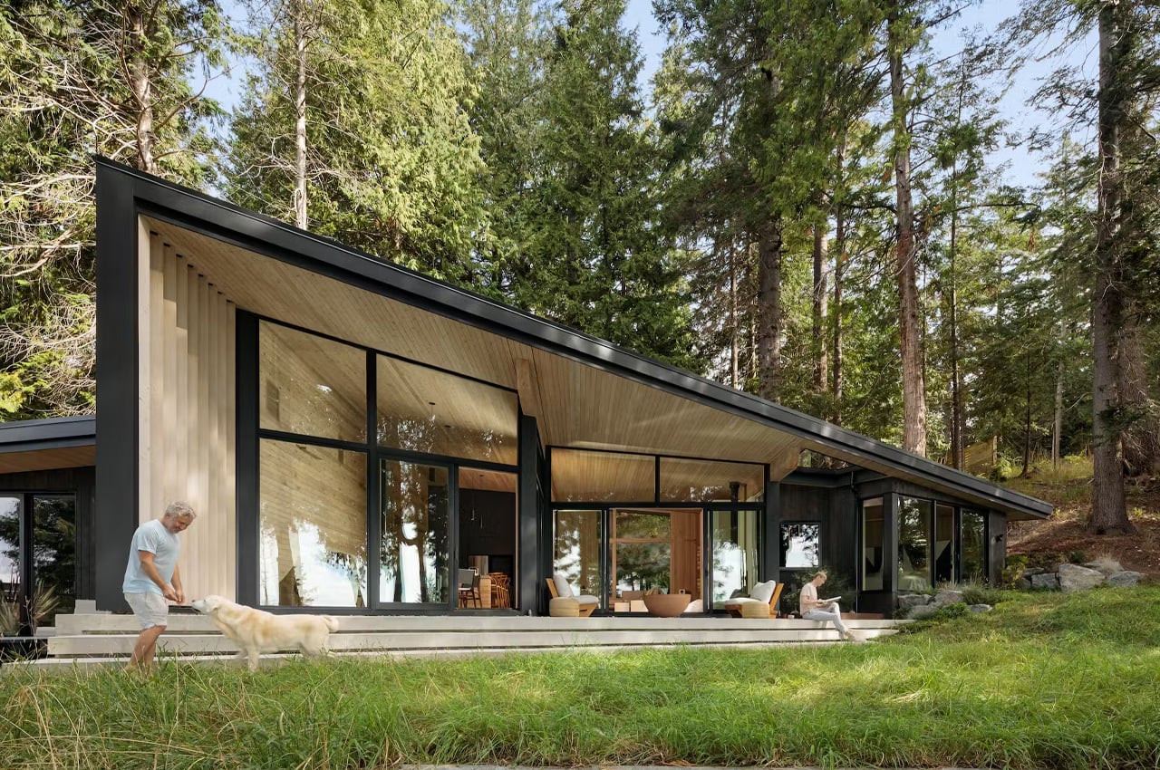
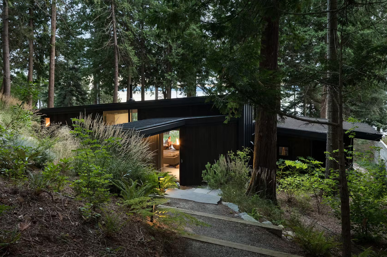
Called the Halfmoon Bay Cabin, this angular black cabin was designed by Patrick Warren and his husband Kevin Kaufman. The adorable home is tucked away on the Sunshine Coast of British Colombia and is gracefully nestled between trees and merges into the landscape.
Why is it noteworthy?
The home is defined by a covered entry, spacious living space, a steeply sloping roof, and massive floor-to-ceiling windows that create a connection between the indoors and the outdoors.
What we like
- The beautiful home is inspired by American coastal architecture of the 1970s, like those found on Fire Island in New York and Sea Ranch in Northern California
What we dislike
- The sloping roof of the design makes it difficult to expand the house
8. Find Sanctuary
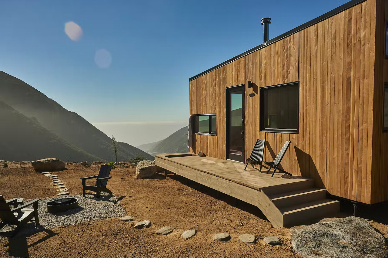
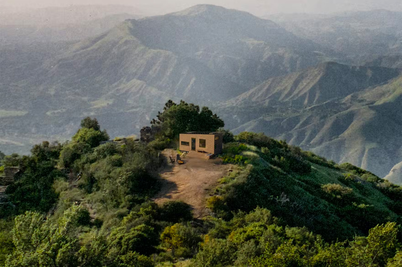
Designed by Charlie Hammon, the Find Sanctuary is designed to provide some peace of mind and a safe space for frazzled workers. The cozy and lovely home serves as an oasis for overworked employees who need some downtime, and space to unwind.
Why is it noteworthy?
Hammond then brought to life his idea, ‘Find Sanctuary’. Find Sanctuary is a renewed and revamped version of remote working. It includes a collection of 40 tiny cabins in Big Bear, California that can be rented, providing exhausted employees with an opportunity to work in a peaceful environment and regain some of their composure.
What we like
- Amped with stunning views of the surrounding mountains
What we dislike
- Designed to be a space away from work, we believe it should not support a working space
9. The Trakt Forest Hotel
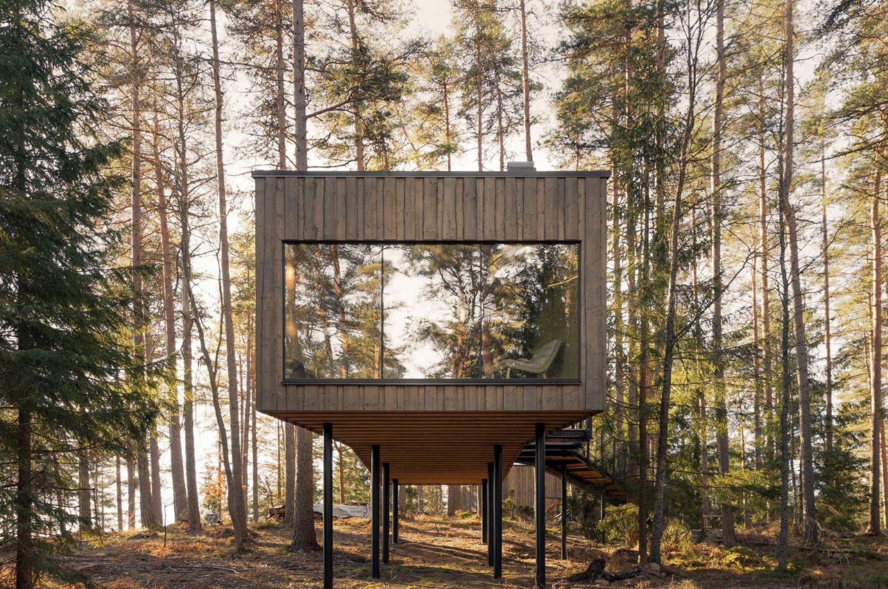
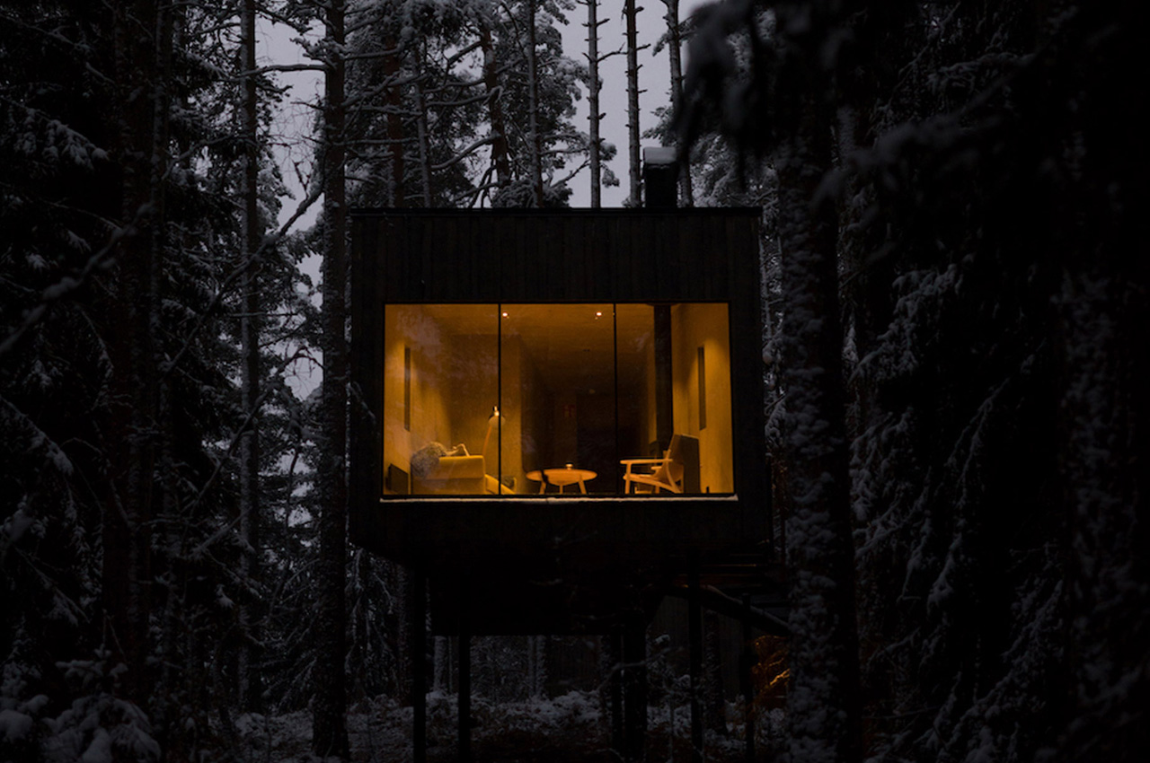
Located in Småland, and designed by Swedish architecture studio Wingårdhs, the Trakt Forest Hotel is a collection of five idyllic suites that are supported by five metal stilts. These suites allow the visitors to feel as if they’re chilling amongst the tree canopies, and are designed to “put nature in focus”.
Why is it noteworthy?
While building the cabins, the studio wanted to create minimal disturbance to the surrounding landscape, and hence they positioned the suites on steel columns placed on concrete plinths. The cabins were constructed using locally-grown wood.
What we like
- Let’s you chill amongst the tree canopy
- Constructed using locally sourced wood
What we dislike
- Deserves a gallery/balcony to improve the experience
10. BioHome3D
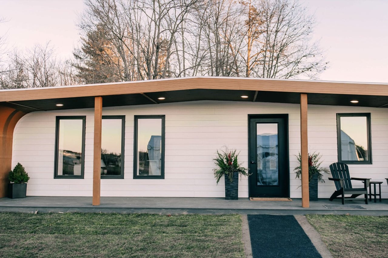
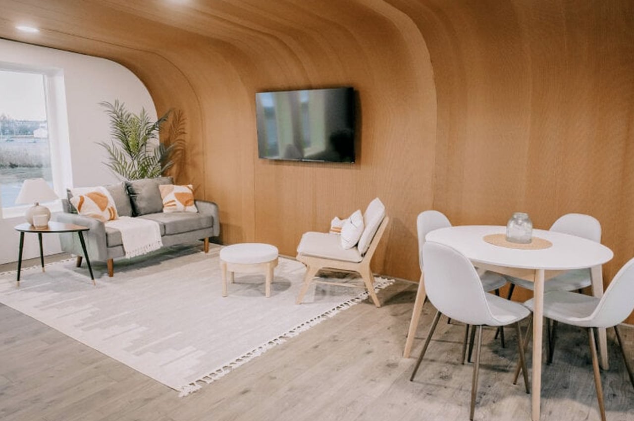
The world’s first 3D-printed home built entirely from bio-based materials such as wood flour or fine sawdust, mixed with a binder made from corn was created by the University of Maine Advanced Structures and Composite Center (ASCC). It is called the BioHome3D, and was specially designed to resolve labor supply chain issues that elevate the costs of homes and reduce the availability of affordable housing.
Why is it noteworthy?
The technology used to build the BioHome3D ensures that the home is primarily manufactured off-site using automation, which leads to less time for off-site3 building and setting up the home.
What we like
- Tackles the issue of labor shortage and supply issue
- 3D-printed
What we dislike
- No roof space to allow for vertical growth
The post Top 10 minimal homes for lovers of all things minimalistic first appeared on Yanko Design.
0 Commentaires