Wood has been the material of choice for furniture designers since ages galore. And no wonder! There’s something about wood that instantly adds a sense of zen and calm to any living space it is placed into. It puts your mind at ease, while managing to radiate a feeling of warmth and tranquility. It’s a minimal material that holds a strong personality without any additional frills and tassles. And I truly believe a well-crafted piece of wooden furniture can add a magical touch to even the simplest of living spaces. Minimal, clean, and almost always soothing, beautifully designed wooden furniture helps add the ultimate finishing touch to a room. And we’ve curated a collection of wholesome wooden furniture designs for you – from a minimalist stool that combines wood and webbing to a table that is the physical manifestation of a wormhole in the form of furniture!
1. The KNOT Stool
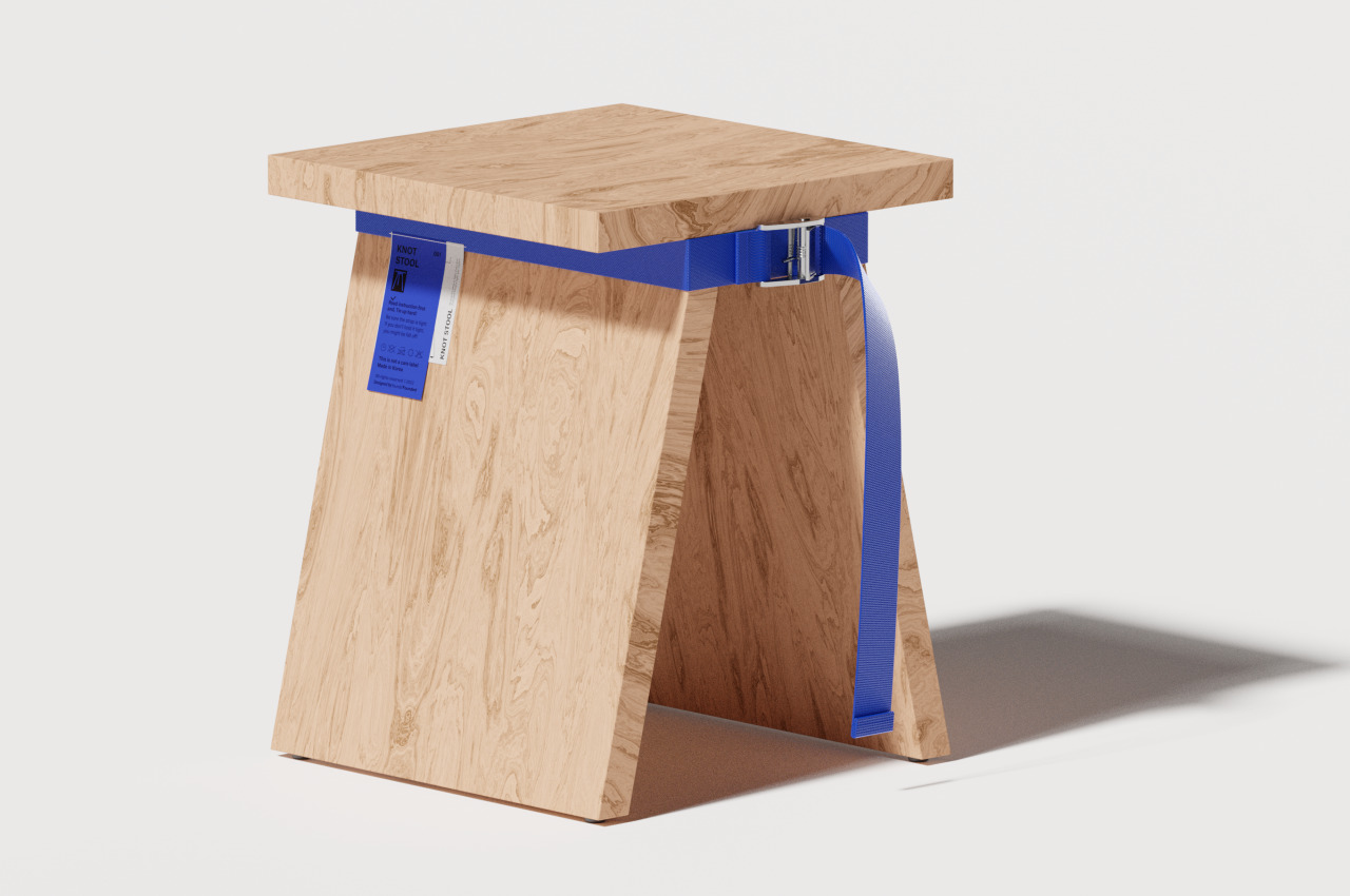
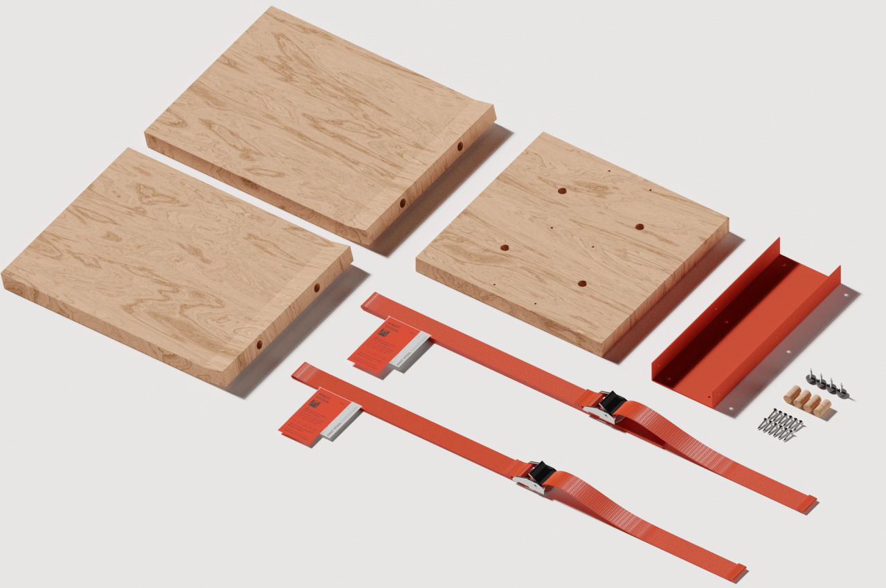
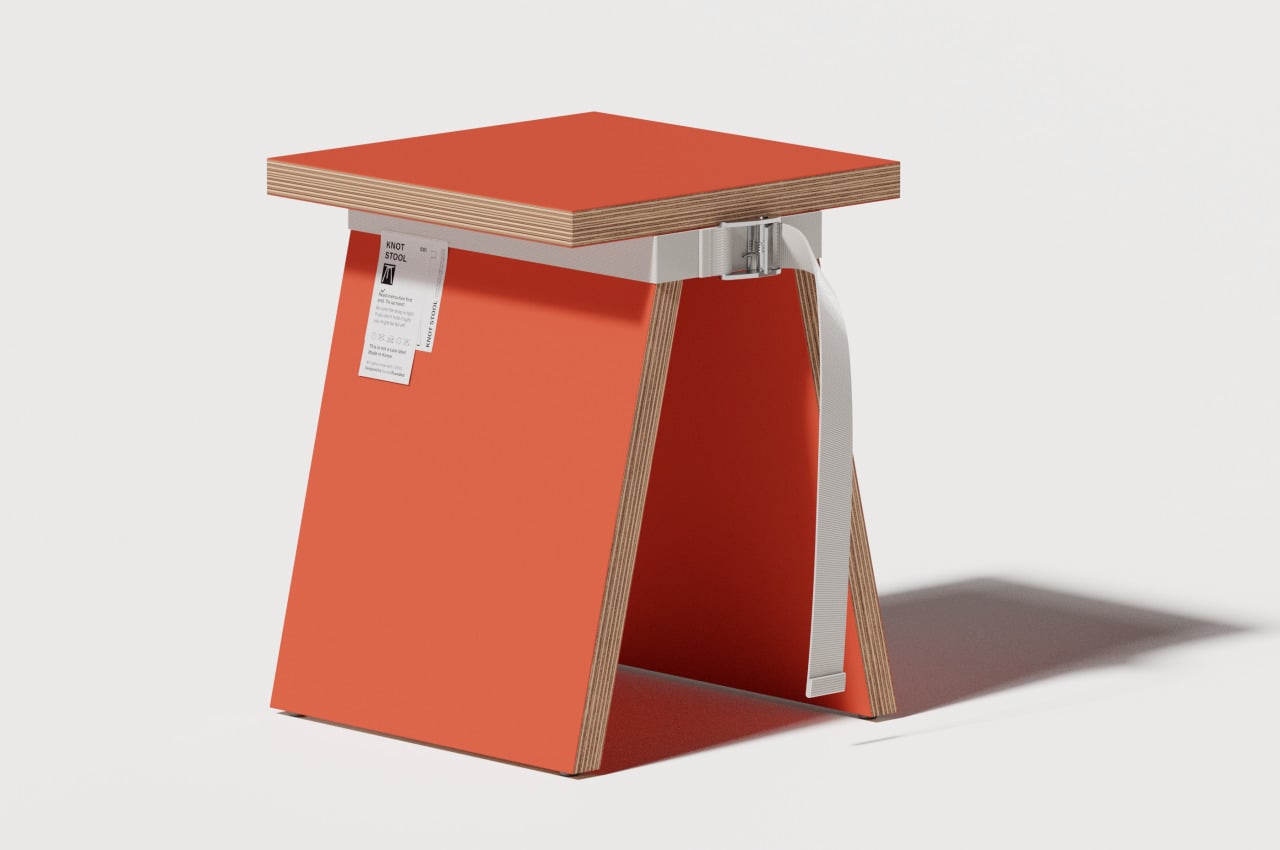
The KNOT Stool is a uniquely designed stool that is flat all around, equipped with neither a curved surface nor corner. You can observe the various layers of wood that makeup all its parts, providing the stool with a rather brutalist aesthetic that is toned down because of the painted surfaces.
Why is it noteworthy?
The three wooden pieces can be painted in the same or different colors. The decorative webbing strap that wraps around the top of the stool’s legs can also come in complementing or contrasting colors, not to mention being made of different materials.
What we like
- Adds a whimsical + fun element to your interiors
- Clean and minimal design
What we dislike
- Seems to be designed more for viewing rather than sitting
2. Wormhole Coffee Table
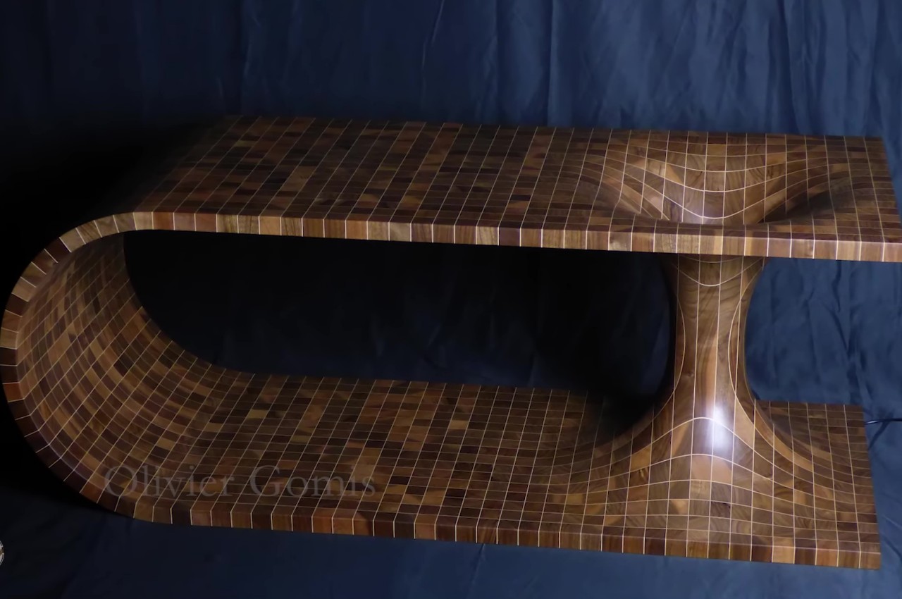
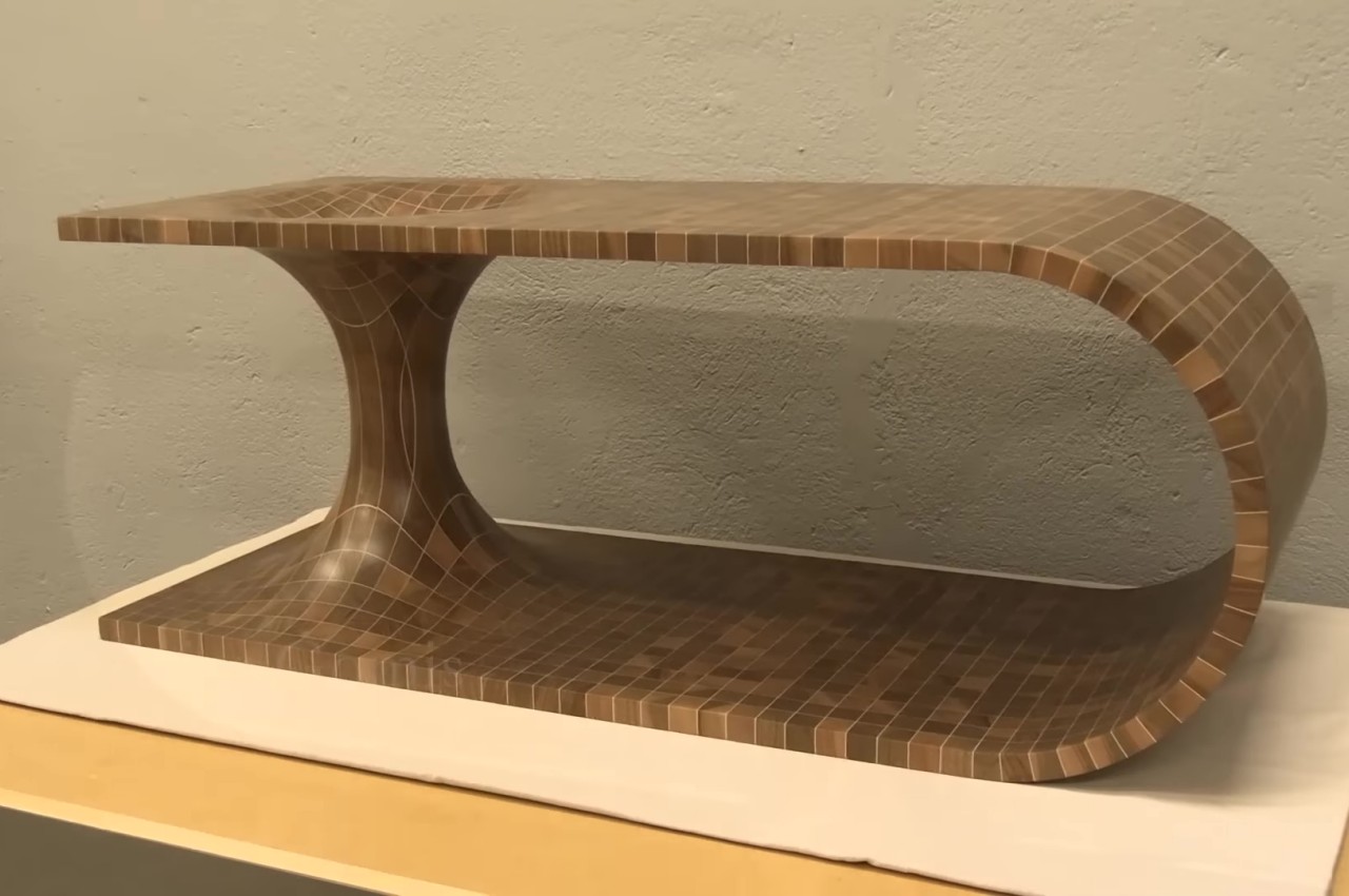
Designed by Olivier Gomis, this mind-blowing coffee table is an ingenious effort to convert the hypothetical wormhole into a physical manifestation. Wormholes can hypothetically connect two disparate points in spacetime via a tunnel, and Gomis brings this concept to reality through this table.
Why is it noteworthy?
The shape of a table is already quite eye-catching on its own. It’s almost like a wooden plank that has been bent so that the two ends are on top of each other and then joined together by a double cone. These are then glued together with sheets of maple veneer in between, which give the appearance of those faint light lines that form the grid.
What we like
- A lamp was installed in the center of the hole, giving the table an eerie appearance in the dark
What we dislike
- The inward curving section provides a risk for products that could roll inside and get stuck like a marble or a coin
3. Live Edge Collection
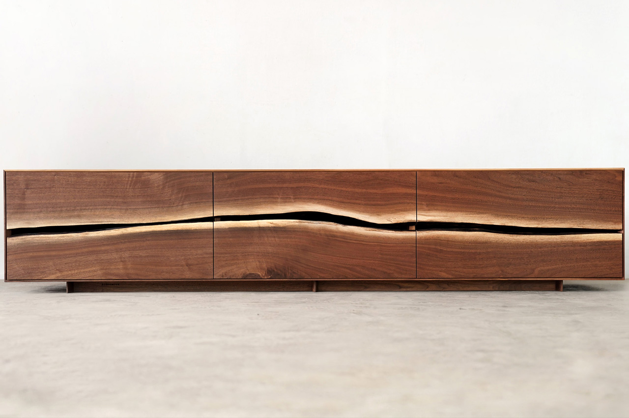
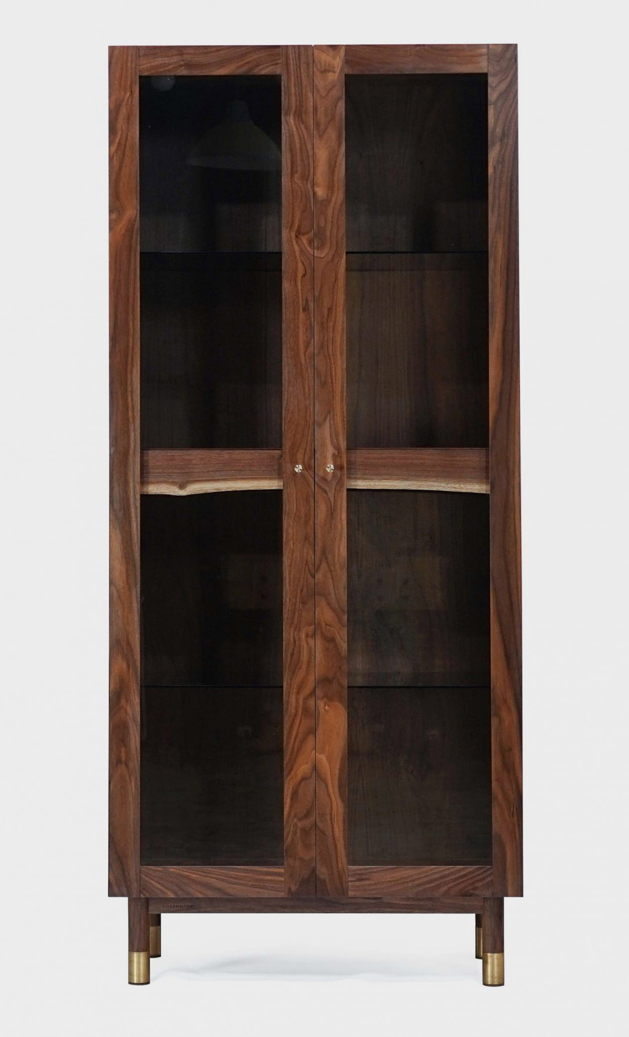
Beomsuk Ko designed a beautiful collection of storage furniture called Live Edge. The furniture pieces celebrate the natural grain of wood and were designed by Ko for Kobeomsuk Furniture, the South Korean furniture brand of which he is the founder.
Why is it noteworthy?
The furniture collection includes a glass cabinet, a walnut TV stand, and a freestanding shelving unit. All the pieces in the collection are beautifully designed with a minimal yet attention-grabbing appearance.
What we like
- The front panels of the stand truly allow the natural grain of the walnut wood to shine through
- It is a true celebration of the natural texture of wood
What we dislike
- Large, bulky, and space-consuming pieces
4. The Centenniale Coffee Table
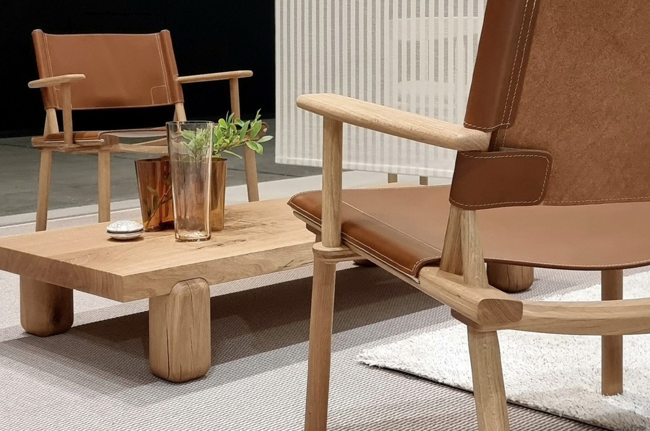
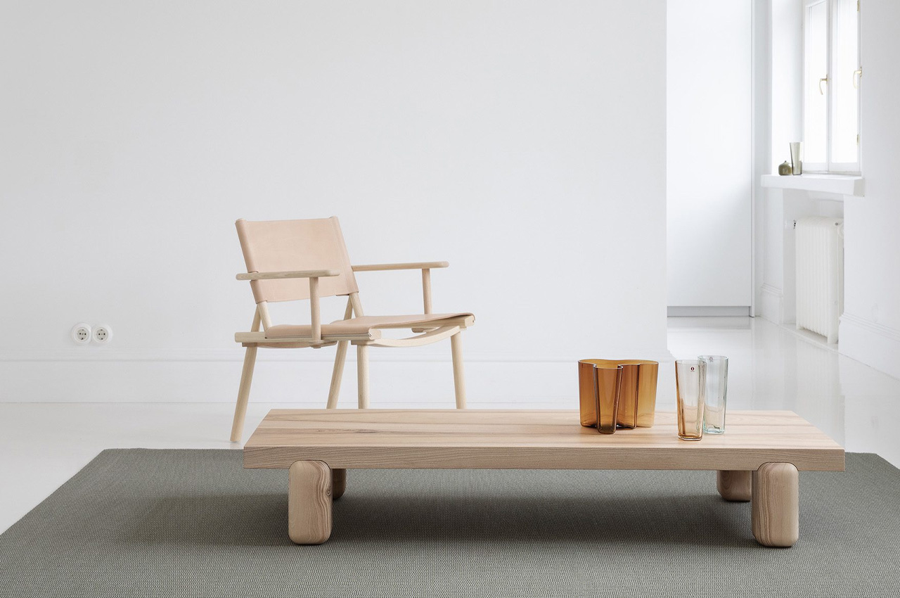
Designed by architect and designer Joanna Laajisto for the Finnish brand Nikari, the Centenniale coffee table is a sturdy and minimal coffee table built using 100-year-old wood.
Why is it noteworthy?
The coffee table was designed by embracing the cracks and imperfections of the old timber. The entire coffee table was constructed from a single piece of wood, and it features a sharp-edged and elongated tabletop that is supported by blocky and chonky legs with rounded edges.
What we like
- The different elements of the table beautifully showcase the unique and versatile variations and textures in the timber
What we dislike
- Aesthetics are a tad bit simple and unassuming
5. The Intension Design Tripod Standing Desk Pro
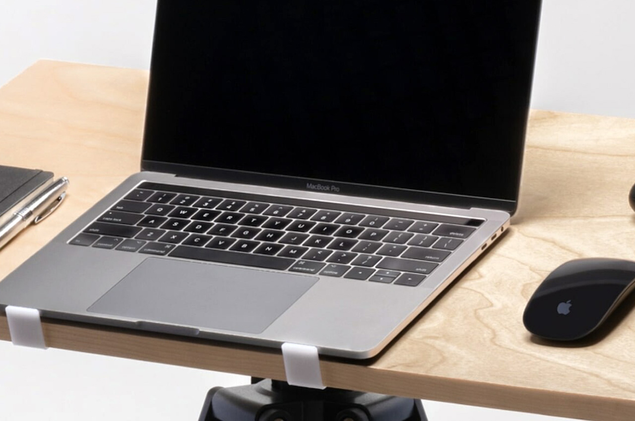
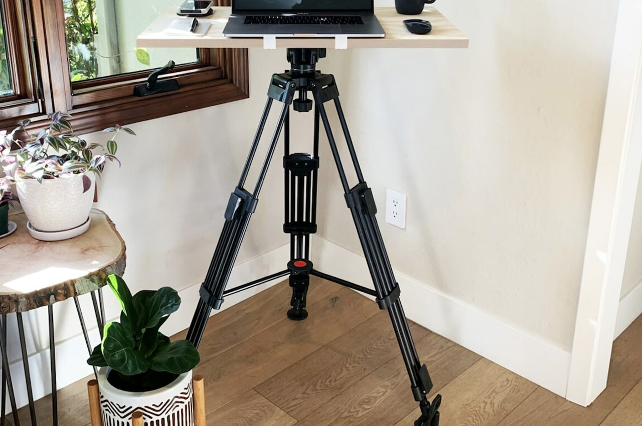
Built from walnut, birch, or black wood, the Intension Design Tripod Standing Desk Pro can be assembled and disassembled within seconds, and it’s great for working from home in small office spaces. It allows you to work anywhere, anytime!
Why is it noteworthy?
The desk weighs only 13 lbs, and it’s an excellent product for traveling or setting up without any assistance. You can use it to work, play board games, or as a more permanent fixture in your home.
What we like
- You can adjust the angle of the desk to flat or at an incline to maximize comfort
What we dislike
- Not a very aesthetically pleasing design
6. The Loop Chair
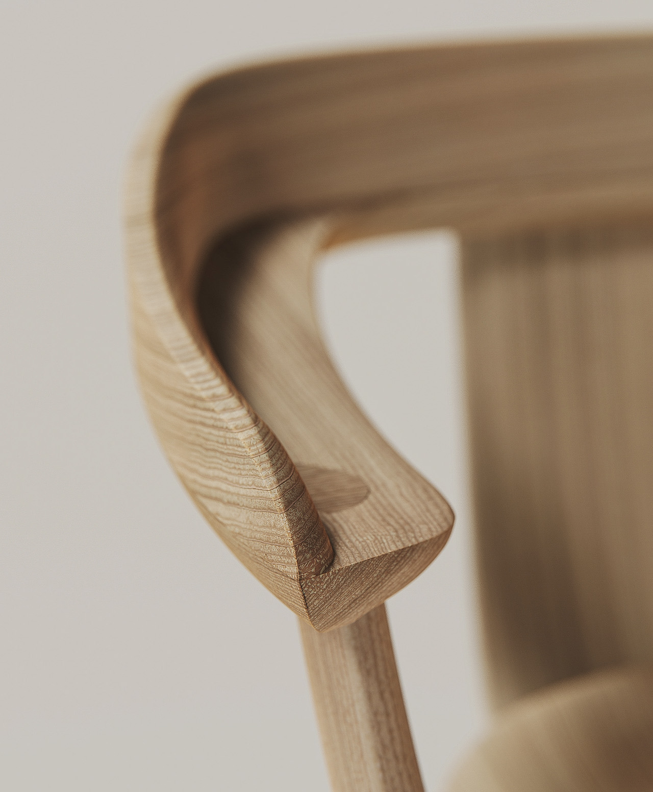
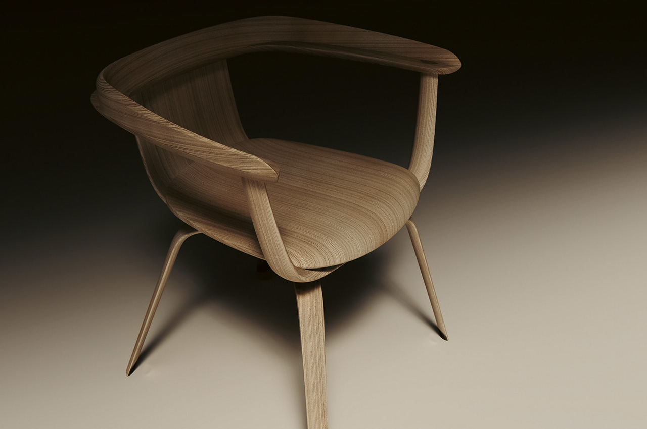
Designed by Annabella Hevesi, the Loop Chair is the kind of straightforward and simple furniture piece that instantly makes you fall in love with it, because of how minimally and cleanly it is designed.
Why is it noteworthy?
Built using wood, the Loop Chair has a traditional and archetypical character accentuated with tricky and progressive details that lend an air of character to it. The form of the chair follows a trapezoidal shape elevated by smooth ellipsoid curves, creating a furniture piece that is visually and geometrically intriguing.
What we like
- The surface of the chair is exceedingly soft, while the edges and curves are pretty sharp, creating an interesting contrast, that builds the character of the chair even further
What we dislike
- From afar, the Loop Chair looks like any other simple wooden chair
7. Allieva
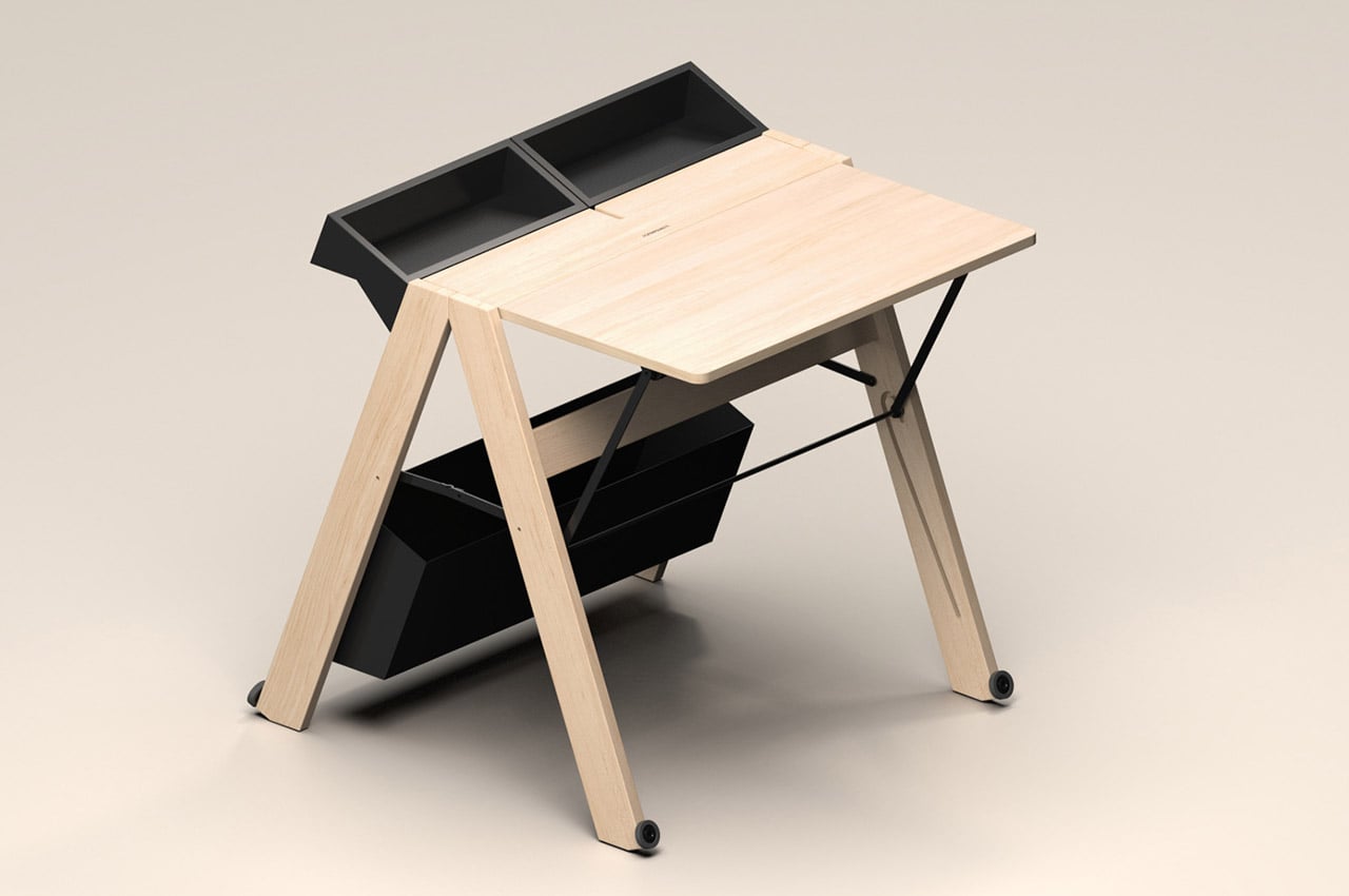
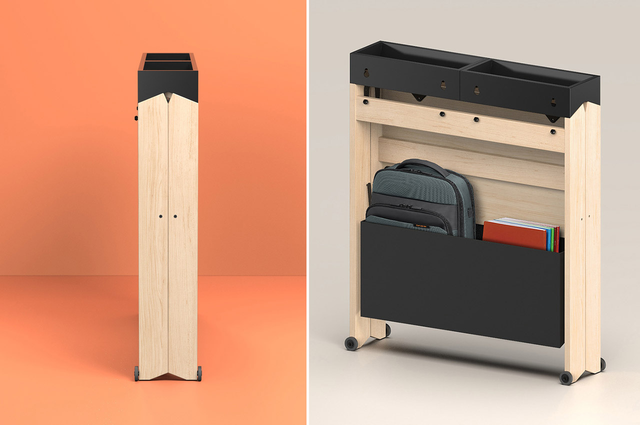
Whynot Design designed the Allieva desk for Foppapedretti – one of the most well-known Italian brands for baby products and wooden furniture since 1945. The Allieve Desk is a foldable wooden workstation that meets the ever-growing need for compact and functional furniture designs in our modern homes.
Why is it noteworthy?
This sleek, foldable work desk is meant to fit in any space, making it perfect for small houses and dorm rooms. Despite compromising on size, Allieva is aesthetically pleasing. It takes up as little space as possible and measures only 7 inches deep when folded.
What we like
- The workstation can be set up easily with a simple gesture
- Comes with a large compartment at the base of the table that allows you to keep everything
What we dislike
- The folding and unfolding mechanism could be considered tedious by some
8. The Arqus Desk
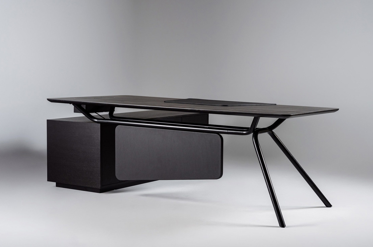
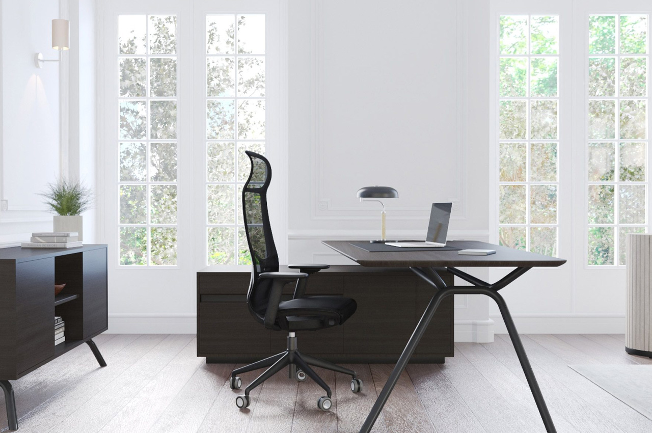
The Arqus Desk was designed by the Italian studio Orlandini Design for Narbutas. It is a part of the Arqus collection and is designed to be a counterpart or lighter replacement to the heavy and bulky furniture designs we find in modern corporate offices.
Why is it noteworthy?
The Arqus Desk is marked by light lines and distinctive metal legs and showcases a lighter and subtler type of furnishing in office spaces.
What we like
- The “expressive” metal legs and the optionally asymmetrical desktop shape signify and capture the manager’s ability to adapt and adjust to changing circumstances
What we dislike
- Despite being designed to a be softer and lighter piece of furniture, it does seem to be quite a space-consuming piece
9. The Nodding Chair
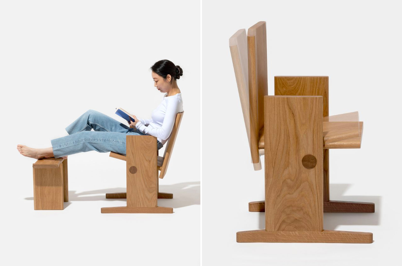
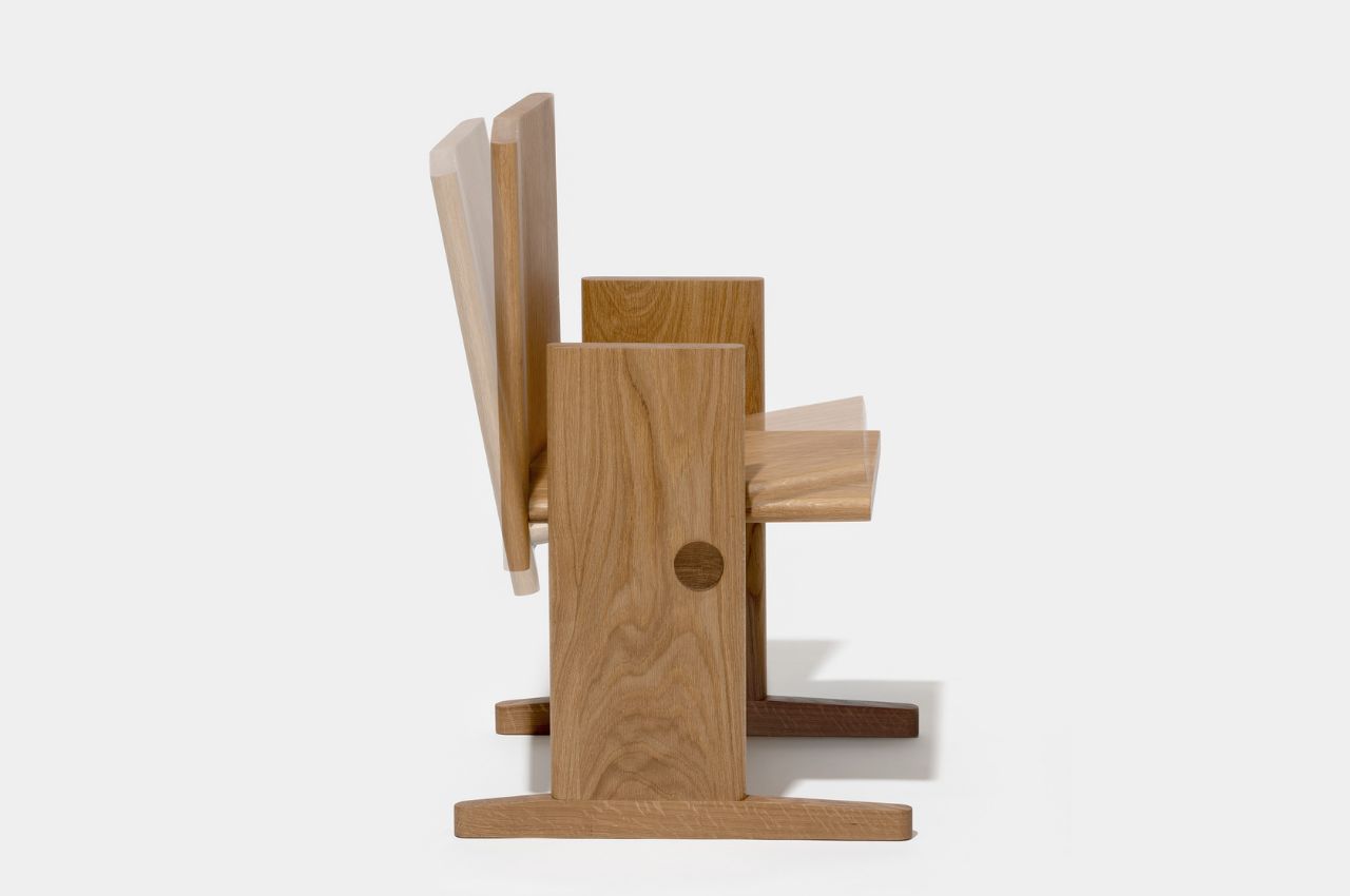
I love cozying up with a good old book; however, sitting in one position and reading for hours on end can be a curse for my back. Hence this unique product concept was created to function as the perfect chair for bookworms!
Why is it noteworthy?
While rocking chairs are good for relaxation, they’re not always good for floors and, if you’re like me, for our eyes and peace of mind. The designer thought of a new way to have a chair that can be comfortable and still let your body have its range of natural motion while reading, resting, or even writing (if you’re used to that). The Nodding Chair can be tilted forward and backward, letting you make smaller movements that won’t make you too nauseous.
What we like
- Creates less pressure on the floor so you won’t get marks and scratches
- Allows the chair to move with you as you occasionally change positions while reading
What we dislike
- The seat itself doesn’t seem to be that comfortable as it’s just plain wood and there’s no cushion
- Not everyone may consider the chair comfortable
10. The Fortune Chair
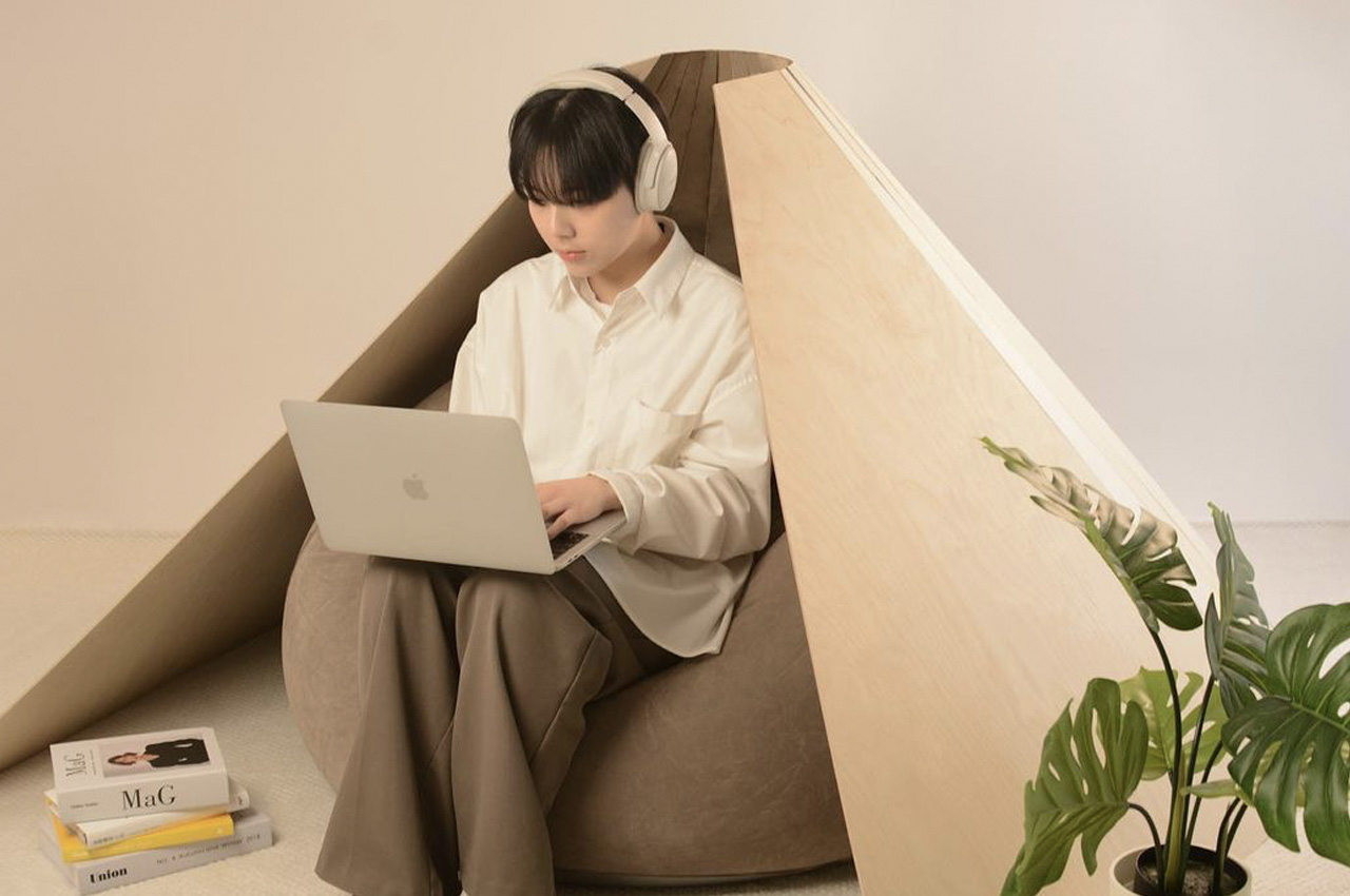

Designed by Hyeyoung Han and Hanyoung Lee, the Fortune Chair is really a mix between a bean bag, chair, and a pod, and it also happens to look like a fortune cookie.
Why is it noteworthy?
The chair includes a fortune cookie-inspired wooden outer wall, which functions as a covering frame that surrounds the user. This outer wall creates a cozy, comfortable, and private space for the user to sit in.
What we like
- Irrespective if you’re working in a corporate office or at home, the Fortune Chair functions as a little oasis for you to work in peace, much like the office pods we find today in commercial offices
What we dislike
- We’re not sure how comfy it would be to sit for long periods of time
The post Top 10 wooden furniture designs to elevate your home with some warm minimalism first appeared on Yanko Design.
0 Commentaires