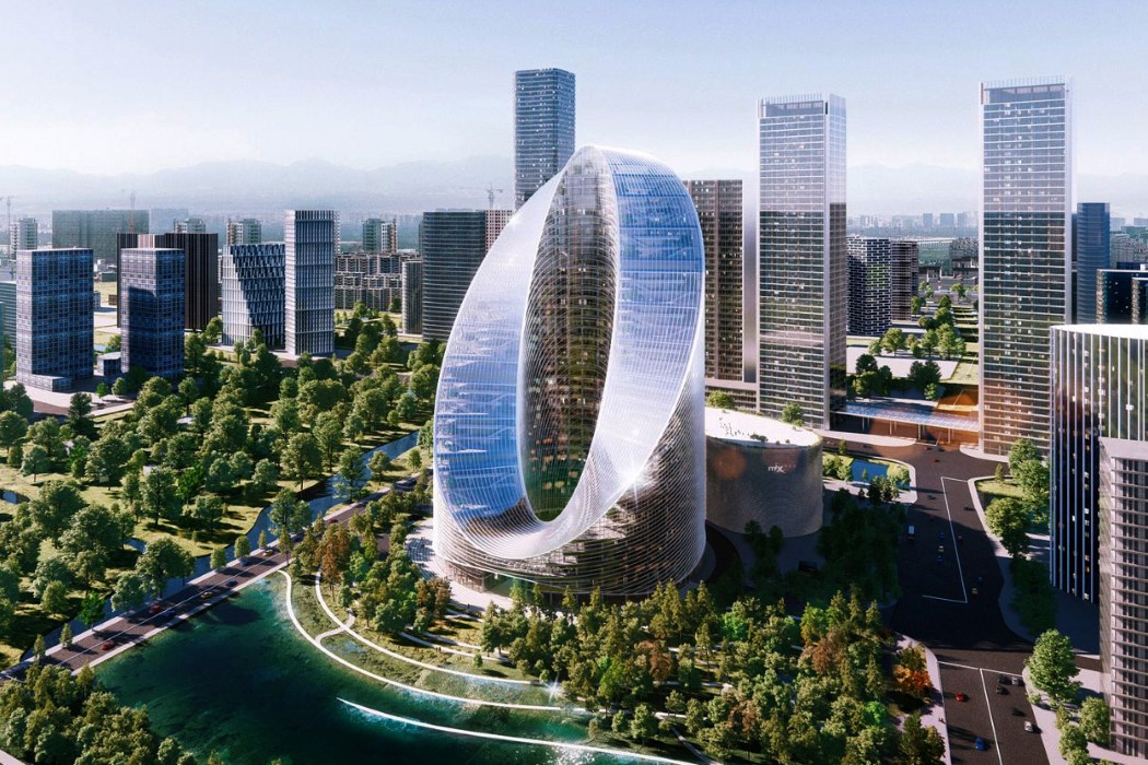
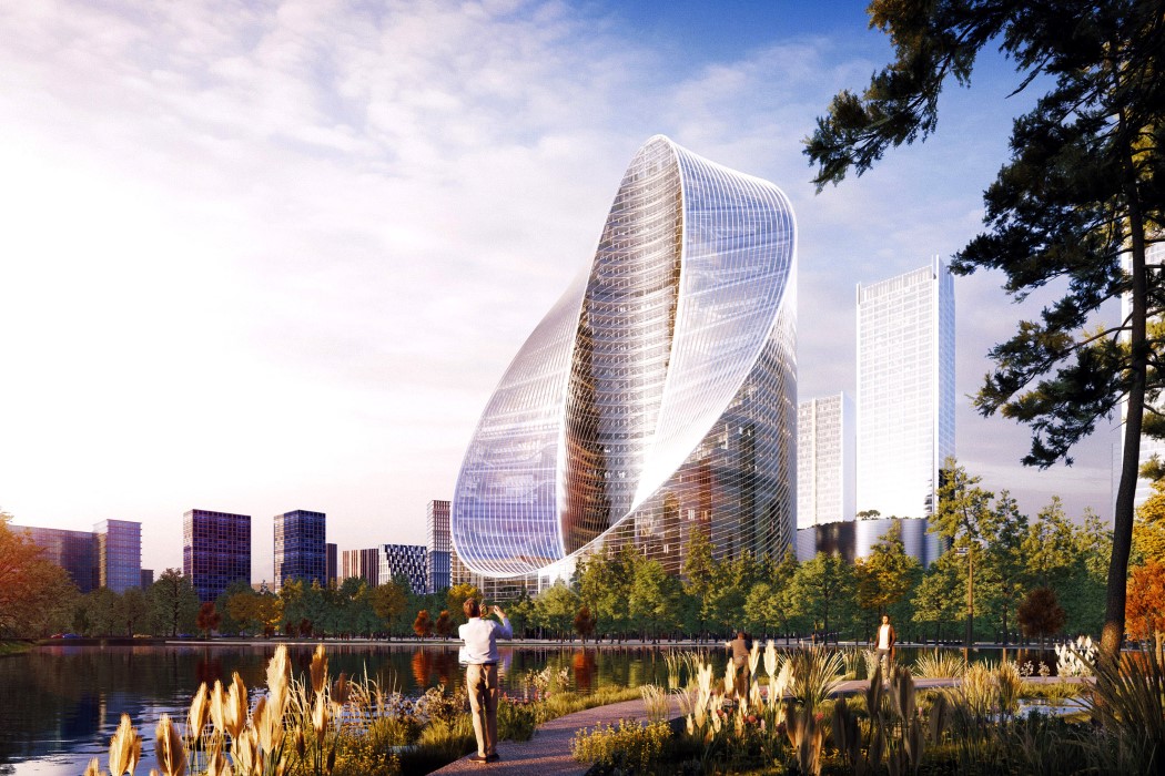
In what could be an incredible branding move, OPPO’s new headquarter design will adorn the Hangzhou skyline with a massive O. Envisioned by Bjarke Ingels Group, the headquarters are described as an “infinity loop” shaped skyscraper that “connects [the] ground to sky in a continuous loop of collaboration”.
The larger-than-life O-Tower is representative of OPPO‘s status as China’s largest smartphone manufacturer. The upper and lower surfaces of the O remain flattened, creating what feels like a möbius strip that represents Oppo’s infinite potential and innovative spirit.
The O-Tower will be located in Hangzhou’s Future Sci-Tech City, within the Zhejiang province of China. Its purpose will be to primarily serve as an R&D building for the smartphone company while acting as an “iconic landmark and gateway” to the business district.
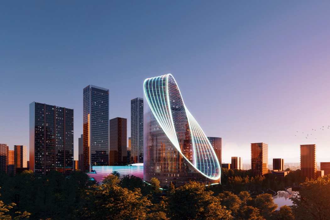
The O-Tower lights up after sundown, creating a magnificent letter-O in Hangzhou’s skyline at night. Not only does it serve as an iconic landmark within the city, but it also helps reinforce Oppo’s brand through the incredible architecture.
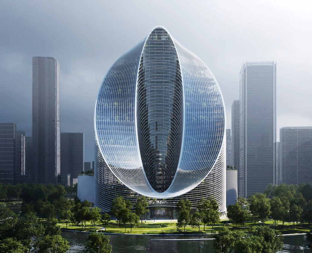
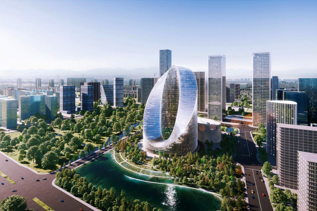
Meanwhile, the front and the top view look equally stunning in the day, creating a rather memorable piece of architecture that’s both iconic and awe-inspiring. The tower is expected to be built alongside a natural lake and a 10,000 square-meter park.
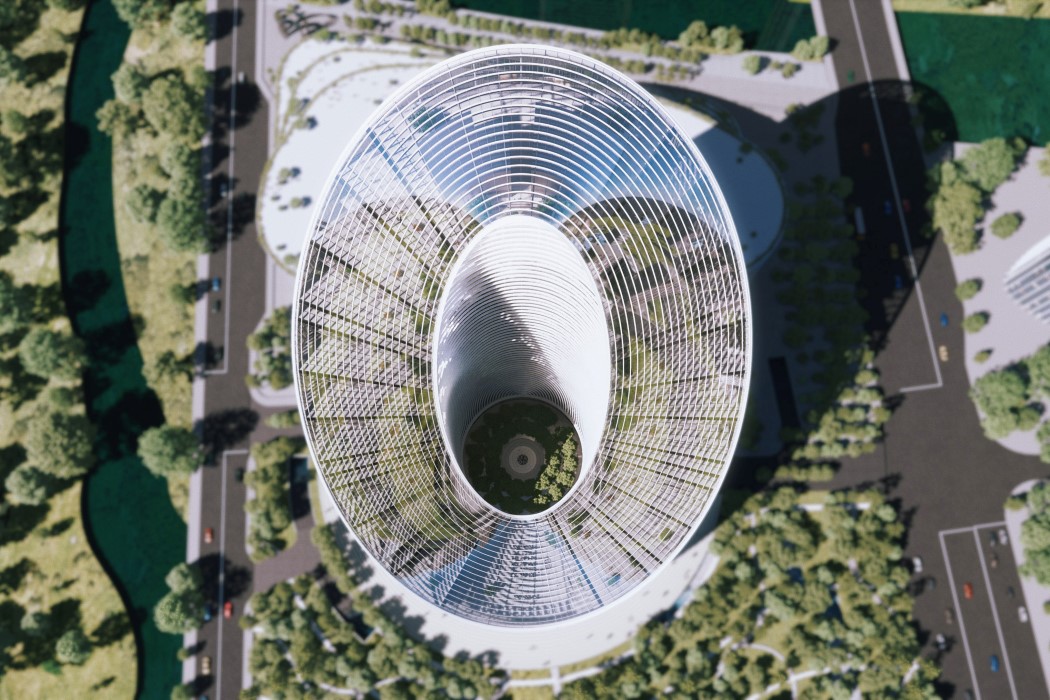
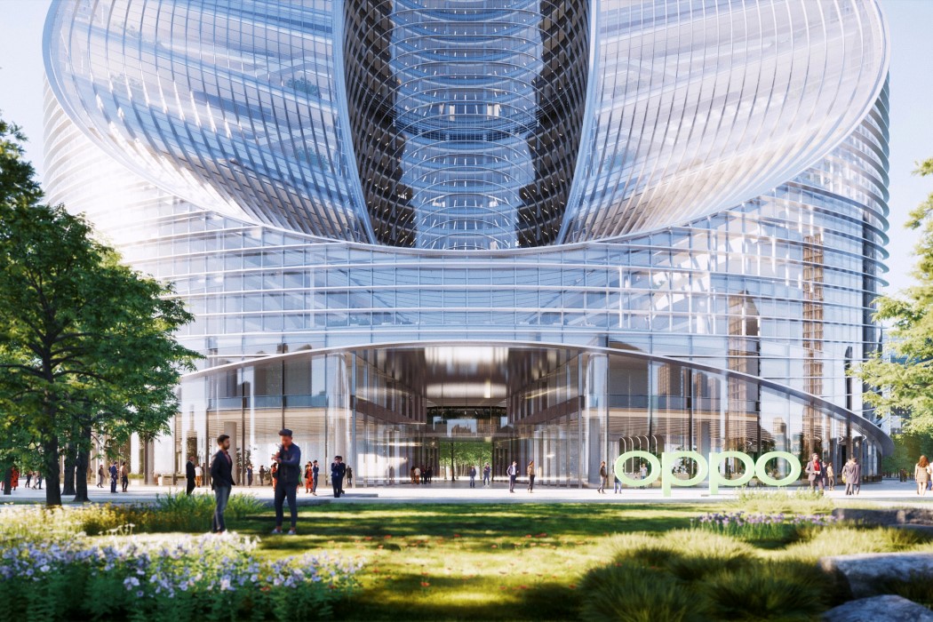
The O-Tower creates a pretty stunning entrance into the building as you walk right through the alphabet into a large circular courtyard populated with greenery. “The central oasis and the surrounding [Hangzhou] wetland park expands the public realm into the heart of the complex,” explained Bjarke Ingels, founder of the Denmark-based architecture studio BIG.
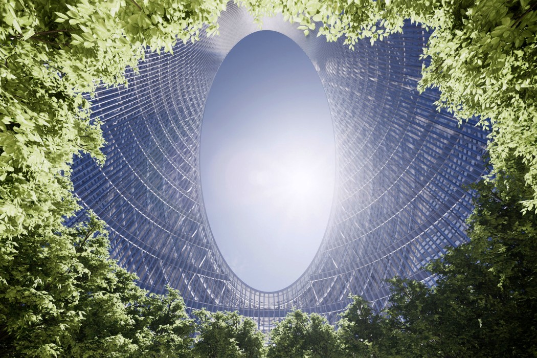
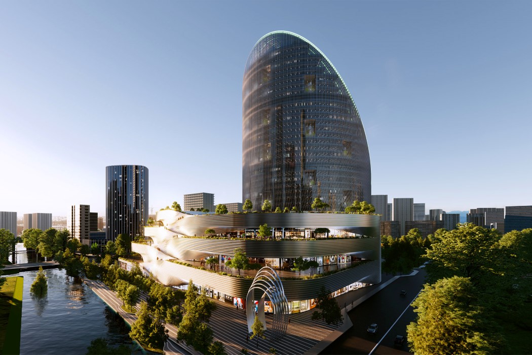
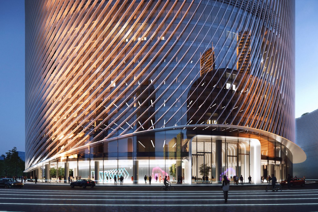
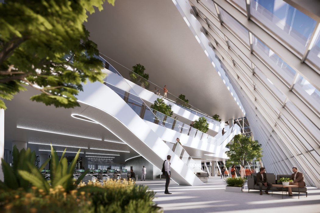
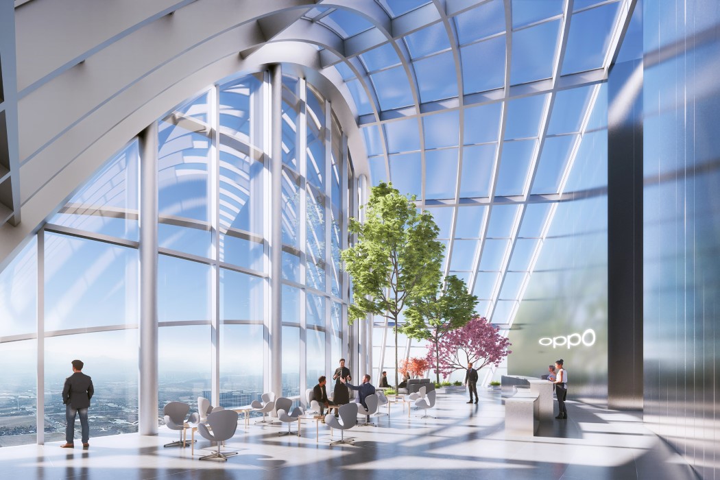
“The compact form folding in on itself provides large flexible floorplates with the daylight access and fresh air of a slender tower”, says Ingels. The O-Tower’s lower floors will contain exhibition spaces, conference areas, and a canteen, while the offices located on the floors above will be joined with a series of triple-height spaces under the sloping facade of the tower’s roof. On the outside, the building will be wrapped in an adaptive louvre facade, featuring slanted slats that almost look like the building has fingerprints. These facades, however, will play an important role in minimizing solar glare. “The adaptive louvered facade omits incoming solar glare and thermal heat gain, enhancing the passive performance of the building”, says Ingels, who’s studio BIG began working with the Chinese smartphone manufacturer at the beginning of 2019 to envision the R&D Building’s design and master plan.
Designer: Bjarke Ingels Group (BIG) for OPPO

0 Commentaires