After highlighting that a transparent phone can look beautiful, companies seem to be jumping on the see-through bandwagon… but things aren’t that easy. Making a product visually clear means exposing even your potential flaws. Renault is celebrating the 30th anniversary of the Twingo by collaborating with Dutch designer Sabine Marcelis to reimagine the Twingo. The redesigned automobile features an almost inside-out design with translucent materials both on the exterior as well as the interior. Celebrating the car’s industrial build while still retaining its soft, lovable form, Sabine Marcelis’ take on the Twingo reaffirms something that Steve Jobs and Jony Ive attempted with their translucent iMac G3 computers – a well-designed product can bare itself to visual scrutiny and still look beautiful. Transparency and translucency aren’t just a visual aesthetic, they’re almost a mark of incredible design and engineering, both on the inside and out.
Designer: Sabine Marcelis for Renault
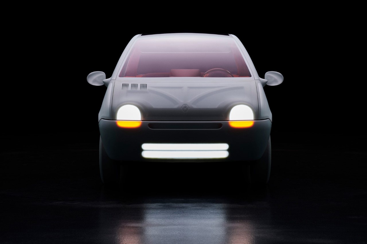
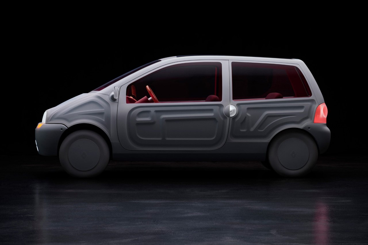
An award-winning designer as well as a mentor for the Lexus Design Awards, Sabine Marcelis brought her unique eye for experimenting with materials, lighting, and pastel aesthetics to the Twingo, which originally debuted in 1993. For Marcelis, the brief was to retail everything iconic about the Twingo while highlighting its lesser-appreciated details through a combination of transparency and inside-out design details. The car’s body, for instance, features industrial panels that usually sit on the inside of the car’s Class-A surfaces, providing the rigidity the automobile needs. By bringing those stamped panels to the exterior, the car looks almost like a skeleton of itself – a feature that’s enhanced by the soft white finish seen on the Twingo’s body.
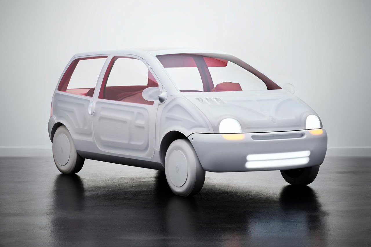
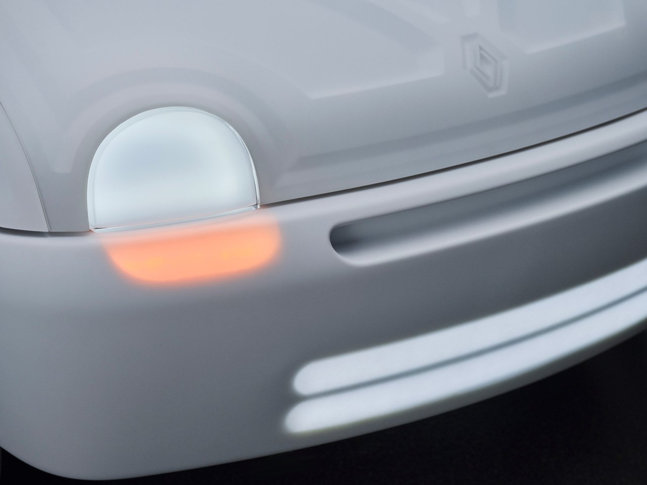
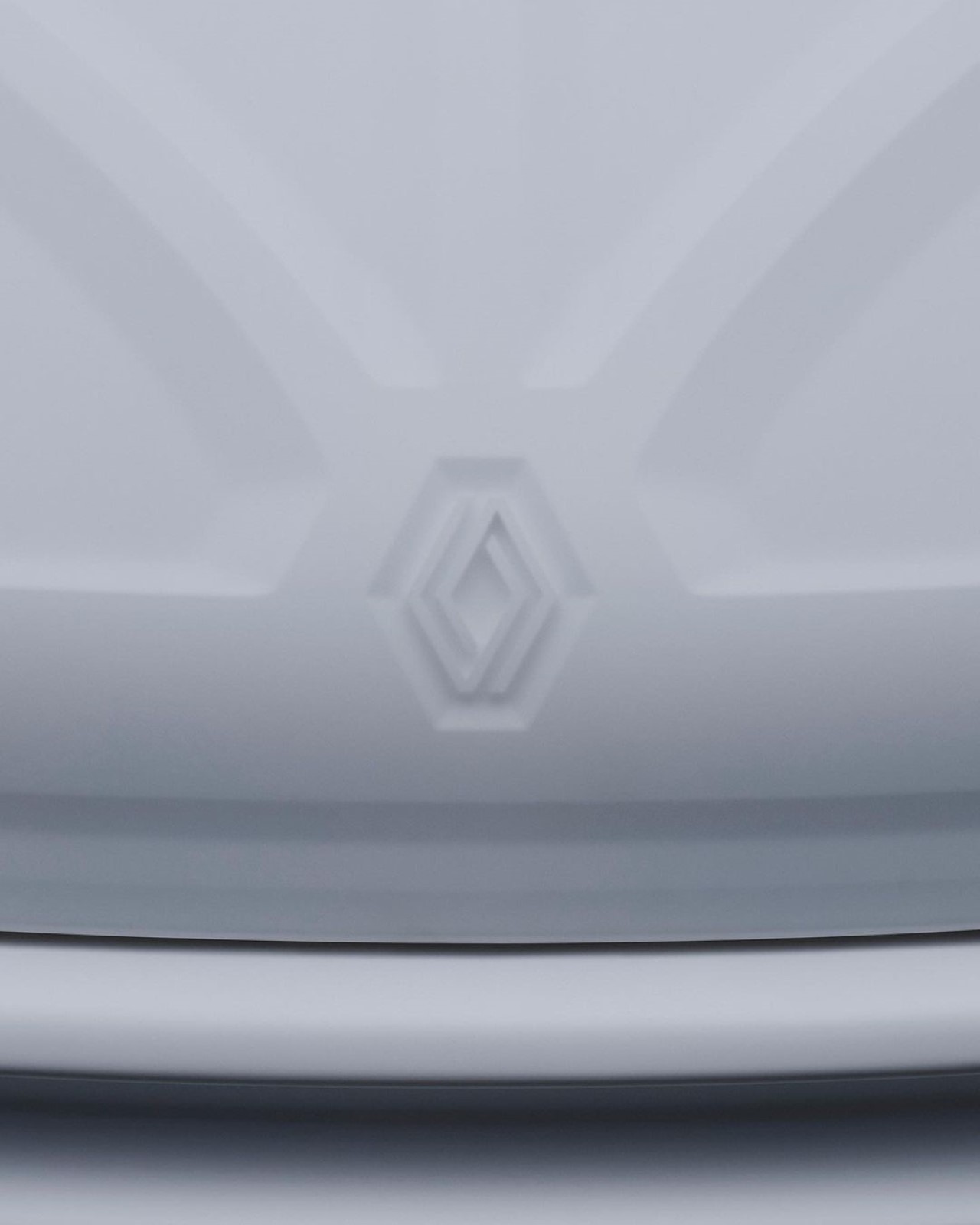
The headlights retain their ‘frog-like’ aesthetic from back in ’93, although Sabine’s treatment of them makes them much softer and more aesthetically pleasing. When off, the headlights almost blend right into the car’s aesthetic, coming alive only when switched on. The main headlight, although limited in its functional brightness, glows with a wonderful white aura, while the indicator beneath shines right through the translucent bumper, with two additional longer light strips illuminating the road as well as drawing attention to the car itself. Even the Renault logo on the hood has minimal visibility, grabbing your attention for a fleeting moment while you admire the Twingo.
“My challenge was to elevate them without losing their unique identity,” Marcelis said. “To bring all elements into a more luxurious realm, activated by light and materiality.”
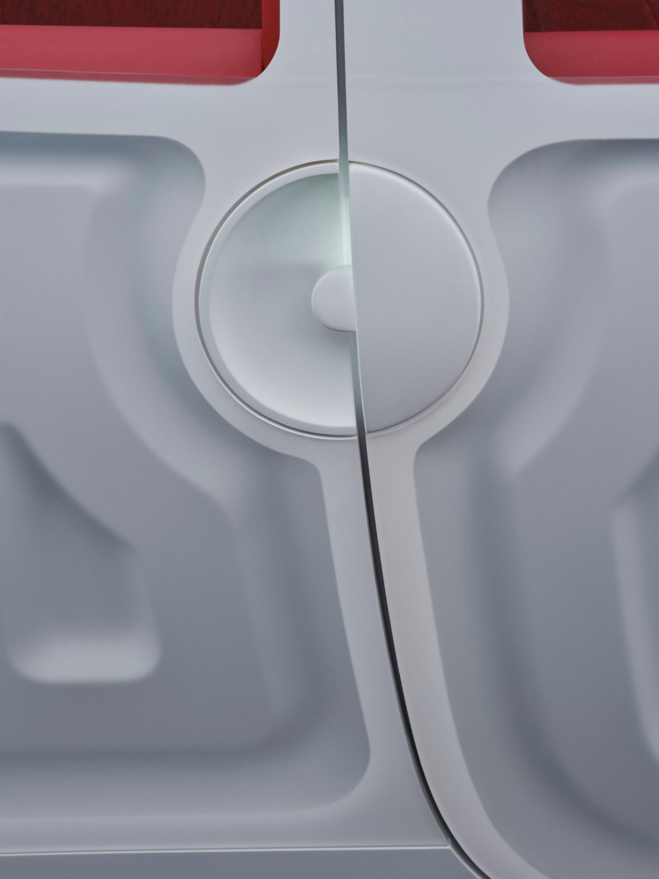
The Twingo’s unique handle gets highlighted here, with Marcelis adding a backlight to it to help it stand out even more.
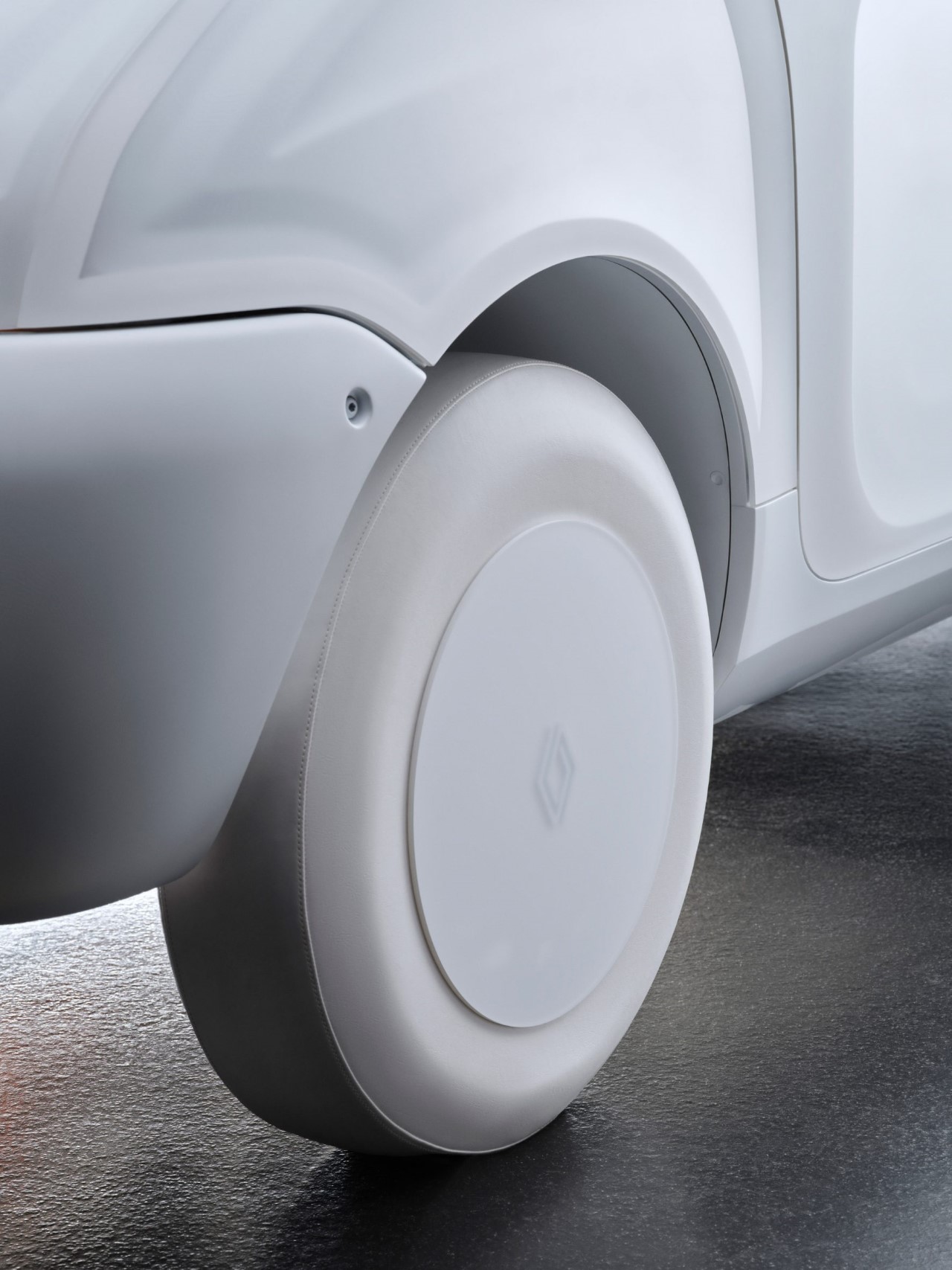
Designed purely as an anniversary concept, Marcelis clad the wheels with white fabric, eschewing the black rubber tires seen on every car.
While the outsides embrace an all-white aesthetic, the insides get a touch of red, almost as a hat-tip to the iconic red color of the Twingo itself. “The interior is very saturated in color and stripped to the essentials, simplifying many elements into singular objects – like the sunshade and rearview mirror which are combined into a single element, and the front seats are also merged into a single bench,” Marcelis said.
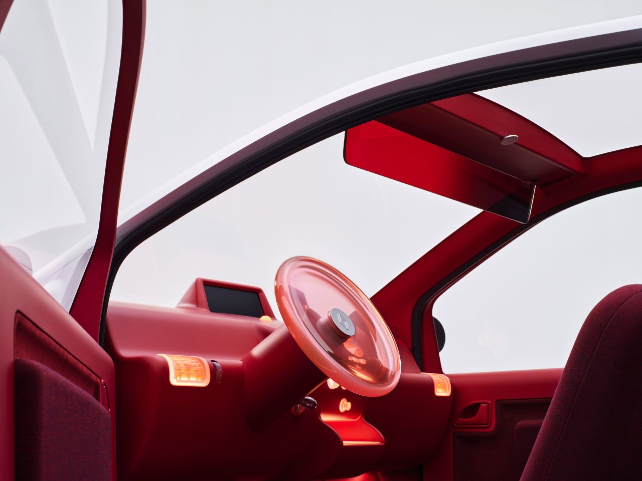
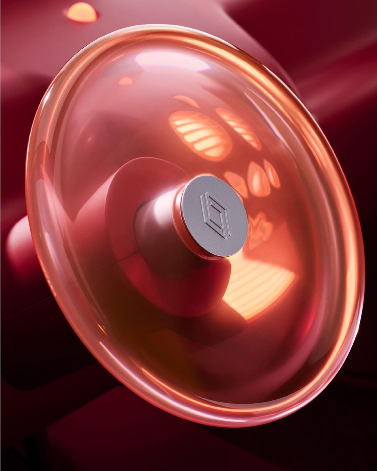
In keeping with the car’s overall softness, the interiors have an almost toy-like quality to them too, with curved profiles, a tinted sun-shade, and perhaps the most gorgeous translucent glowing steering wheel I’ve ever seen. The colors aim to evoke a feeling of coziness, and the steering wheel’s unique design direction was designed to be aesthetically pleasing but still functional. Marcelis described the almost candy-like wheel as “a single disk with all the functionings of a steering wheel, whose shape reveals itself further when light catches the edges.”
Renault and Marcelis’ reimagined Twingo was unveiled on the car’s 30th anniversary at Centre Pompidou, an art museum located in the heart of Paris. The car was also retrofitted with an electric motor to symbolize Renault’s “commitment to electric cars”, with its upcoming to electrify all European models by 2030.
The post Renault’s ‘Translucent’ Twingo Is The Latest In This Era of ‘See-Through’ Design first appeared on Yanko Design.
0 Commentaires