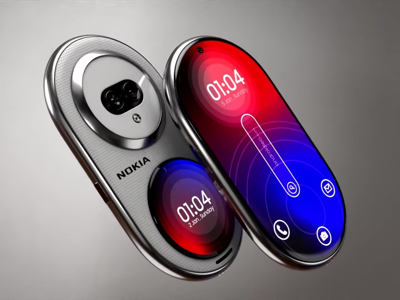
You might criticize Nokia for flooding the mobile market with dozens of hard-to-remember devices, but you can’t deny that the Finnish giant also brought bold new designs that were far too ahead of their time, from the gaming-centric N-Gage to the cinematic N93 to the fashion-conscious 7380 “lipstick.” In contrast, today’s smartphones mostly play it safe due to usability and sales concerns, but that’s not to say that an odd design won’t sell either. There’s definitely room for novelty and plenty of space for creative ideas. This curiously shaped phone, for example, changes the design formula significantly, and while it does look like a futuristic device, it also raises a few important usability questions.
Designer: AndroidLeo
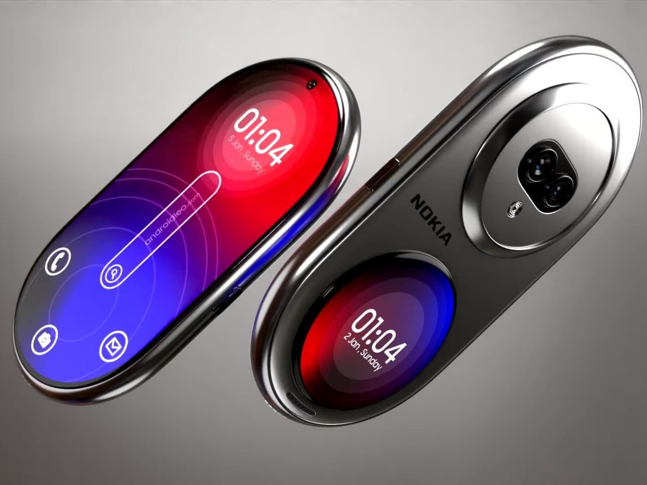
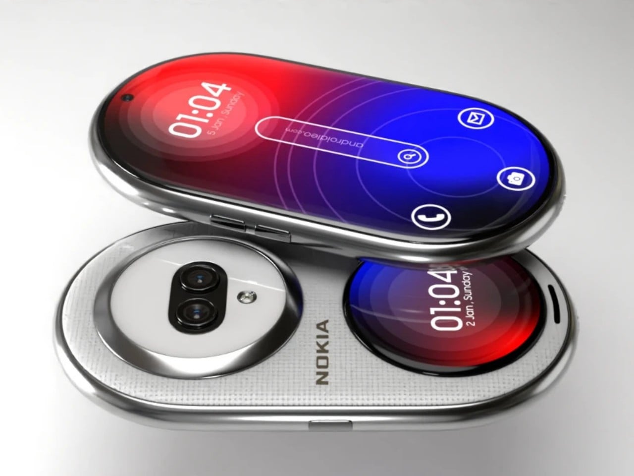
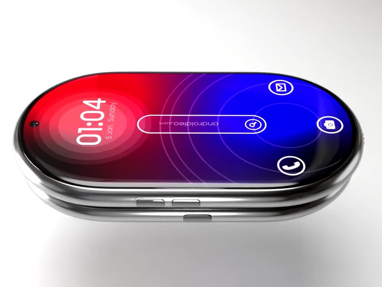
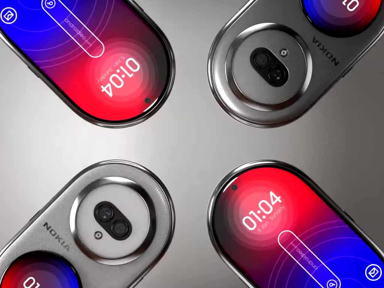
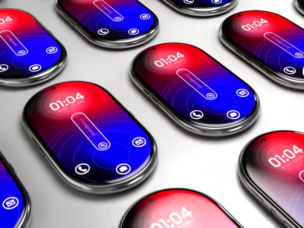
The “candy bar” form factor has emerged as the one true smartphone shape because of its handy and compact design. That doesn’t mean it isn’t the only possible form, though, especially when you consider that the top and bottom of these devices don’t need to be perfectly flat. It’s not like you’ll be standing it up or squeezing it alongside other flat and rectangular objects. This “Nokia Infinity Pro” concept challenges that status quo with a thin pill-shaped design that seems like a cross between a foldable clamshell and a smartwatch all rolled into one.
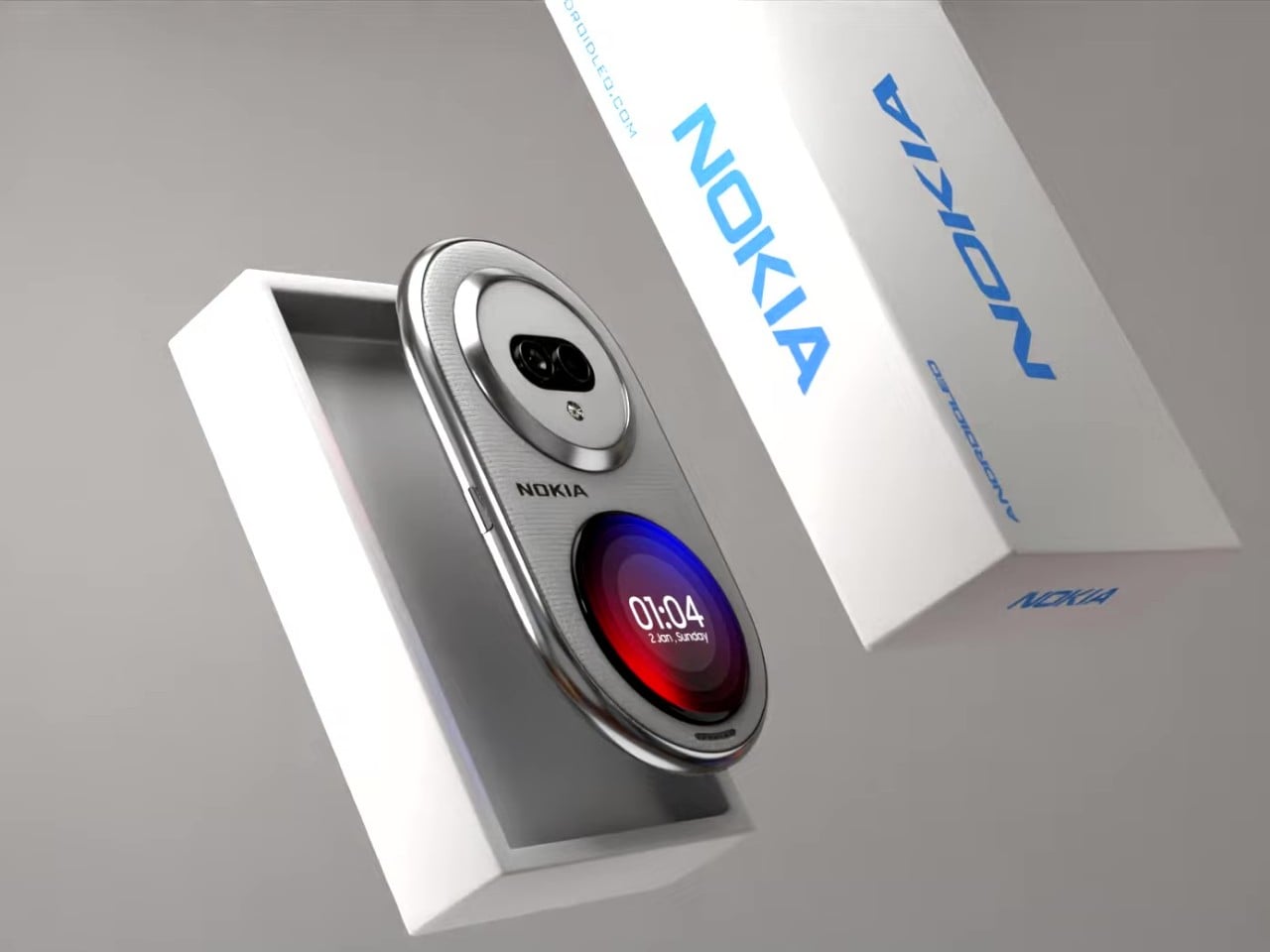
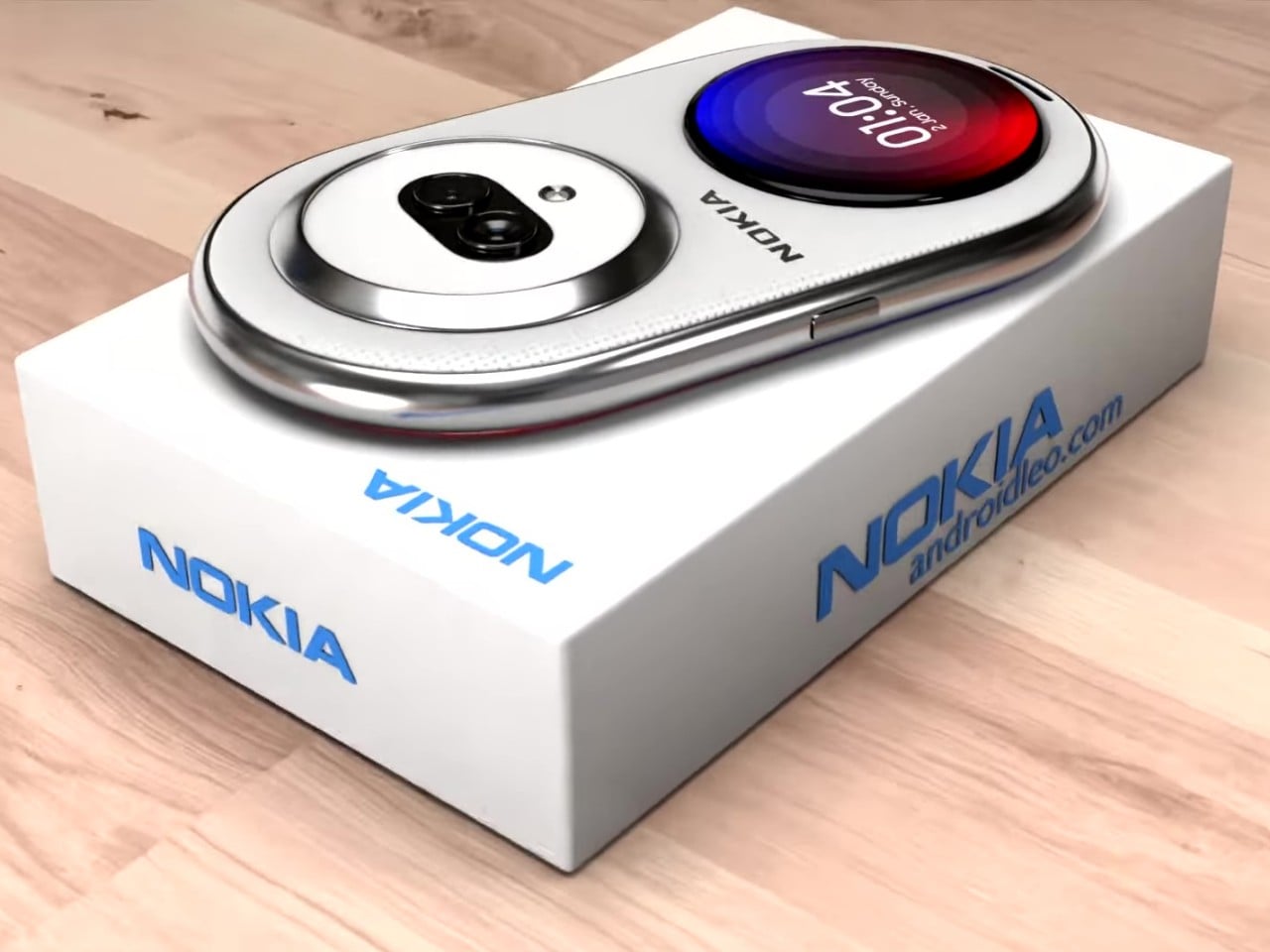
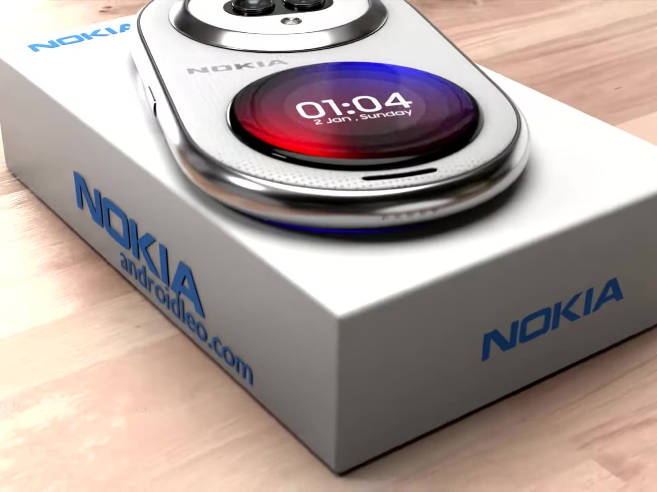
The more curvaceous shape of this concept phone supposedly rests more comfortably in your hand with no corners to cut into your skin. There might be some doubts about whether that would also make it too slippery to hold, but that’s not always a uniform experience. This Nokia Infinity Pro wouldn’t be the first to try out this design either, as the likes of the short-lived “open source” phones like the OpenMoko and Neo Freerunner sported similar shapes.
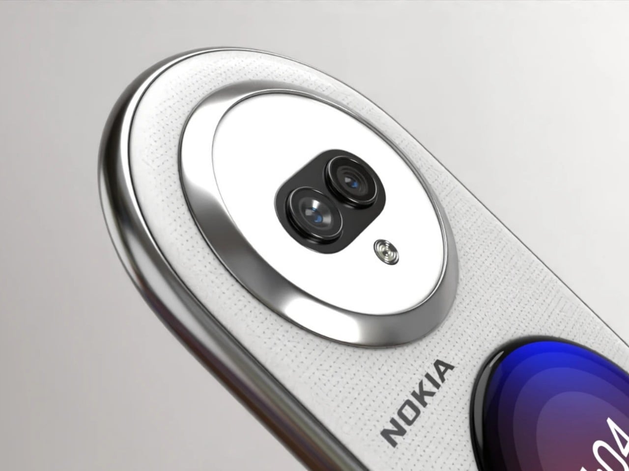
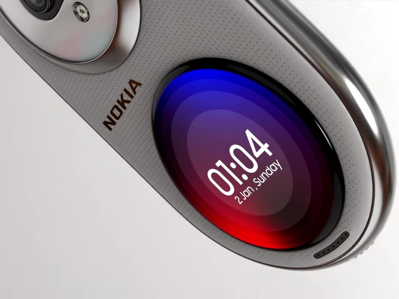
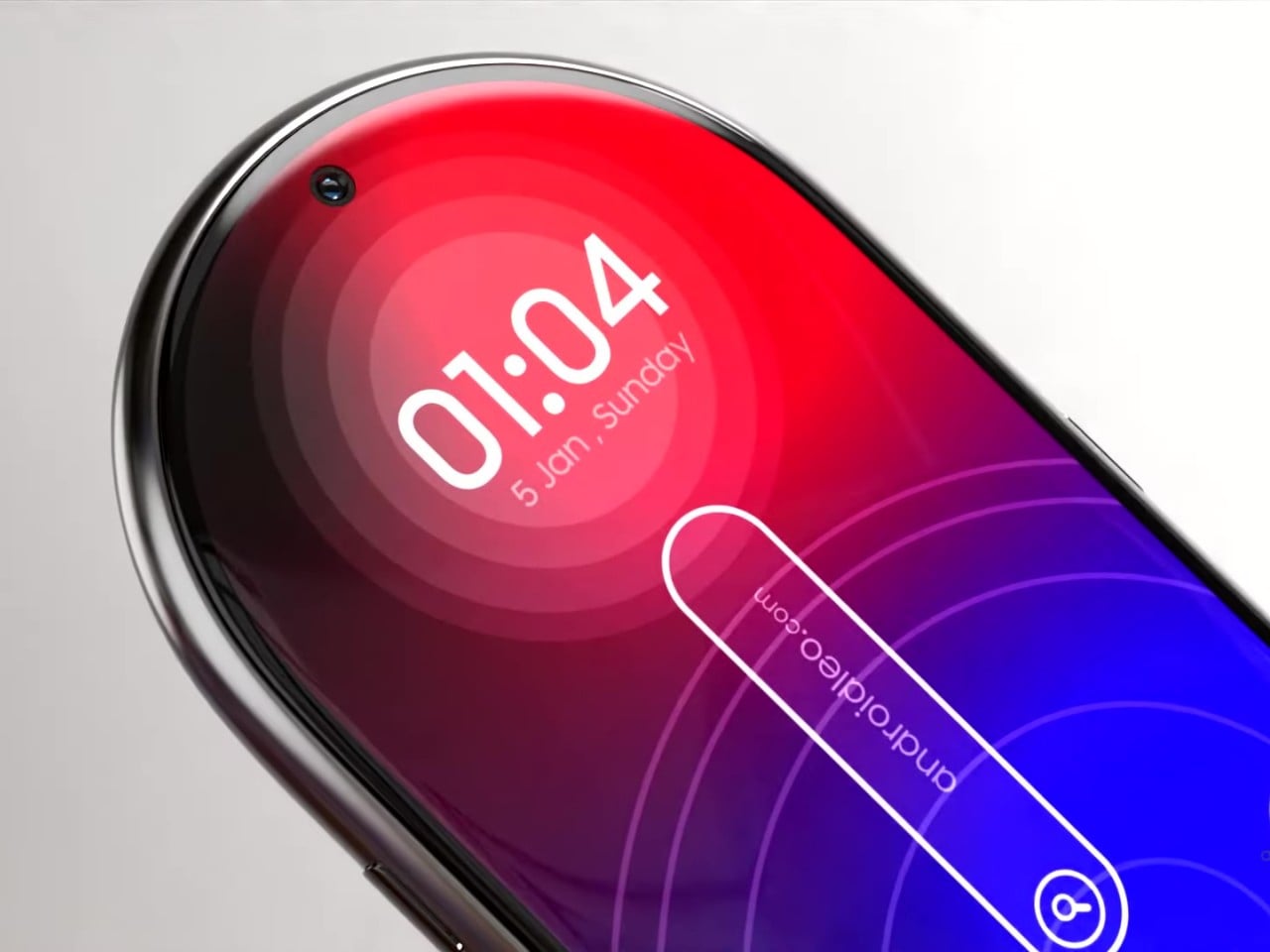
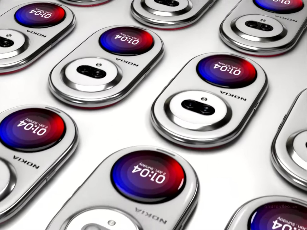
What makes this idea different, however, is that the screen covers the whole surface of the phone’s front, not just a rectangular section. Such a screen is now more possible to pull off, even if it’s still not that easy. The back of the phone also has two circular mounds opposite each other. One is a dual-camera system and another is a circular display not unlike those on smartwatches or some foldable phones’ “cover screen.” The idea is that you can place the phone face down on a table but still have access to important notifications and controls without distractions.
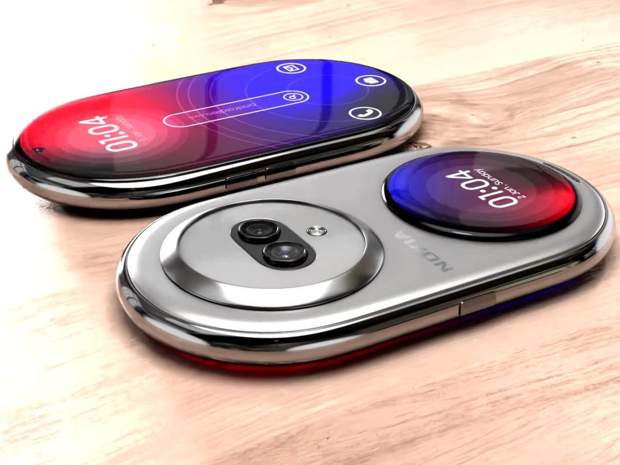
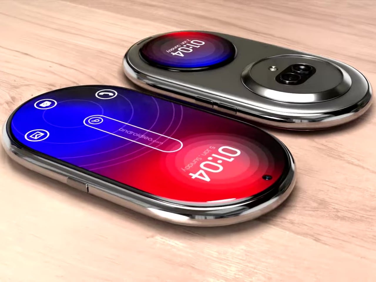
As interesting as it might look, however, there are some practical issues with such a design. For one, putting the phone face down always risks scratching the screen. At the same time, the circular outer screen will be covered by your palm and smudges whenever you have to hold up the phone. And then there’s the matter of what UI elements can be used at the top and bottom of the display since most platforms and content are created for rectangular screens. Maybe someday, we will have more adaptable software, and that will be the time for the Nokia Infinity Pro to truly shine.
The post Nokia Infinity Pro concept phone brings a pill-shaped design and a few questions first appeared on Yanko Design.
0 Commentaires