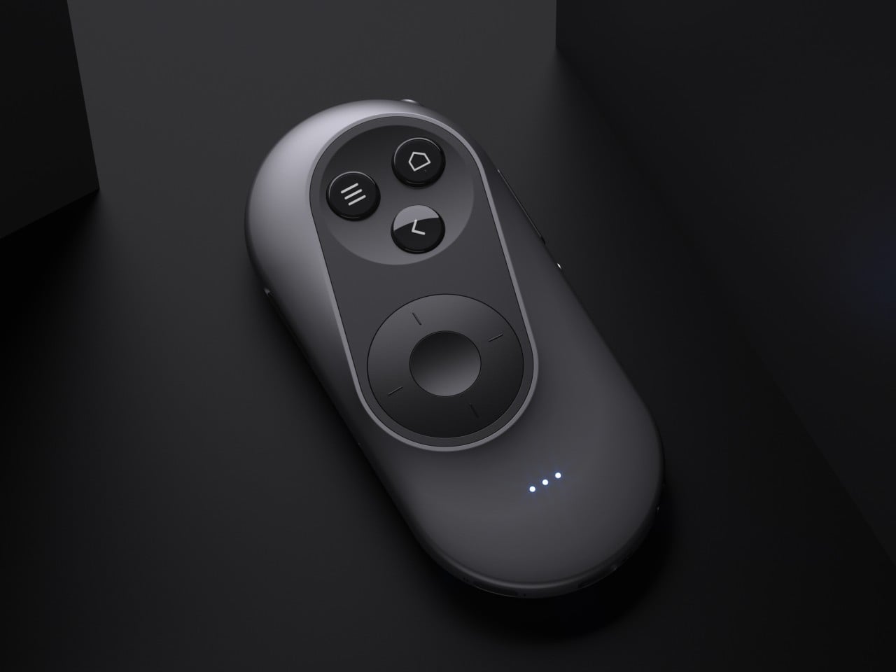
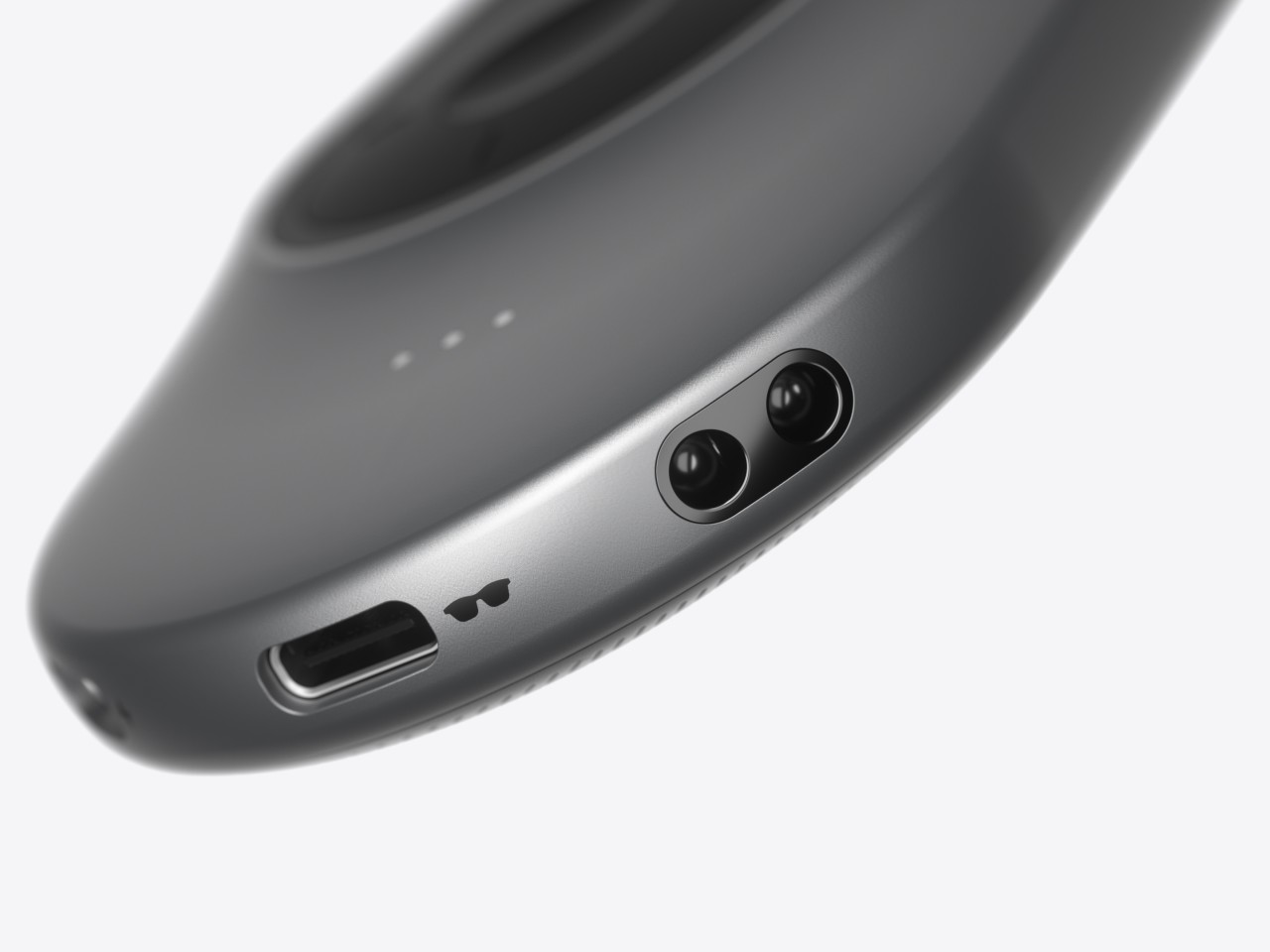
The launch of the Apple Vision Pro sparked renewed interest in extended reality experiences, both those offered by full-blown and heavy headsets as well as those pushed by more straightforward glasses. The latter often rely on your smartphone or a dedicated remote control to navigate through apps projected in front of you, an indirect interaction method made more awkward by the standard design of these devices. Remote controls might be fine for TVs and appliances, but not when you can barely see your own hand. This concept design tries to challenge convention by redesigning the face of a remote, offering a more ergonomic and simpler way to move around mixed reality while wearing those XR glasses.
Designer: Yiqiao Liu
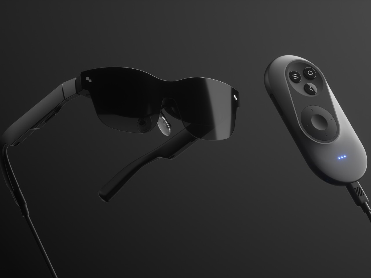
XR or eXtended Reality glasses like the Xreal Air and TCL RayNeo can probably be called the poor man’s Vision Pro. They practically display a virtual monitor in front of you, which may or may not be pinned in an arbitrary location or follow your head around. This allows the glasses to be lighter, cheaper, and less conspicuous, though they do look like overgrown sunglasses. This also makes using the XR platform feel a bit more familiar because they more or less correspond to familiar operating systems like Windows or Android.
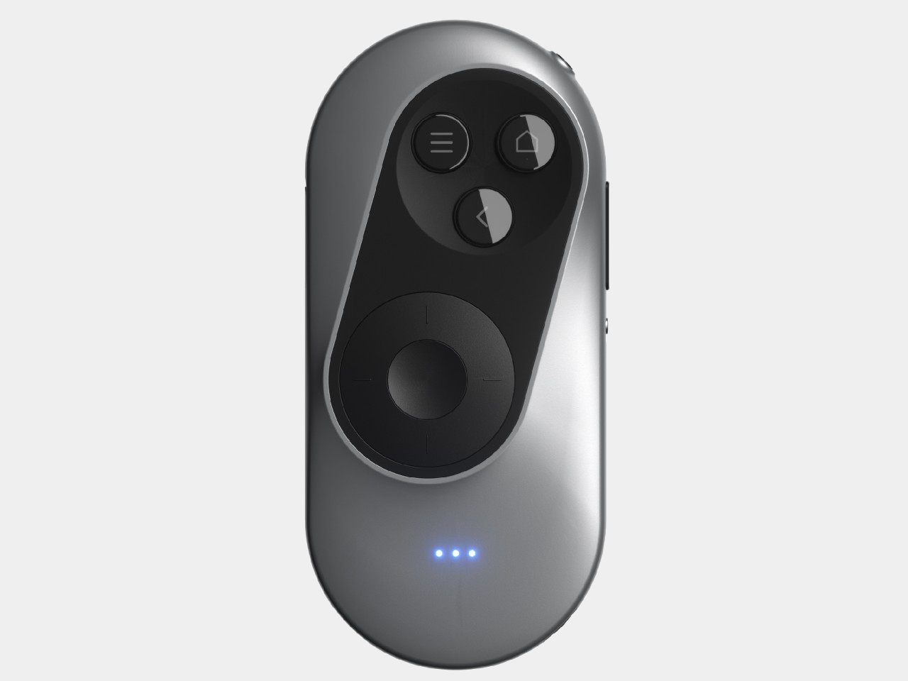
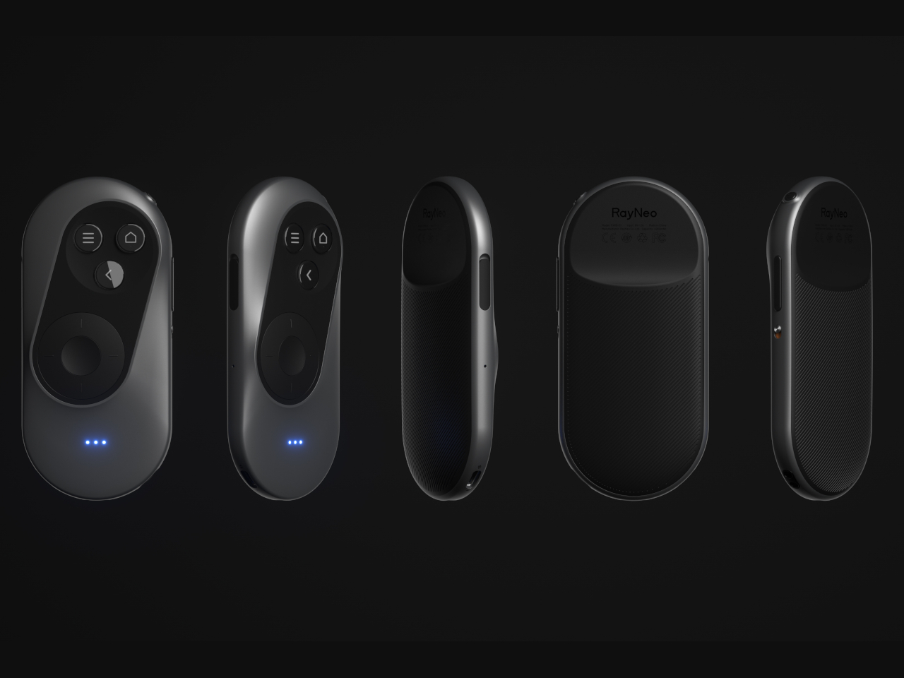
Moving around and interacting with objects in this XR space is then a simpler matter as well, and some even use the phone itself as a pointer and remote control, which is difficult to use when your vision is partially obscured by the glasses and all your fingers can feel is a flat and featureless surface. On the other hand, conventional remotes with their numerous buttons and straightforward layout can also be cumbersome to use as well.
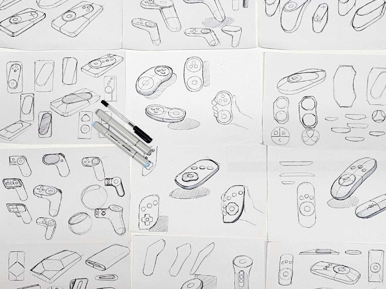
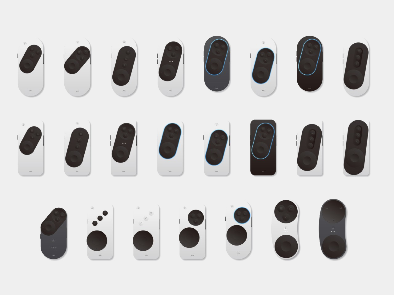
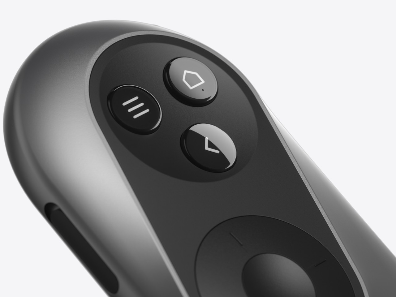
The XR Glasses Controller concept takes the minimalist design of something like an Apple TV remote and tilts it at an angle. Visually, this soap-shaped device looks like an unbalanced remote, with the top buttons leaning to the right and the bottom touch dial sliding to the left. It’s not a design that was made just to look different, though it definitely gives it a distinctive appearance.

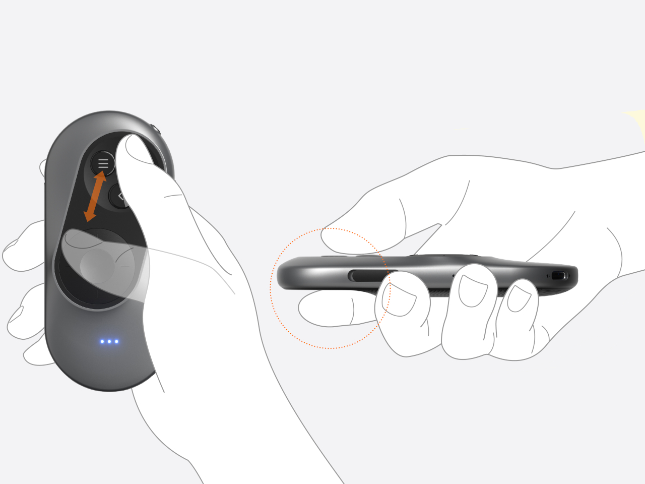
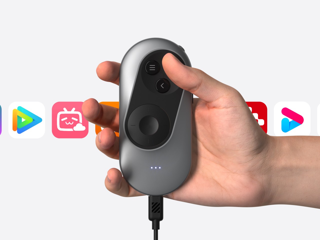
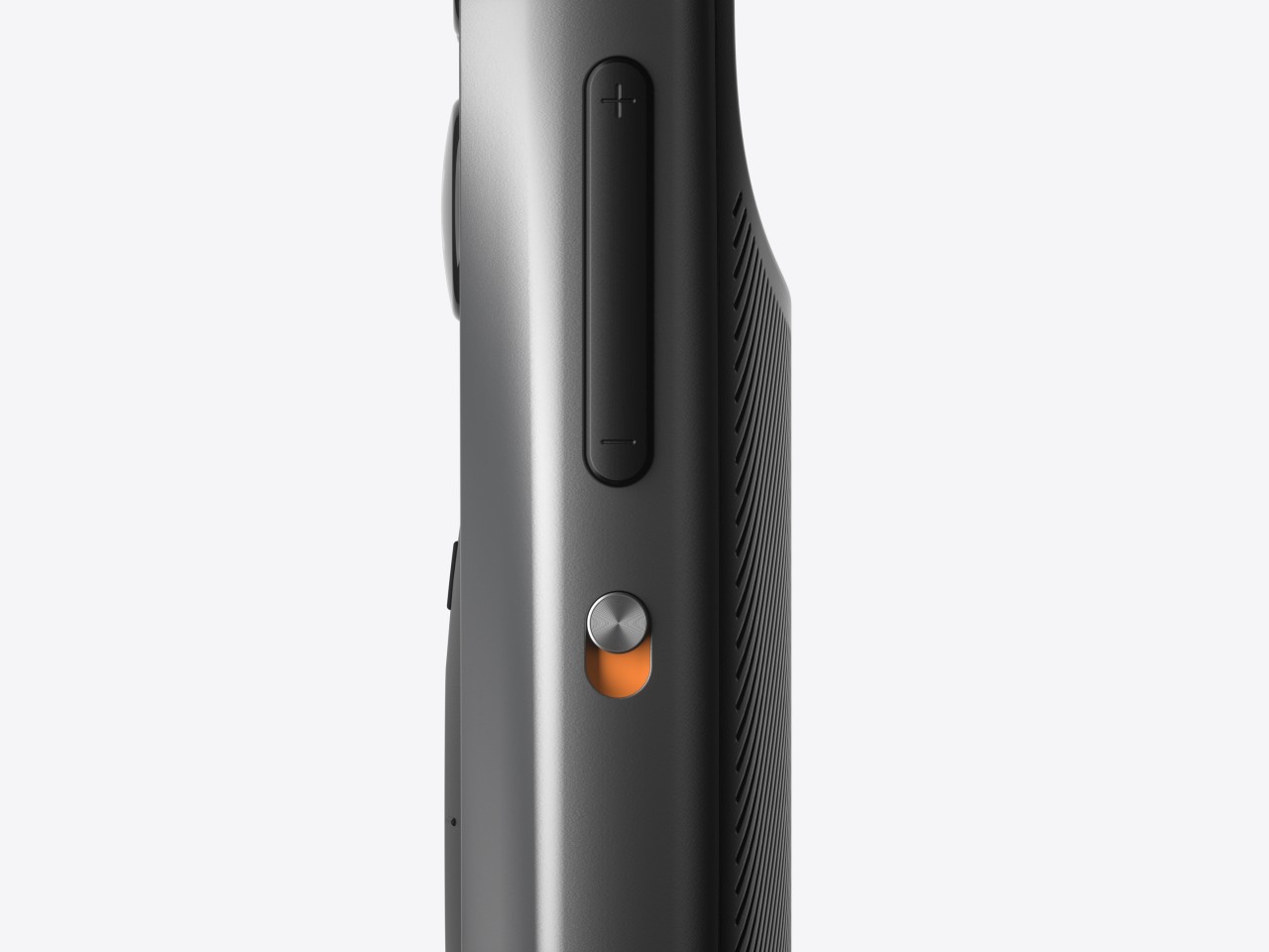
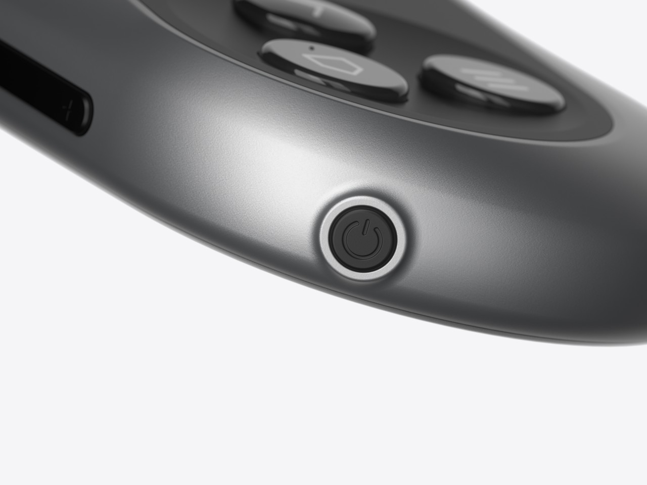
The theory behind this design is the mobility and limited range of our thumbs when holding a remote. As many smartphone designers already know by now, the thumb holding the remote moves naturally in an arc, and that up-and-down movement can cause more strain. The controls are thus aligned with this arc, making it easy for the user to switch between buttons and touchpad without having to overextend or bend their thumb. Along with the significantly reduced number of buttons, the remote is easier to use as well, though it does limit itself to Android-based XR platforms since those buttons perfectly match Android’s navigation scheme.

The post Ergonomic controller suggests a more comfortable way to use XR glasses first appeared on Yanko Design.
0 Commentaires