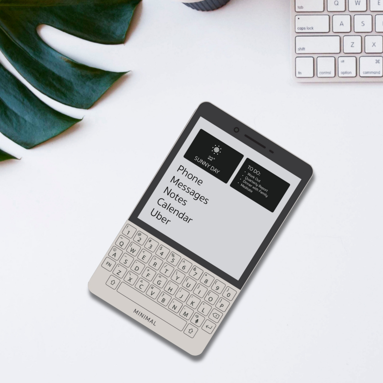
As useful as our powerful smartphones might be, they have also become the bane of modern society. Not only are they the source of most of the distractions that bombard our consciousness day in and day out, they also developed this rather odd scenario of paying more attention to a social circle of virtual strangers than to the people physically present around us. It’s practically too late to go cold turkey and turn our backs on smartphones, regardless of whether we actively use social media or not, which is why there have been attempts to distill the experience down to the essentials, both in software as well as in design. The latest attempt at a minimalist phone, literally called The Minimal Phone, puts a rather interesting twist to that idea by marrying the gentle and almost laid-back nature of an E Ink screen with a QWERTY keyboard that’s long been associated with productivity and busyness.
Designer: Andre Youkhan (The Minimal Company)
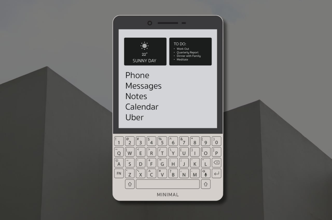
You’d be forgiven if you looked at this design and presumed it was a variant of the BlackBerry Passport or a shrunken-down old Kindle with a Keyboard (yes, those existed at one point in time) because that is exactly how this device would look like to those who have seen enough of tech history to know these devices. It’s a hardware combination that has been done before, albeit now in a smaller and more modern style, but the purpose is completely different. Rather than encouraging the use of the device, the design is, in fact, ironically meant to make you use the phone even less.
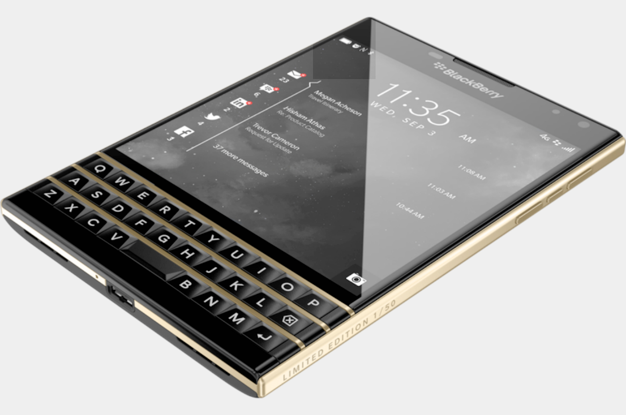
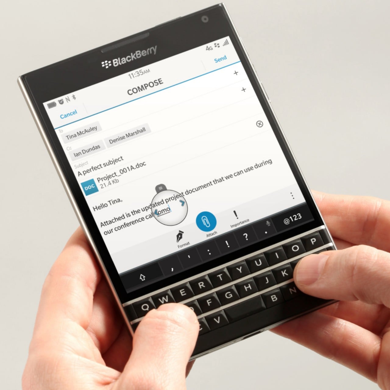
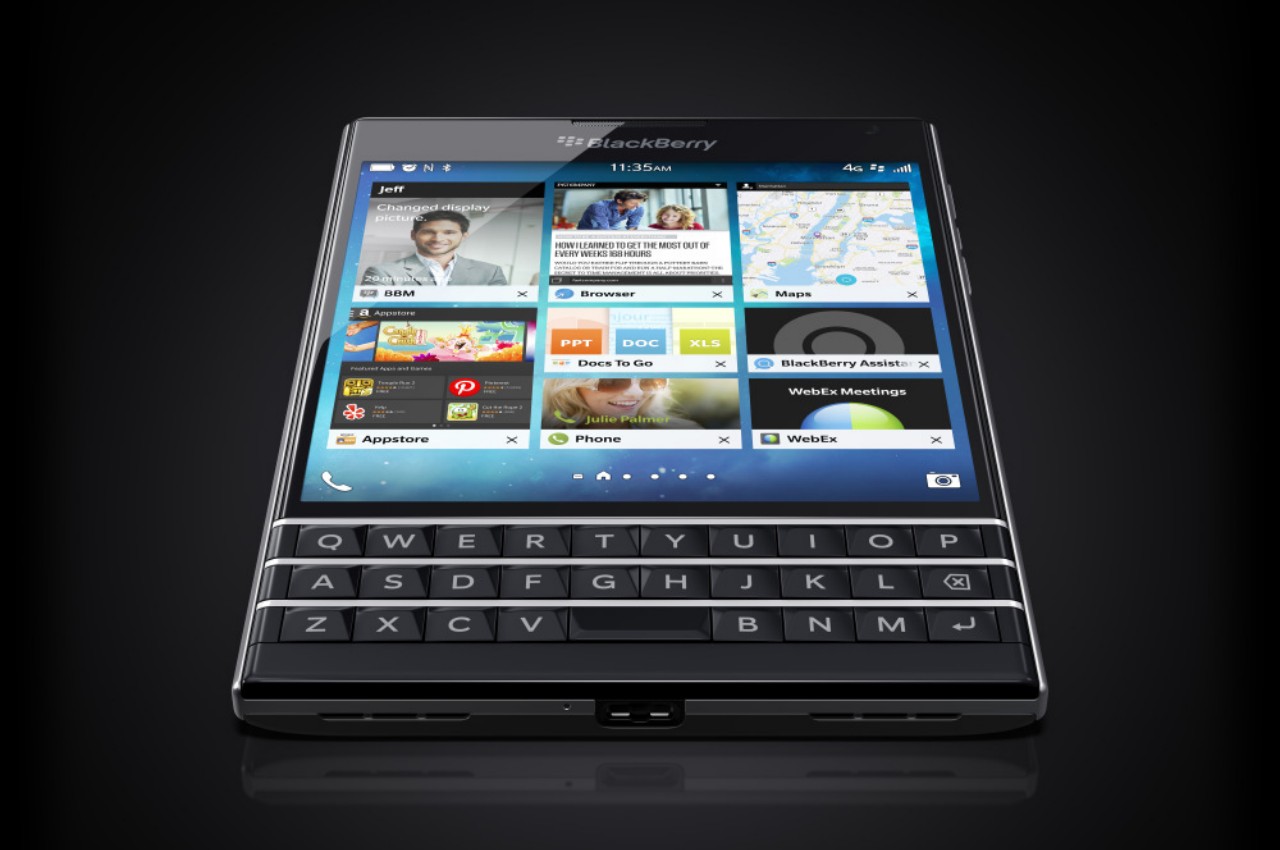
BlackBerry Passport
While E Ink is great for reading text for long periods of time without straining your eyes as much, their low pixel density, low refresh rate, and lack of vibrant colors would make them terrible for the most distracting uses of smartphones, namely social media, videos, and aimless web browsing. The relatively smaller size and square aspect ratio of the display, something familiar to BlackBerry users, is also less conducive to most online content that presumes a tall smartphone screen. The idea behind The Minimal Phone, then, is to still provide the common smartphone experiences but in an environment that would make you want to just get a reply out quickly or search for the correct information and then stop.
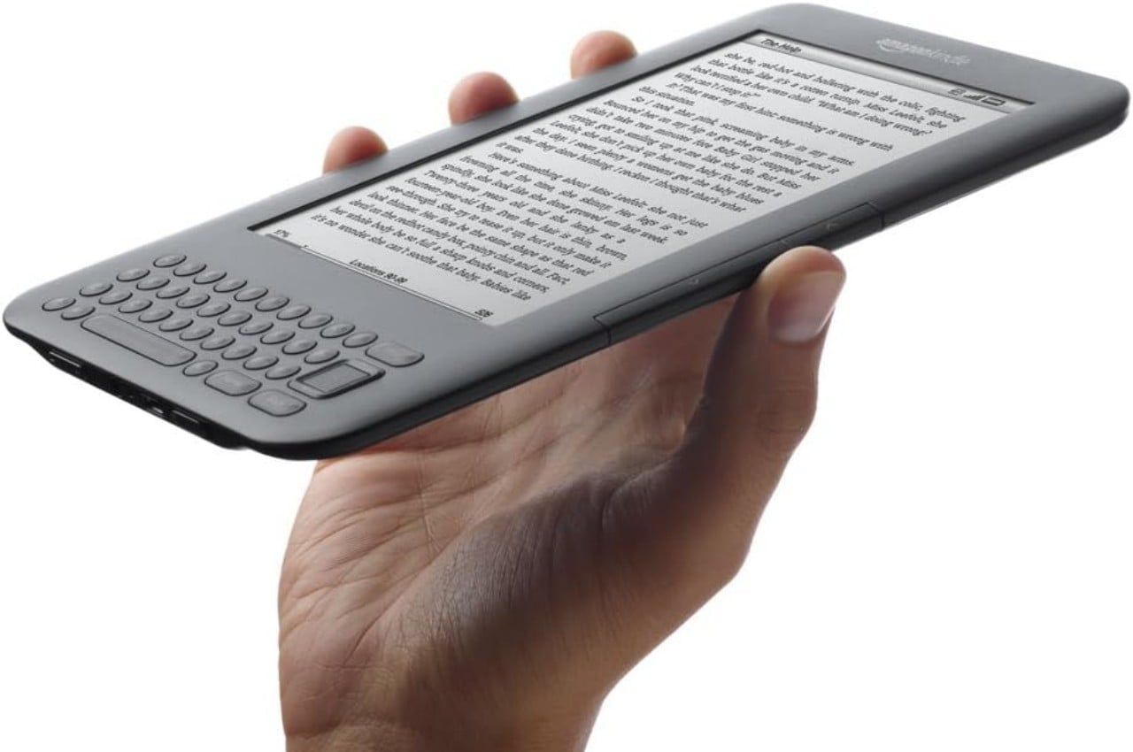
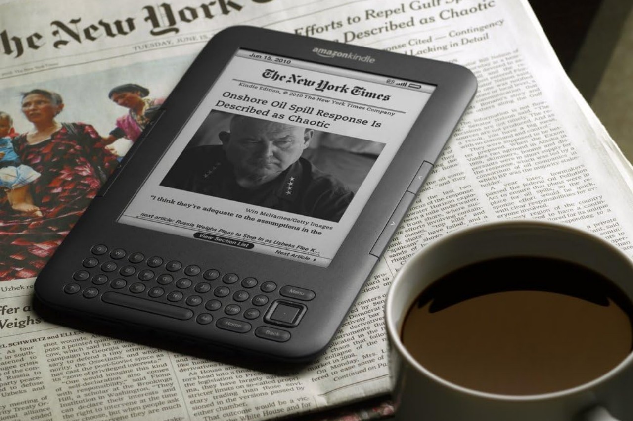
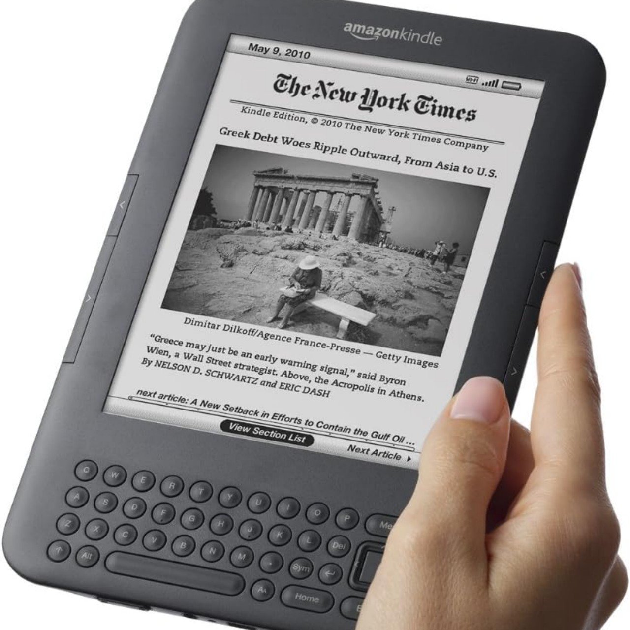
Kindle Keyboard
Strangely enough, The Minimal Phone almost does a U-turn by squeezing a QWERTY keyboard into the design, which would normally make typing and productivity easier. That said, typing on a slow E Ink screen can be an infuriating experience and would be contrary to the mindfulness that the phone wants to cultivate. A QWERTY keyboard offers a faster and more pleasant experience so that users can swiftly peck out a post and then put The Minimal Phone back in their pocket.
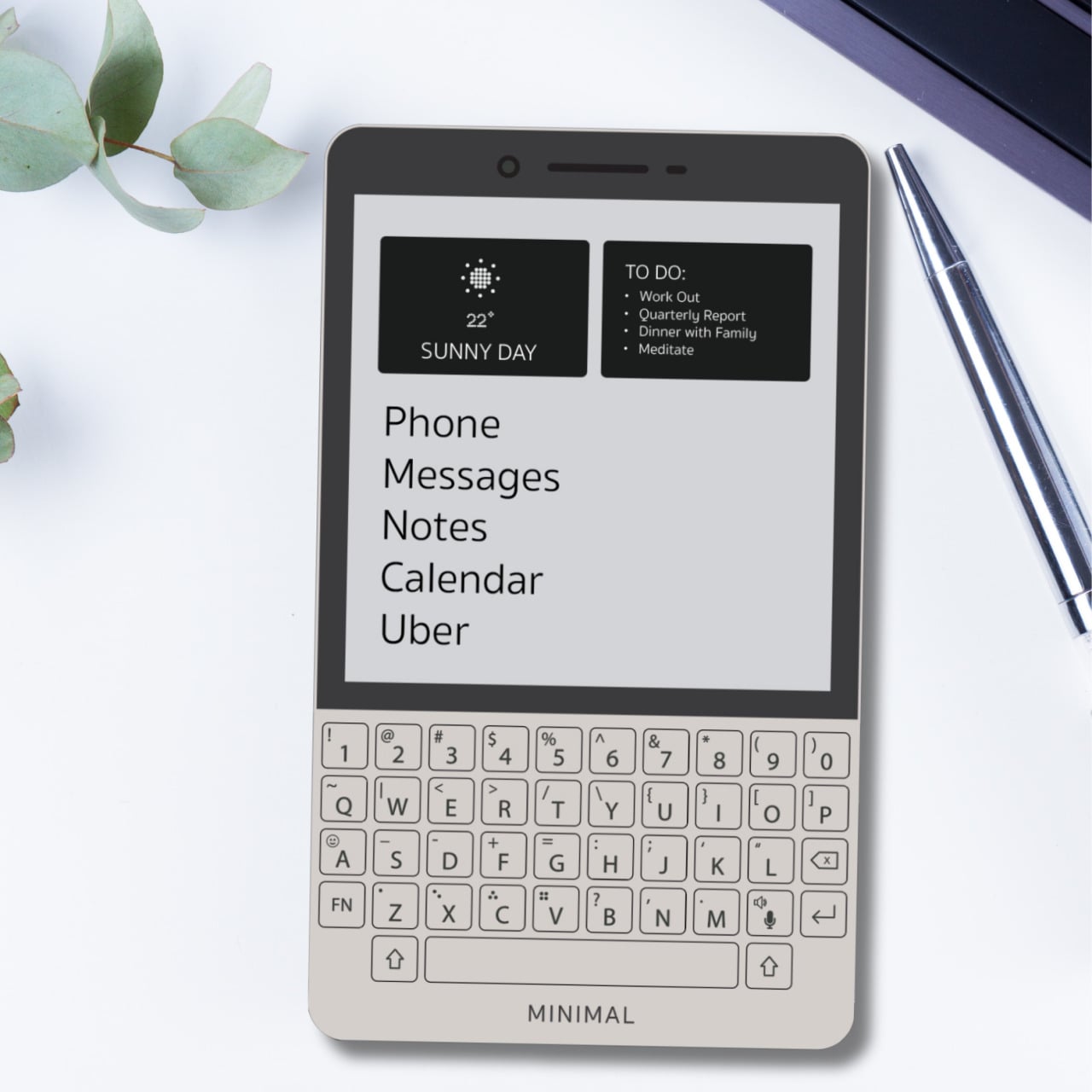
While the theory sounds reasonable, there is still a lot about the implementation that is unknown at this point, other than having a 4,000mAh battery that’s promised to last around 4 days. There will be a custom Android-based OS that will take advantage of the unique form factor and objectives of the design, but there’s no guarantee that Google Play will make its way to the unconventional device. A crowdfunding campaign set to launch next month will judge whether the concept will strike a chord with people tired of noisy smartphones or if it will be just another forgotten attempt at curbing our tendency to be distracted by every ping and buzz.
The post The Minimal Phone mixes BlackBerry and E Ink to minimize your phone use first appeared on Yanko Design.
0 Commentaires