
Samsung has quite a large number of smartphone models in the market, but few have reached notable fame more than the Galaxy Note series. And yes, that includes the one that burst into flames. Although that brand of stylus-bearing smartphones has officially been retired, its spirit lives on in the “Ultra” model of Samsung’s Galaxy S flagship. Call it by any other name, these devices were designed with one unique feature that very few phones have to date: an active stylus for scribbling notes and even making art. That said, there is perhaps some irony that these phones’ screens aren’t designed to take full advantage of that feature, at least in some edge cases, literally. That might finally change with the Galaxy S24 Ultra next year which will be ditching a rather old design convention to hopefully give the S Pen an edge, pun intended.
Designer: Samsung (via David Martin)
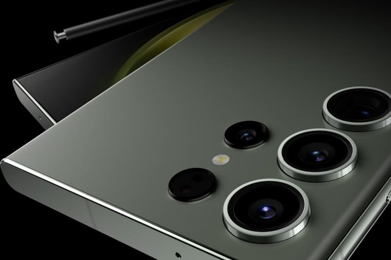
Once upon a time, smartphone screens whose edges curved to the side were regarded as a sign of premium and stylish design. There was indeed a hint of elegance, not to mention manufacturing excellence, at seeing the screen disappear to edges, not unlike an infinity pool. It was also a visual trick to make at least the side bezels disappear, though in reality they’ve just been pushed down nearer to the frame. Today, however, that design seems to be showing its age and the trend is leaning more towards completely flat screens and edges.
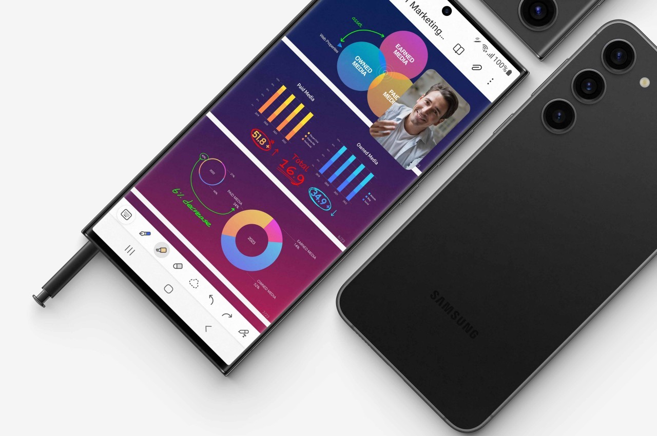
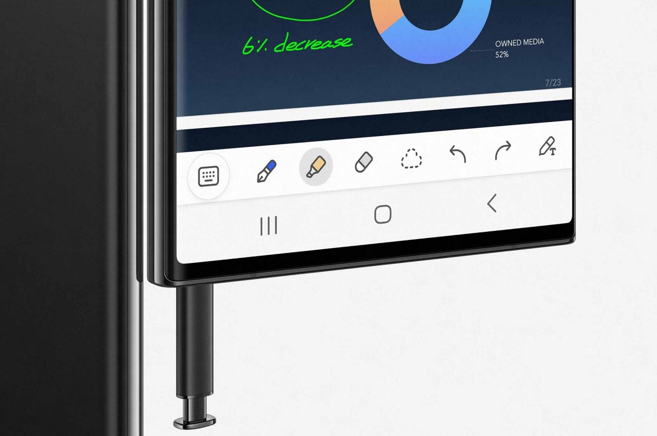
On stylus-enabled smartphones like the Galaxy Note line and the more recent Galaxy S Ultra models, those curved edges are more liabilities than assets. Technically, a part of the screen “falls off” the edges and can’t be reached by the S Pen without sliding off. Depending on the app, that might be precious screen real estate wasted, and there have been awkward moments when the tip just slips off and ruins your momentum.
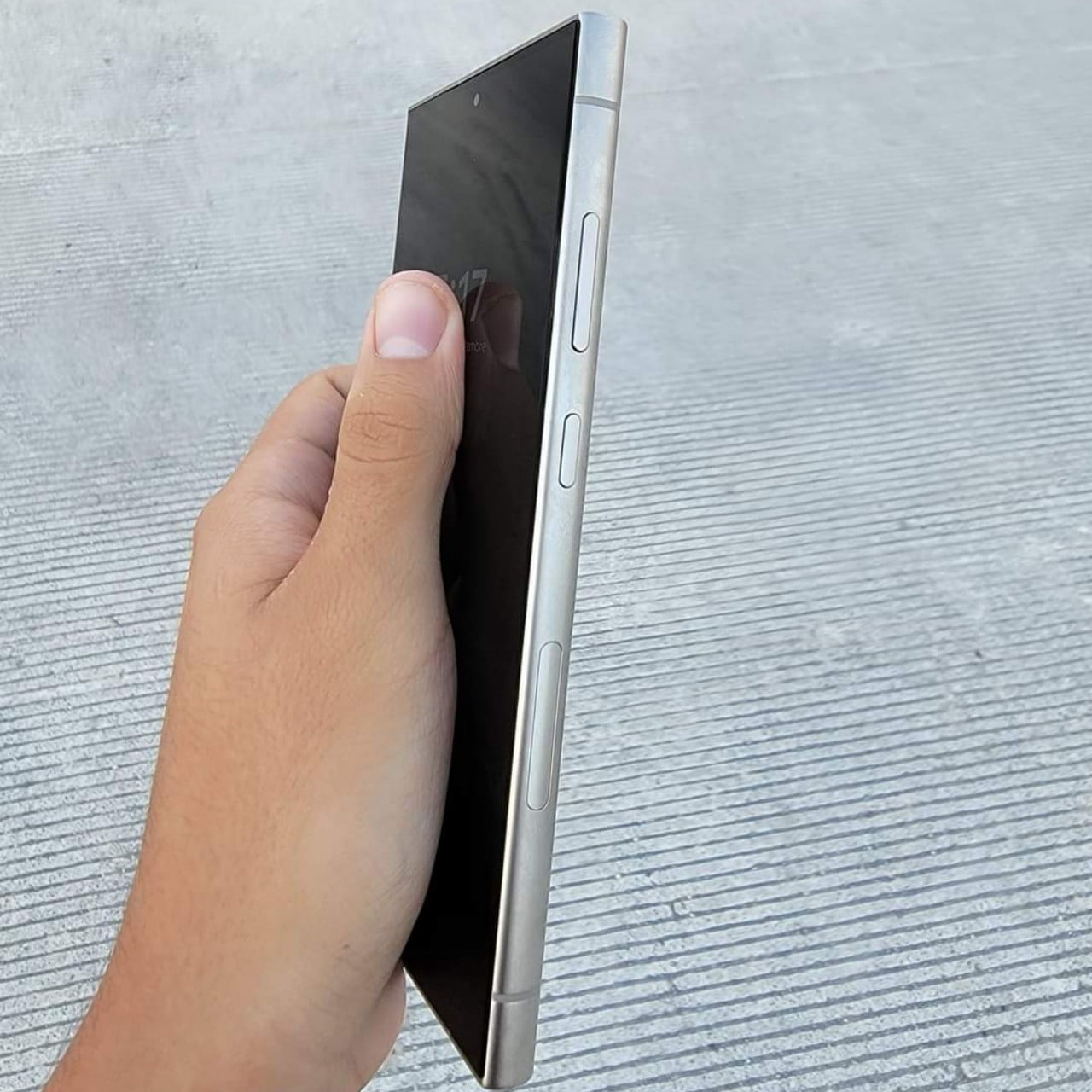
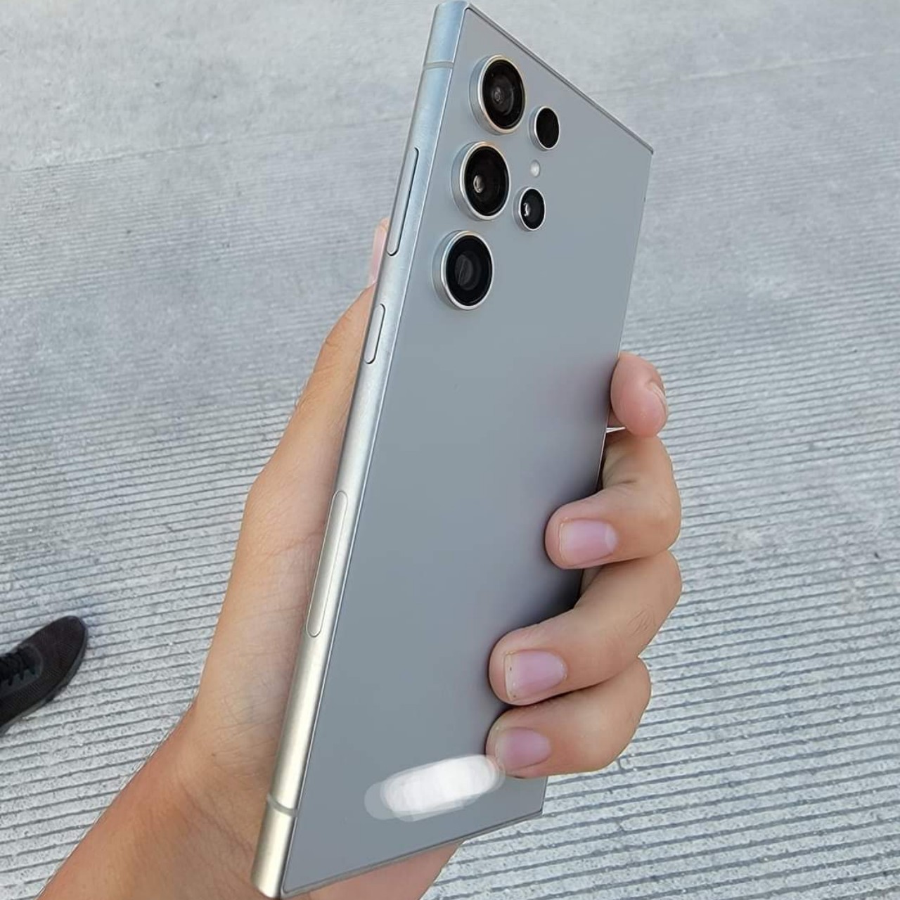
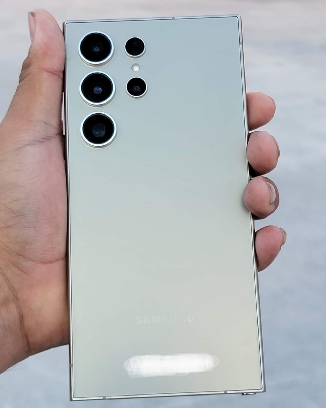
According to recently leaked photos, the Galaxy S24 Ultra next year will finally address one of the pain points of avid S Pen users. The screen seems to be completely flat on all sides this time around, which means that owners will have access to the full width of the screen. This design actually benefits all types of content since there will be no interface elements or images that will look distorted at the edges.
The rest of the phone, however, will retain the design from this year’s Galaxy S23 Ultra, at least based on those same photos. That meant it would still have curved left and right edges, while the top and bottom are completely flat. There’s also no change in the camera design, though the hardware is, of course, expected to see some upgrades. This goes in line with leaks last month that the Galaxy S24 series will take a more iterative approach to its design, largely keeping the same aesthetic while slapping flatter screens on top.
The post Samsung Galaxy S24 Ultra flat screen design will improve the S Pen experience first appeared on Yanko Design.
0 Commentaires