One problem that never seems to leave us, especially if you’re living in a major city – is the lack of space! If you’re an independent millennial who recently moved out of their family home and into their own, then a major issue that you may be dealing with almost every day…is space constraints in your own home. Our modern millennial homes have many virtues, but one thing they lack is space! Space constraint is something most of us end up dealing with every day. Smart storage solutions can be lifesavers in such tricky and compact situations. And to make your lives easier, we’ve curated a whole collection of storage solutions that come in the form of furniture designs that, to be honest, are going to completely organize your home. Not only do these products comfortably store your belongings, but they’re also perfect for displaying those special items that you don’t feel like shutting away in a dusty cabinet. From a Wolf stool concept to shelves that look like abstract art of faces gazing at you – these innovative storage and display solutions are the additions your home needs.
1. Allieva
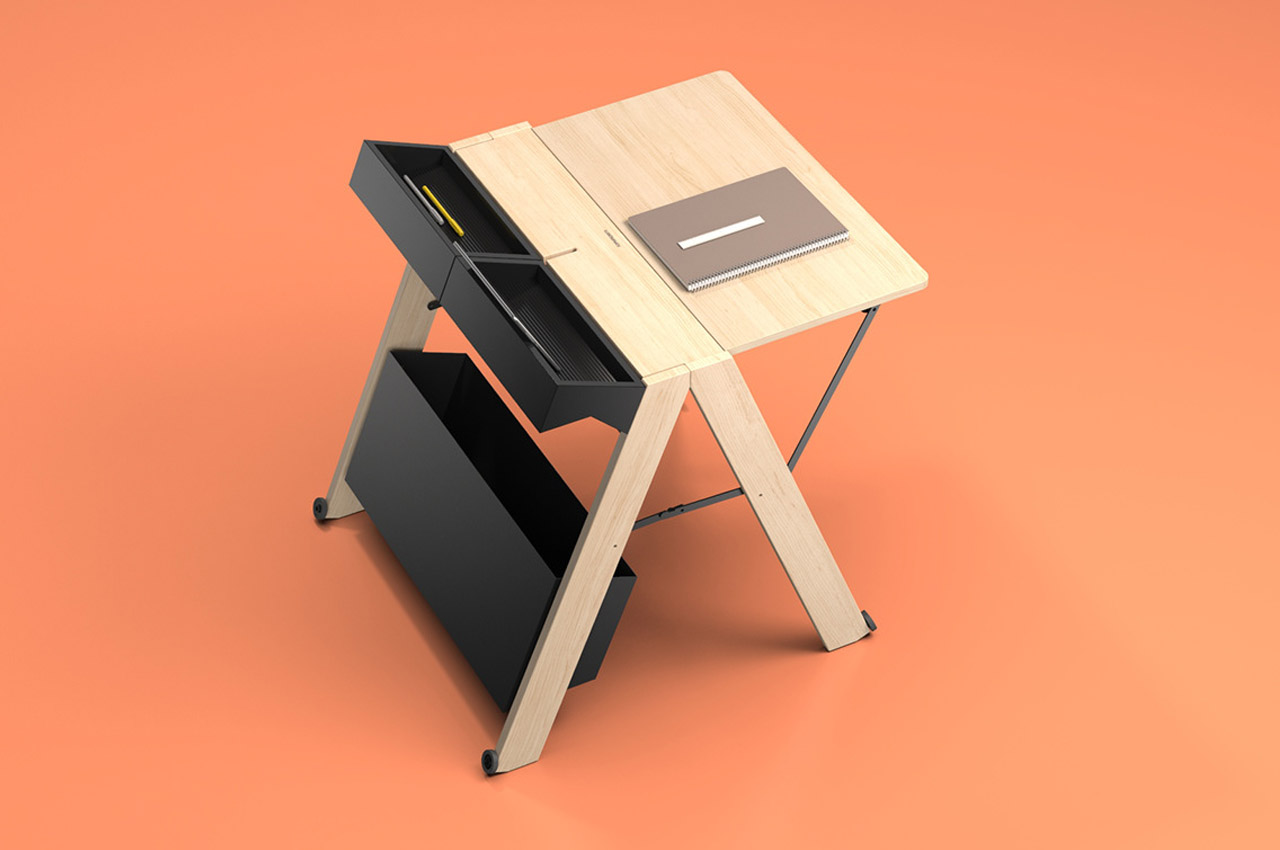
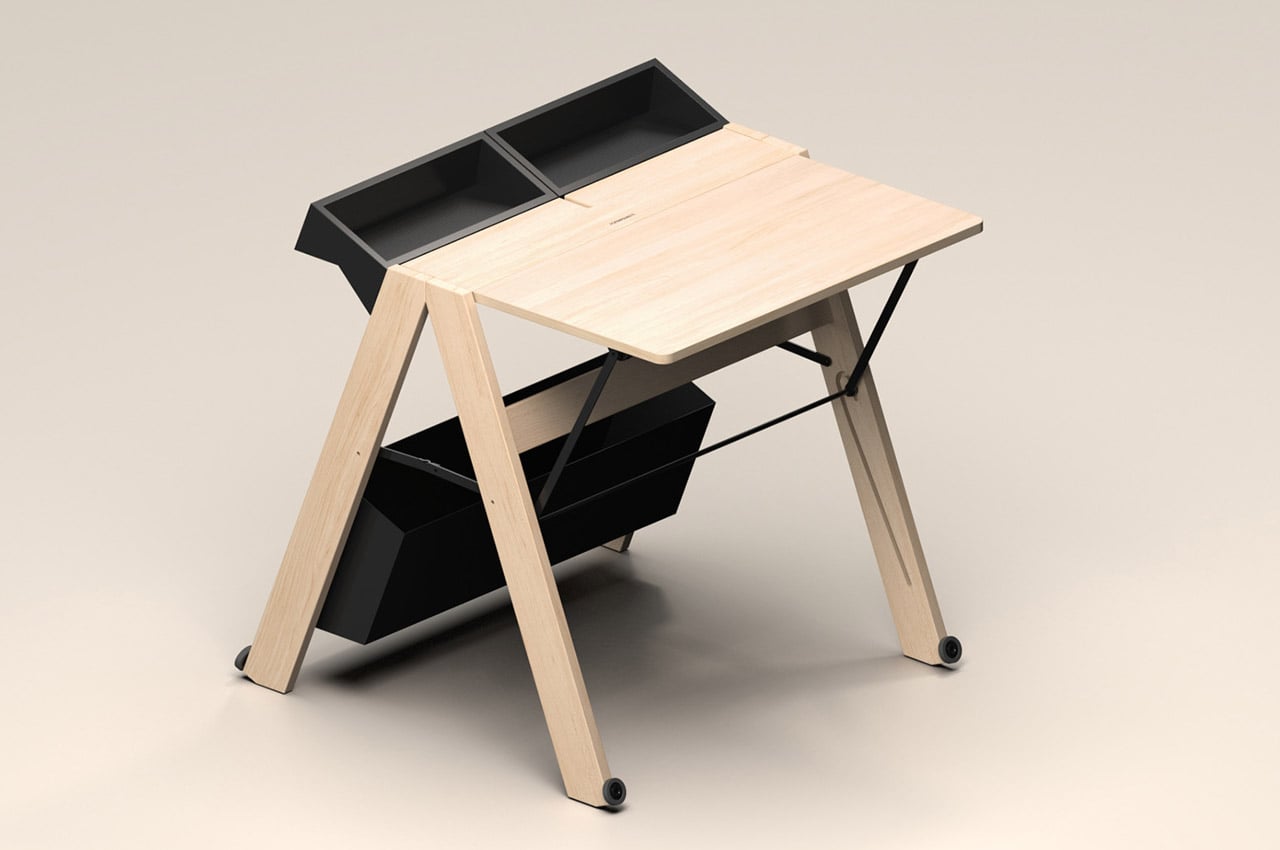
There’s always been a need for compact and functional workstations. But this necessity is further compounded by the growing trend of distance learning and working from home, especially after the pandemic. To address this problem, Whynot Design has introduced a unique and innovative solution called the Allieva. This foldable wooden workstation is designed for Foppapedretti, one of the most well-known Italian brands for baby products and wooden furniture since 1945.
Why is it noteworthy?
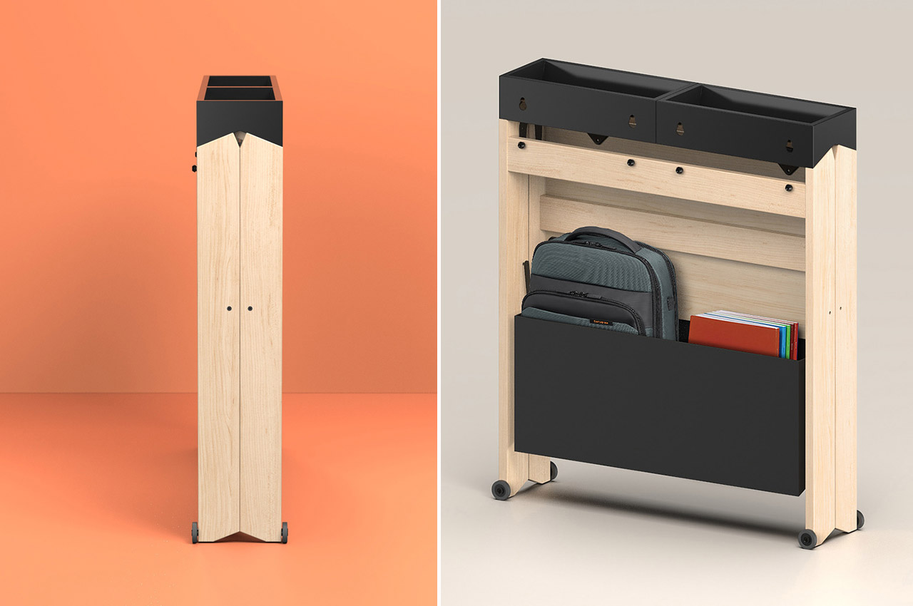
This sleek, foldable work desk is meant to fit any space, making it perfect for tiny houses and dorm rooms. Despite compromising on size, Allieva is aesthetically pleasing. It takes up as little space as possible and measures only 7 inches deep when folded.
What we like
- The workstation can be set up quickly with a simple gesture
- It comes with a large compartment at the base of the table that allows you to keep everything
What we dislike
- The folding and unfolding mechanism could be considered tedious by some
2. The Overlap Table
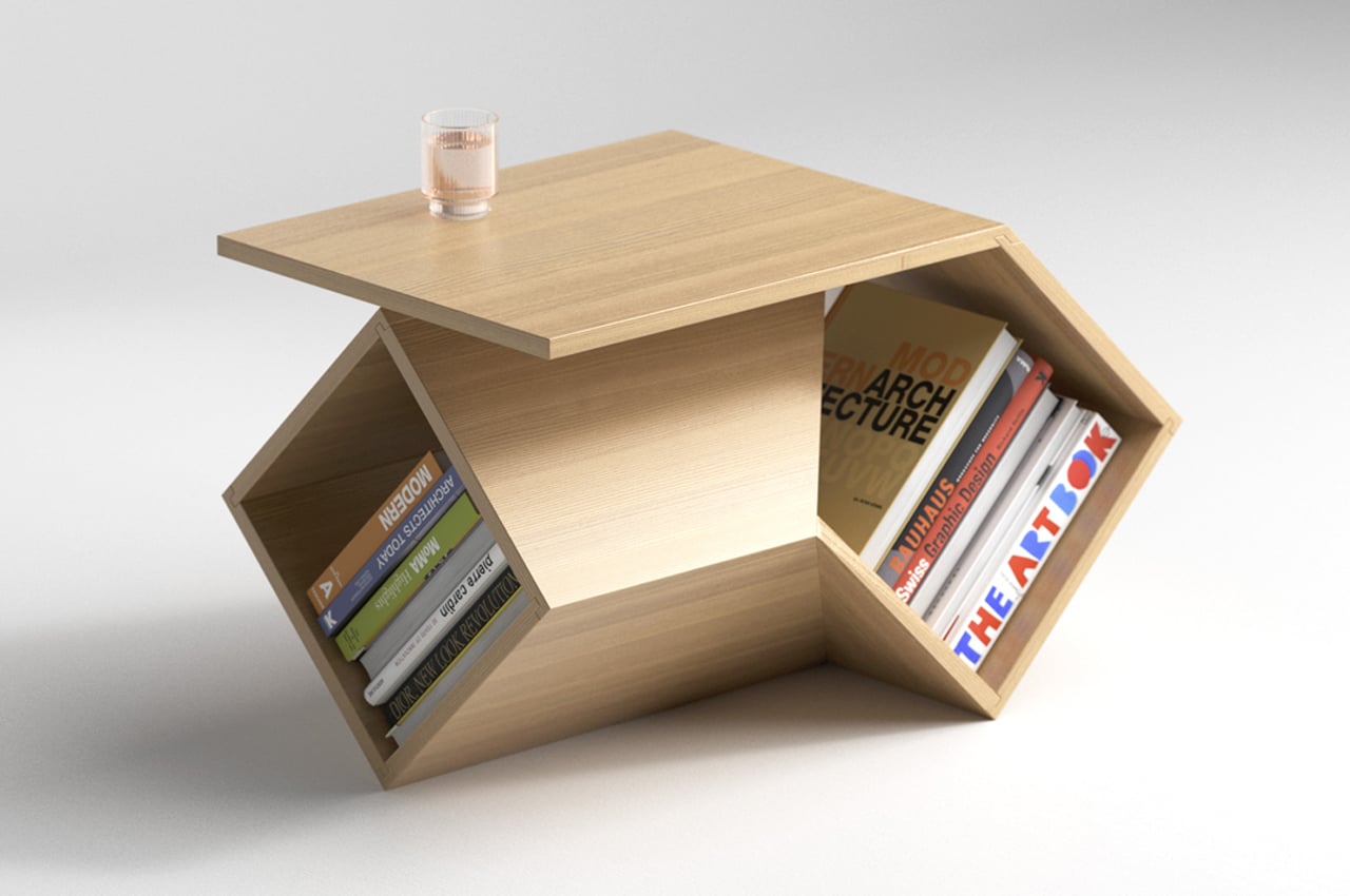

The Overlap table is commanding and functional enough to work as a coffee table, and also compact and cute enough to be used as a side table.
Why is it noteworthy?
Deniz describes the Overlap table as a ‘table-storage design’, which quite simply explains what the piece of furniture is. Overlap basically comprises of two rotated wooden boxes that have been artfully joined and intertwined together to create a sturdy table that can also be used as a storage space.
What we like
- The well-designed table/storage design can be fit into the tiny corners of your home, or placed as a centerpiece in your living room
What we dislike
- It’s a concept!
3. The Monolith
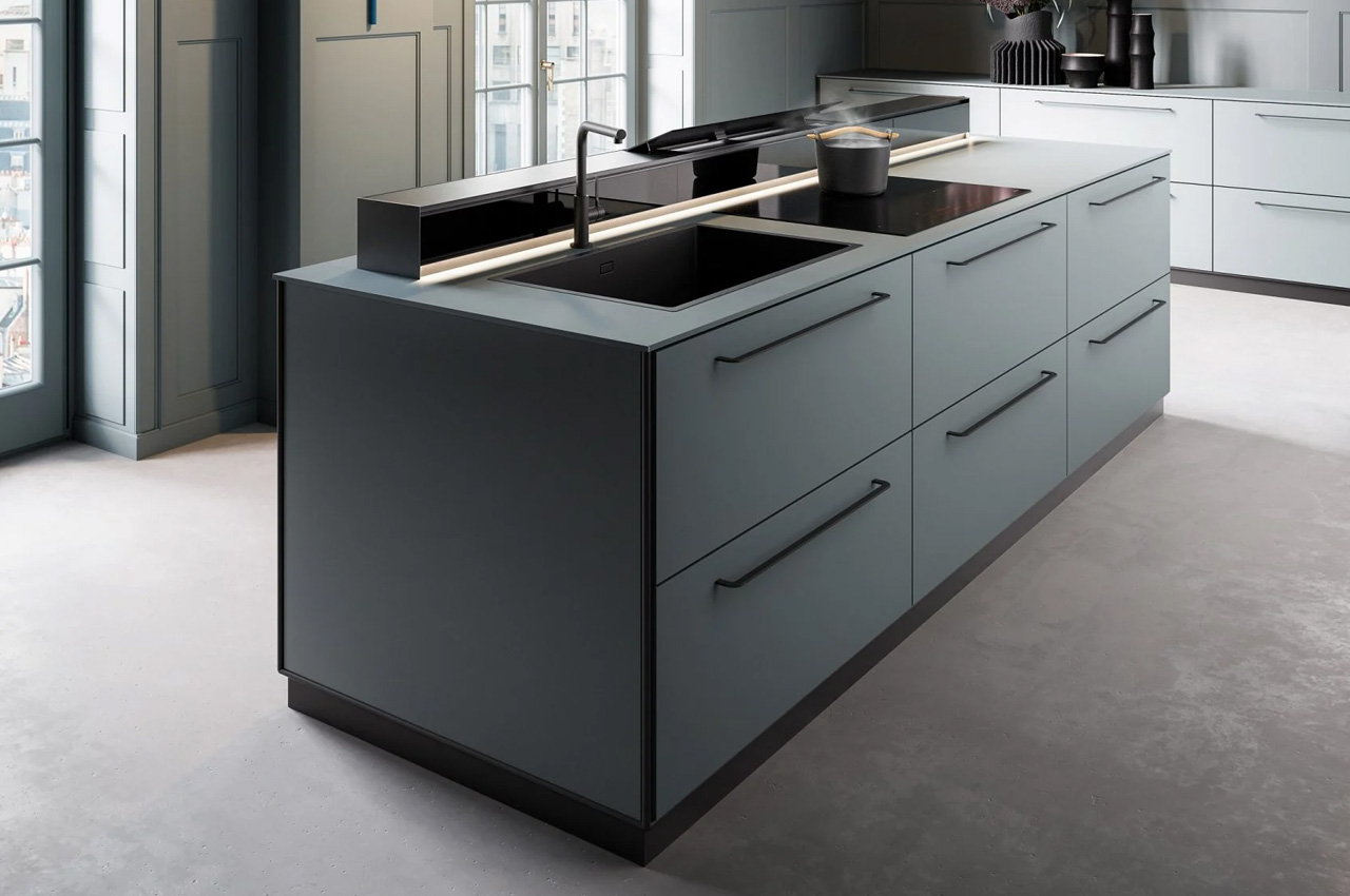
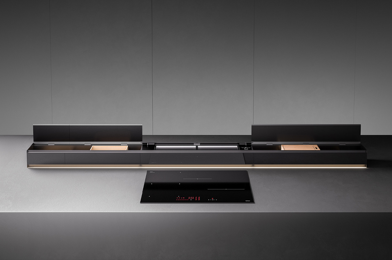
Designed by Italian kitchen brand Falmec and designers Studio Ferriani, the Monolith is an extractor hood that can be integrated into the benchtop and also used as a nifty storage space for utensils.
Why is it noteworthy?
The extractor hood is a part of the Elements Collection and features a 90-centimeter-long suction element. It has also been equipped with differently sized storage units that can be placed and arranged in different custom configurations.
What we like
- Integrates storage units
- Sleek clean aesthetics
What we dislike
- Bulky design
4. The Cobra Table
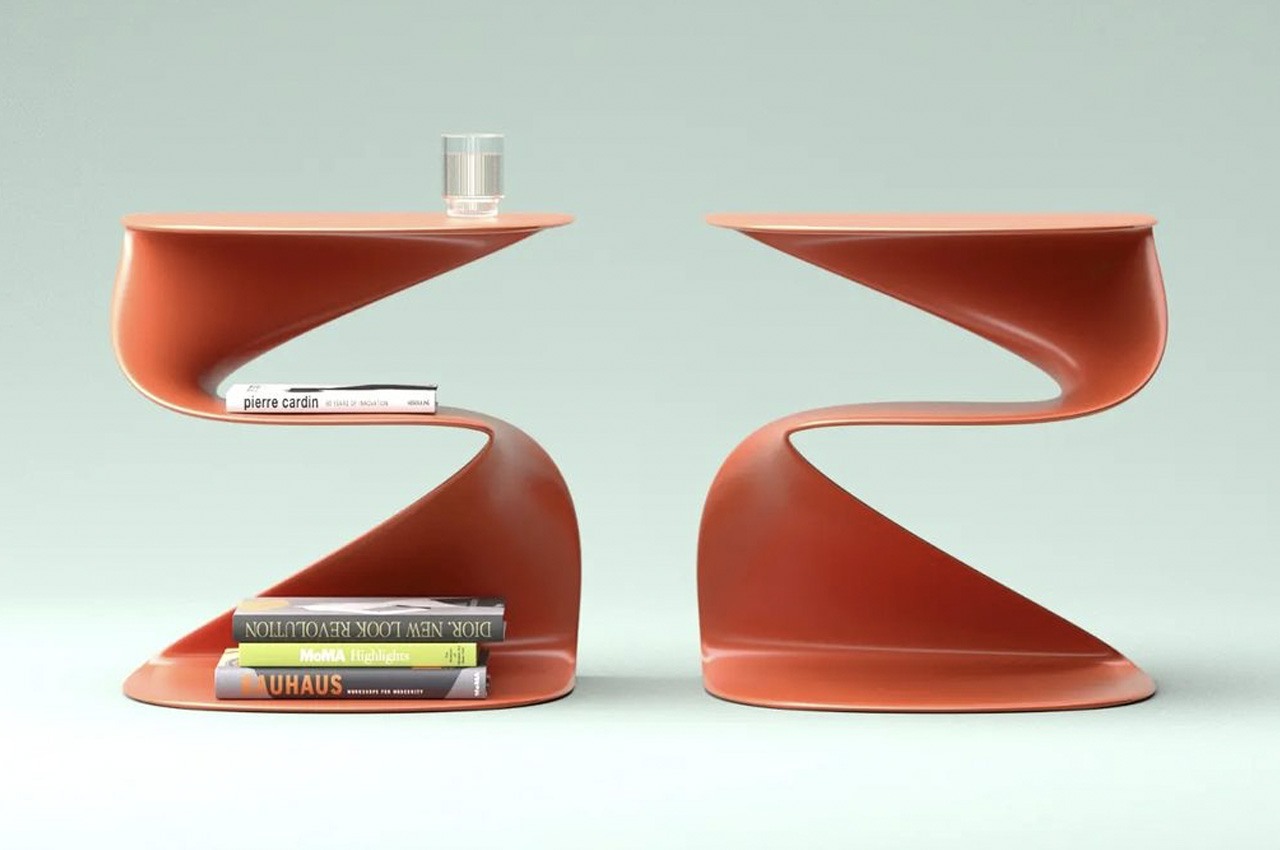
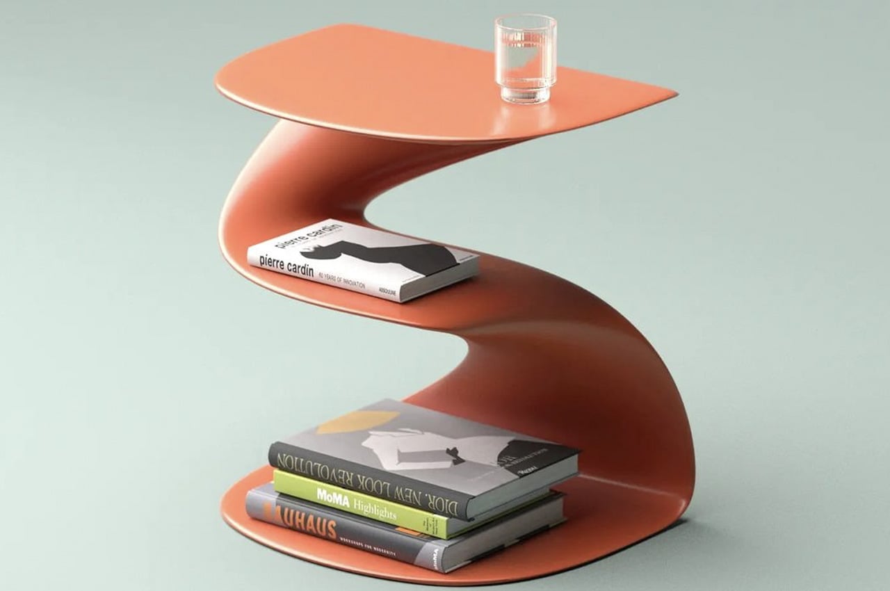
As its name signifies, the inspiration behind the Cobra table was simple – it was a cobra. While designing the Cobra table, Aktay had the intention of creating something that is artistic and sculptural, but also functional.
Why is it noteworthy?
The Cobra table could function as a small center table or a more suitable side table. It doesn’t have much of a footprint, and it has a snake-inspired form that is accentuated by a rather meandering shape.
What we like
- The smartly designed table features three storage levels
What we dislike
- It’s a concept!
5. The Cheft Bookshelf
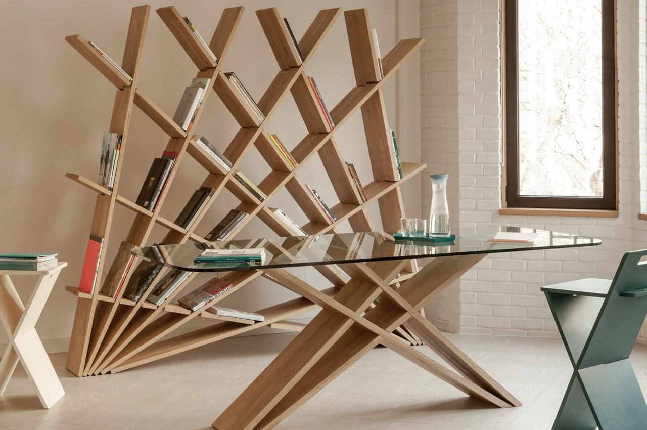
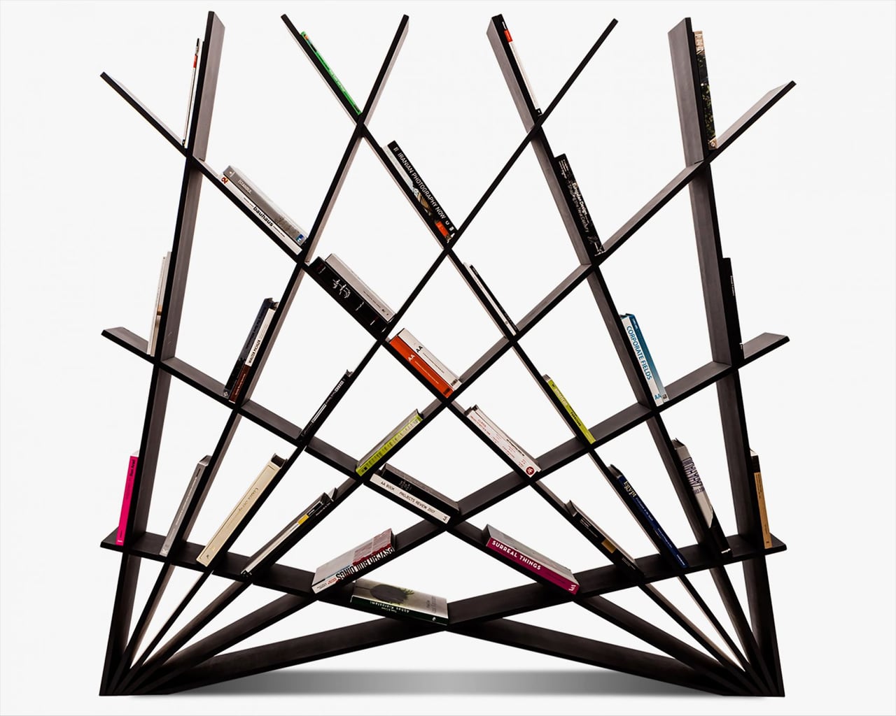
Maryam Pousti is the founder of the design and architecture practice Studio Pousti, and she put together a geometric bookshelf that is crafted from interlocking sheets of wood. The Cheft Bookshelf can be assembled without utilizing nails, screws, or glue.
Why is it noteworthy?
Besides functioning as a practical bookshelf, it can also be used as a room divider, or as a form of shelving for other items in your home. To be precise twelve interlocking sheets of wood were used to build Cheft. The bookshelf is also accompanied by a table and bar stool which all together form the Cheft furniture collection.
What we like
- All three furniture pieces are inspired by the geometrical patterns of traditional Persian architecture
- The bookshelf’s warm wooden aesthetics allow it to merge with the interiors of any modern contemporary home harmoniously
What we dislike
- Extremely space-consuming design, not suited for smaller homes
6. Magnetic Key Holder
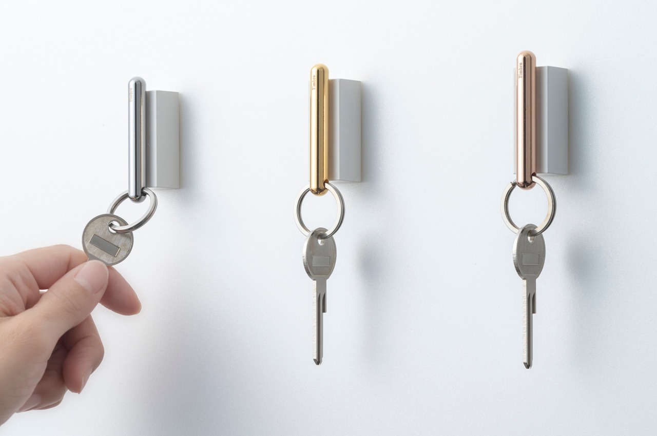
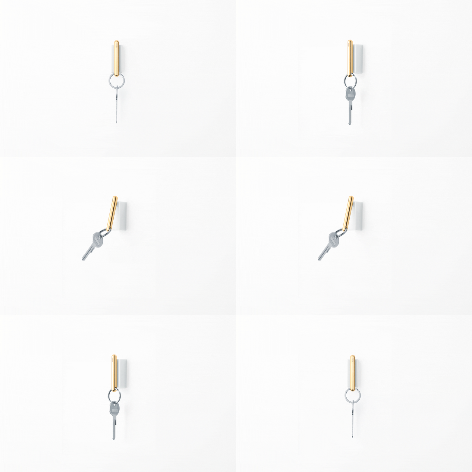
Developing a habit requires associating something good with an action, like a reward of sorts. It doesn’t need to be something material or financial, of course, as anything pleasant will do the job. The Marubo key holder does exactly that by giving your ears a brisk yet satisfying experience whenever you return it to its proper home.
Why is it noteworthy?
The secret to this simple positive feedback is the simplicity of the key holder itself. Made from iron with a chrome finish, the key holder finds the perfect partner in an ABS resin base that holds a strong neodymium magnet that will keep your keys from falling off.
What we like
- Elegant appearance and minimal form
What we dislike
7. The ZooZoo Collection
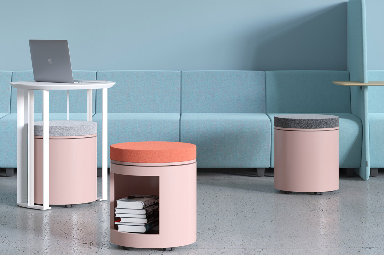
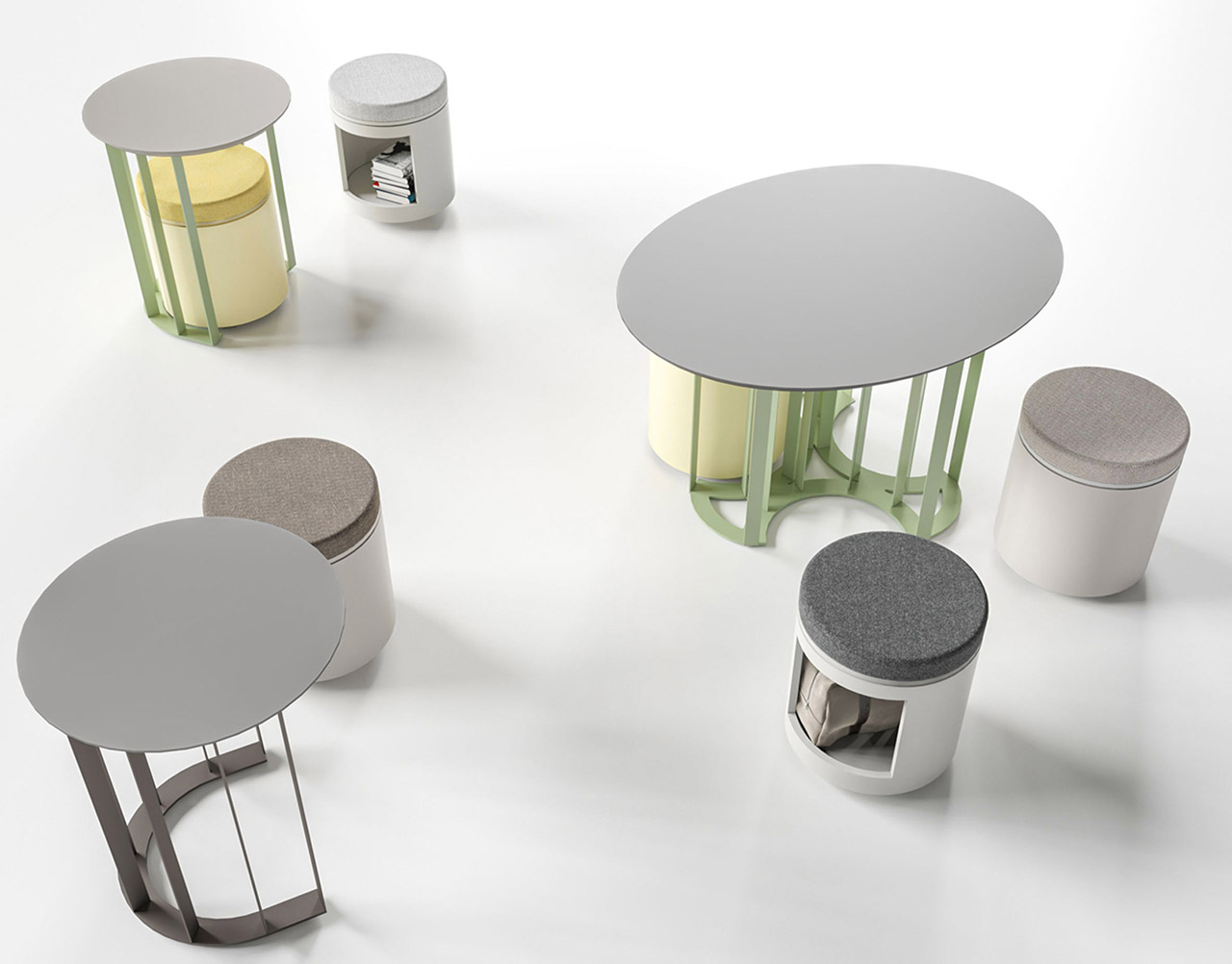
Adding an element of warmth will surely help employees to ease into their new work routine, after spending more than a year working from home. And a great collection of furniture could really help with that – such as the ZooZoo collection by Narbutas.
Why is it noteworthy?
Designed by Annie Lee for the workplace furniture brand Narbutas, the ZooZoo collection includes an intriguingly high coffee table and a complementing pouf. The sleek coffee table is 27.2 inches tall and features a metal base, as well as a smooth top. The coffee table is available in two sizes, and the metal base can be customized to the color of your choice. The collection also includes a series of matching poufs available in a variety of colors and textiles. The poufs are accompanied by cushioned seats.
What we like
- The entire collection is available in a single color or a two-toned option, hence allowing it to suit diverse interior spaces
- The poufs can be neatly stowed under the coffee tables, and also boast handy storage nooks to hold books, folders, and other miscellaneous items
What we dislike
- Not ergonomic for working long hours
8. The Altura
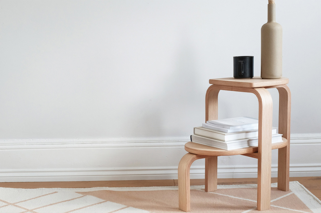
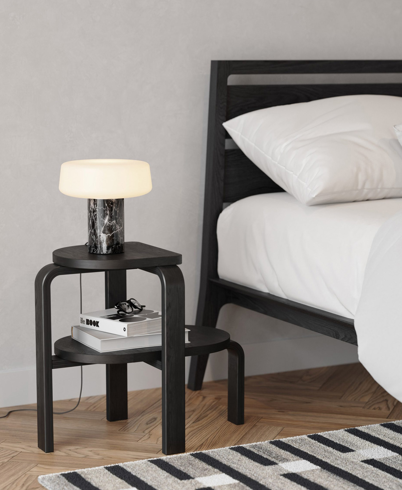
Patricia Perez designed the Altura, a minimal and sturdy step stool, for Case Furniture. An interesting fact about the stool is that it doubles as up as a side table and a plant stand.
Why is it noteworthy?
Described as a “sleek yet sturdy design”, the stool has been equipped with two stepped tiers that serve extremely handy in holding and storing all kinds of items – from lamps, and books, to an entire person!
What we like
- It enables users to reach those high-up places in their homes that they usually aren’t able to reach
- Altura’s minimal and neutral aesthetics make it a great addition to any modern living space
What we dislike
- There are similar designs on the market, but nothing to really help it stand apart
9. Spectator
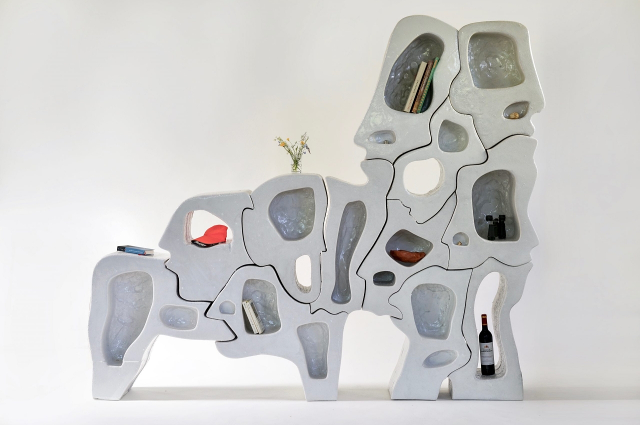
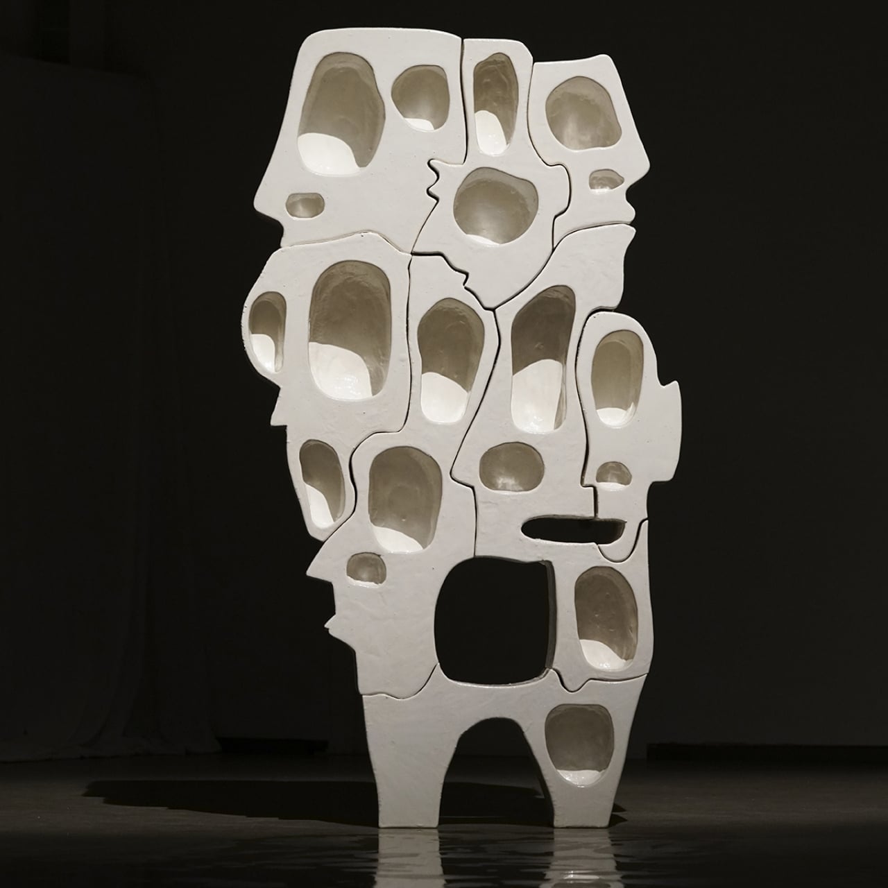
Named ‘Spectator’, this intriguing bookshelf definitely looks as if it’s staring right back at you! It seems to be made of interlocking jigsaw puzzle pieces, and each piece looks like a distorted human face!
Why is it noteworthy?
The Spectator Series of shelves is as much a psychological art piece as it is a piece of furniture. In its small way, it demonstrates the wonder of our brains that try to fill in the gaps to complete forms and ideas, like how it is able to see faces in shapes that are so far removed from human heads. With so many faces hiding in plain sight, the roles of observer and observed are also reversed, at least in our mind’s eye again.
What we like
- The shelf adheres to minimalist design principles despite the odd shapes of its pieces
What we dislike
- Not everybody would like the aesthetics of this piece
10. Wolf
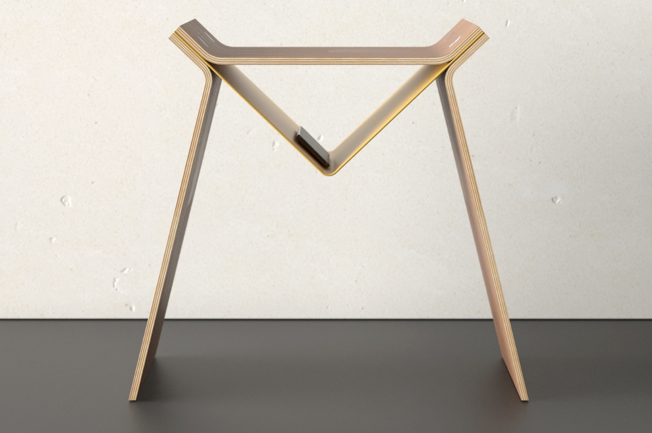
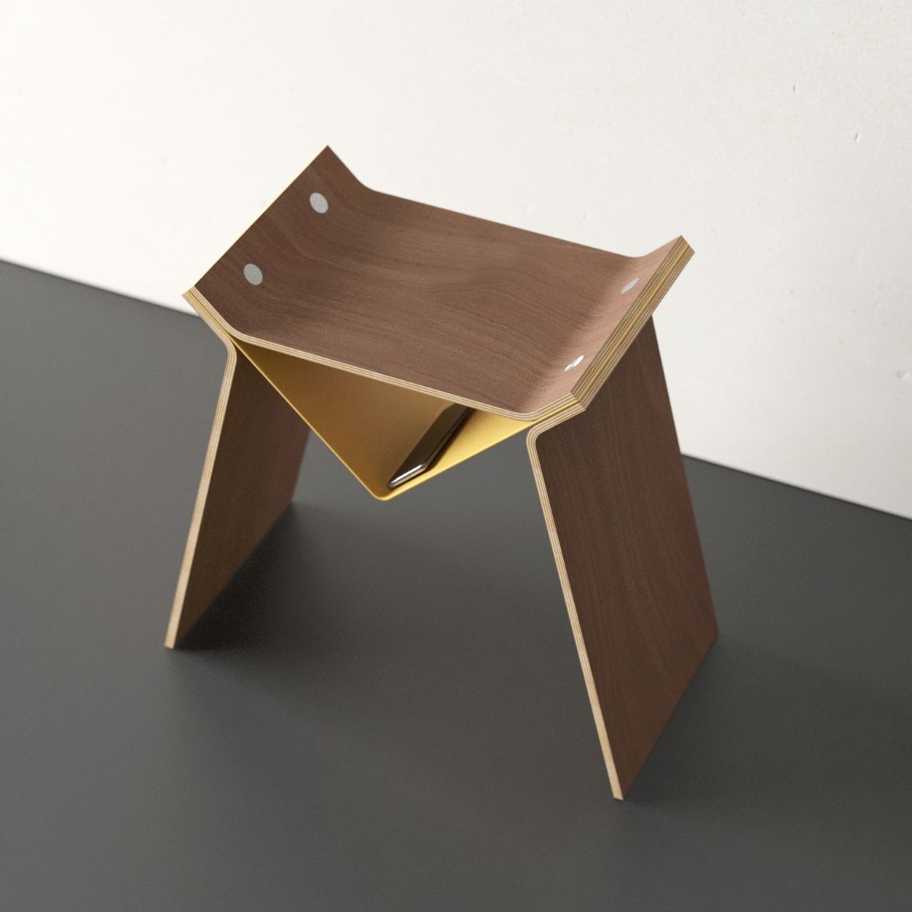
Are you the kind of person who would look at clouds and try to see what shapes or creatures you can see there? If yes then you’re probably a pretty creative person who can see all sorts of things in different figures and structures even without hearing the name of the product concept. So even though there’s no description or explanation, you probably understand why this new product concept for a stool is called Wolf.
Why is it noteworthy?
The German-based designer is making a name for himself with his unique takes on simple furniture like bookshelves, lamps, and chairs. This new concept for a stool is called Wolf and if you let your imagination run a little wild, you’ll be able to see a wolf in the shape of this minimalist piece of furniture. In fact, the shape of the stool looks like a logo for a new video game or a brand that gives off a scary, wolf vibe.
What we like
- The triangular middle part can actually be turned into a small storage area
What we dislike
- Doesn’t seem like a very cozy seating space
The post Top 10 designs to make your home more organized + de-cluttered first appeared on Yanko Design.
0 Commentaires