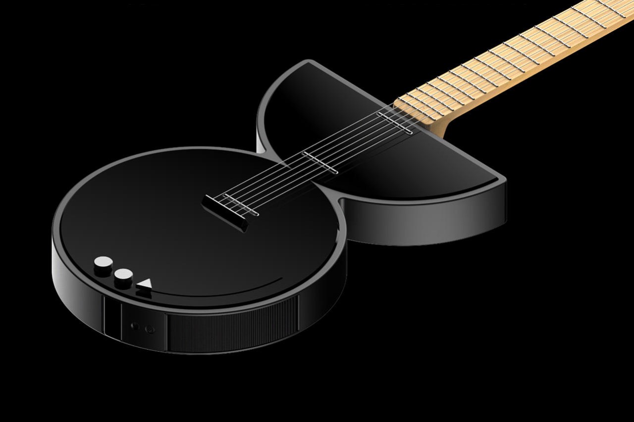
The Zeta Electric Guitar isn’t rooted in tradition. Instead, it looks at design movements and tries to adapt to them, merging music and design into one beautiful package. Through its weirdly abstract and minimal design, the Zeta both challenges and conforms to the notions of what an electric guitar should look like in the future. “The challenge was to take the most iconic electric guitars of the past and make them current with a more minimal and clean aesthetic research,”, said designer Nicola Morelli. “Among all the drafts, two emerged that summarize the two spirits of music with guitar: Light and round, Heavy and angular.”
Designer: Nicola Morelli
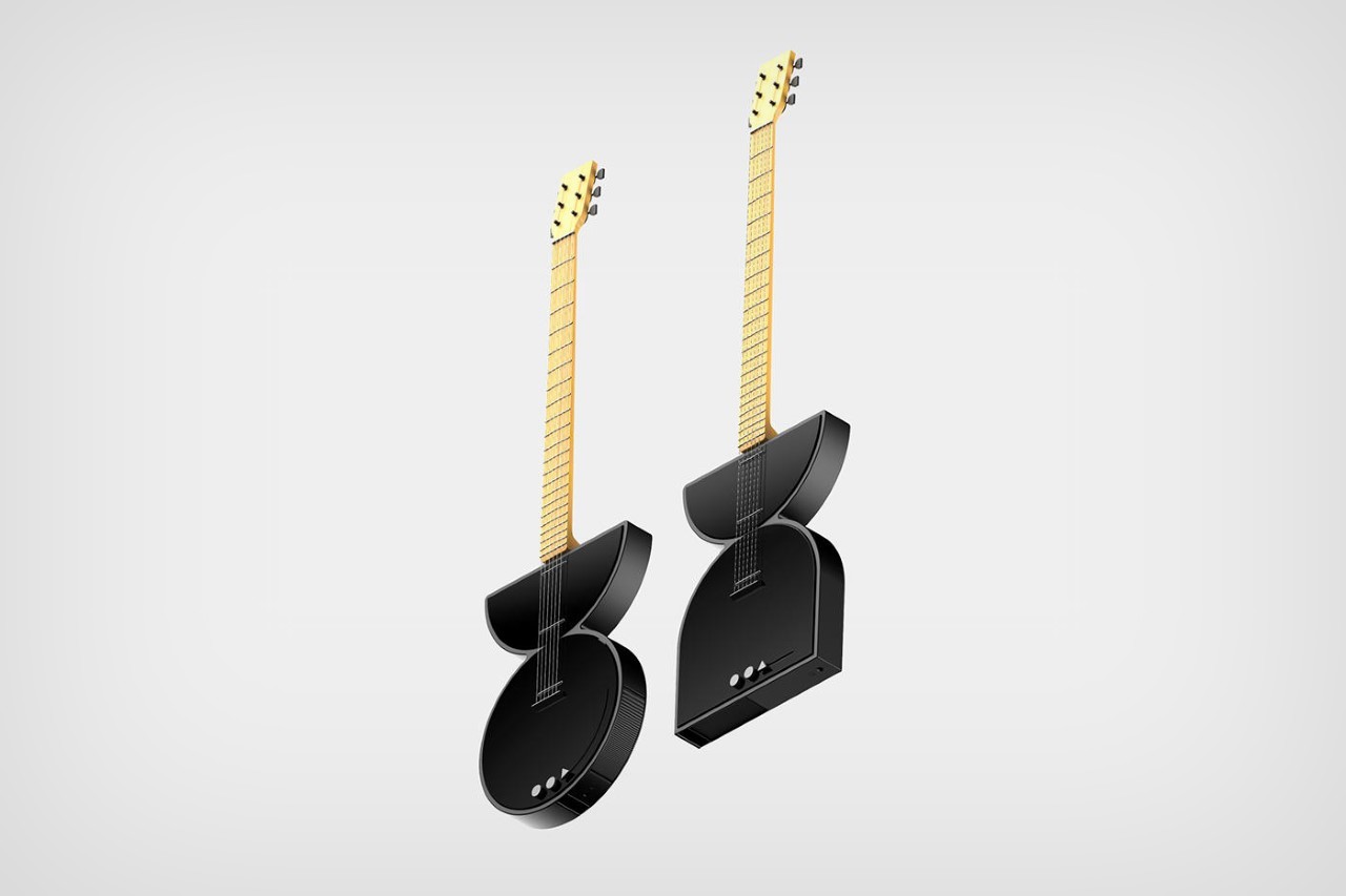
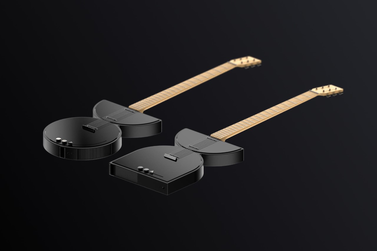
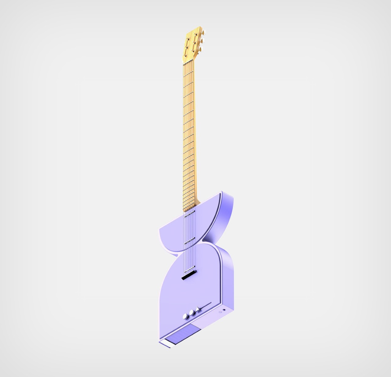
The guitar’s design approach borrows from a few notable art movements, including Suprematism, Memphis 2.0, Abstractionism, and Minimalism. Its entire body (the distinct, most iconic part of the guitar itself) sees a redesign, opting for simple geometric shapes instead of ergonomic ones designed to fit the contours of the player’s body, or even acoustic requirements. The guitar (which comes in two shapes) abstracts two of the most famous electric models ever played, the Stratocaster and the Les Paul, simplifying their iconic shapes into something much simpler, yet just as eye-catching.
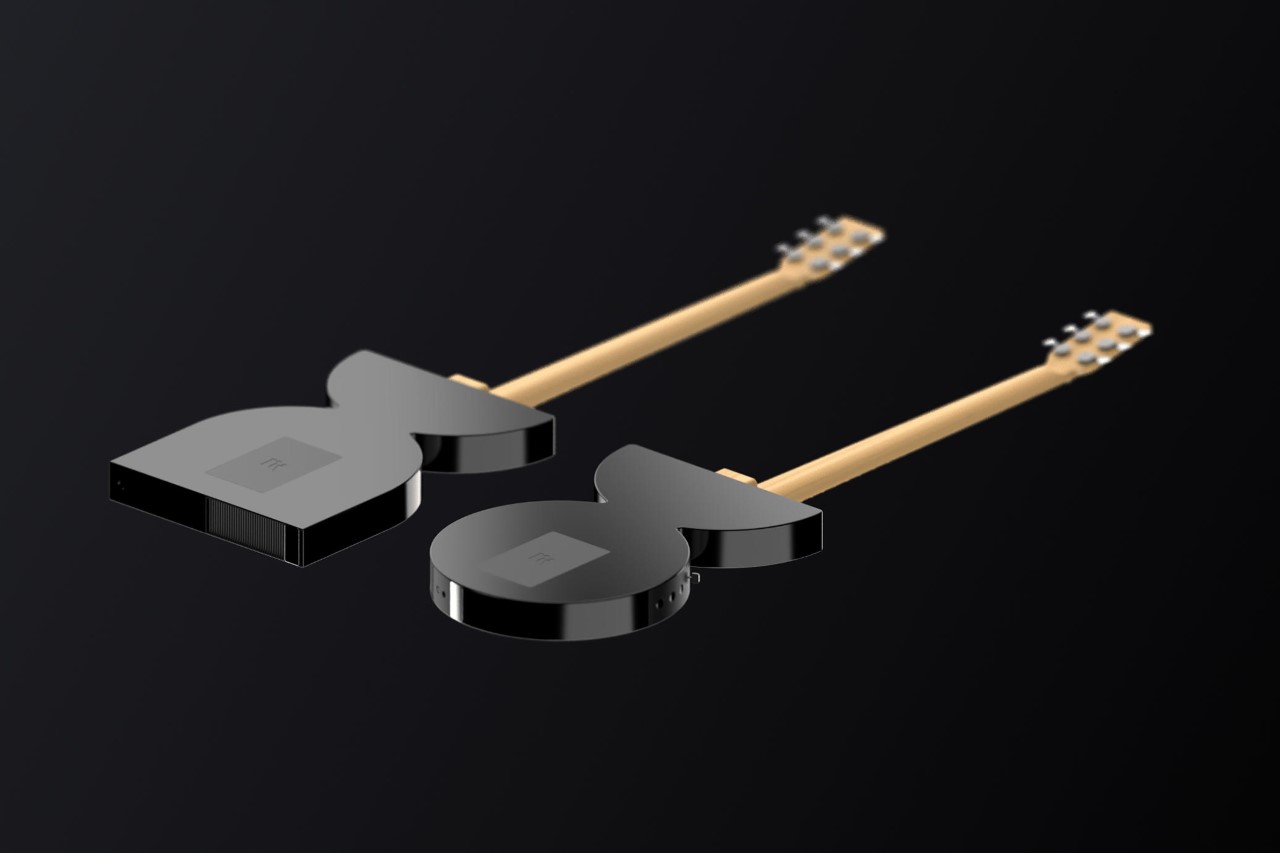
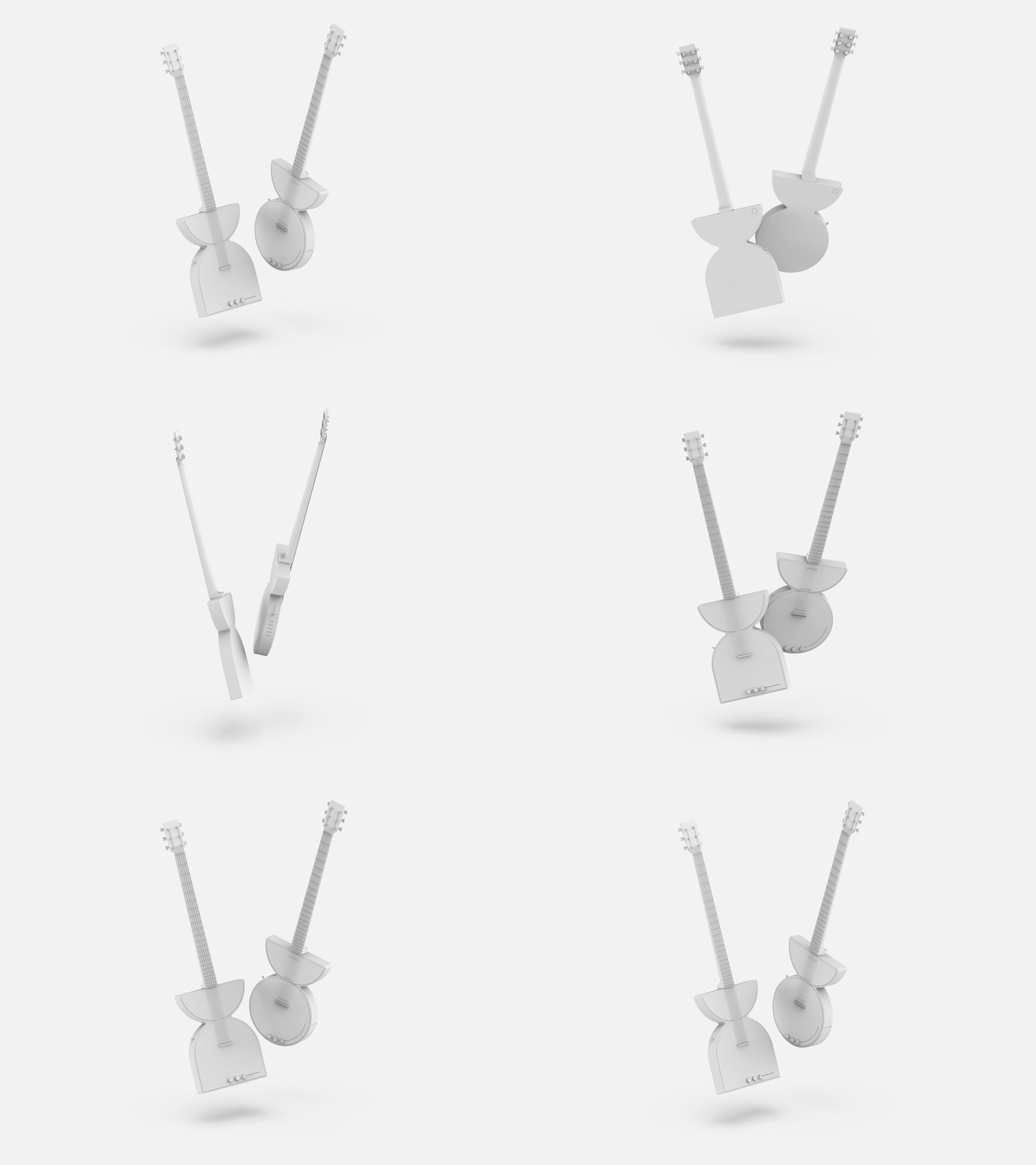
Ultimately, for Morelli, Zeta also needed to be technologically futuristic. To that very end, the instrument is designed to use the MIDI protocol to help guitarists harness their true creative potential. Knobs and sliders located on the side of the body let the player modulate the guitar’s sound in unique ways, playing with MIDI metrics to create new tones altogether. Finally, a built-in speaker, along with a standard 1/4-inch jack lets the Zeta Electric Guitar be either played independently as an instrument, or be plugged into an amp like a more traditional piece of music equipment.
The post ‘Electric guitar of the future’ explores a minimal form that isn’t bound by acoustic or ergonomic concerns first appeared on Yanko Design.
0 Commentaires