They may be technological marvels, but foldable and rollable screens remain just that in consumers’ eyes. Foldable phones have been on the market for almost five years now, but they’re still considered to be expensive eccentricities and luxuries that only a few can really afford. Even if they were more affordable, most people would probably still not be able to justify such a purchase, especially considering some concerns regarding durability. The Microsoft Surface Duo and its successor tried to offer a less risky yet still expensive interpretation of the foldable design, offering two distinct screens rather than folding a single one. At first, it seemed that it would actually be a new mobile device category to stand beside typical foldables, but the rumor now is that Microsoft seems to have thrown in the towel. Although it did have its fair share of fans, the Surface Duo 2 just didn’t seem to click with the masses, even less than the likes of the Samsung Galaxy Z Fold, and these are five reasons why.
Designer: Microsoft

Identity Crisis
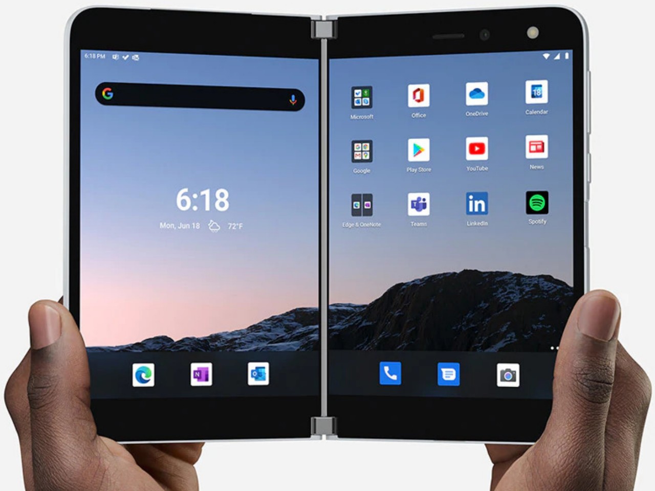
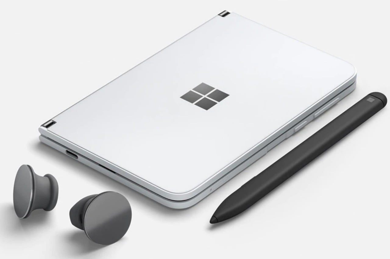
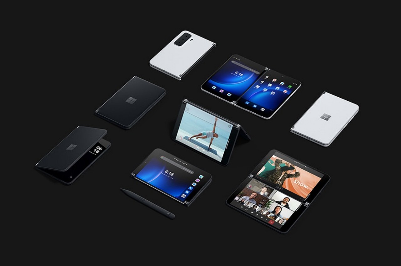
To some extent, the Microsoft Surface Duo is in a class of its own. You can’t really call it a smartphone, even though it does make calls since it’s rather awkward to actually use it as a phone unless you’re always wearing earbuds. You can’t even fold the Surface Duo 2 back completely now that it has a camera bump. You can easily call it a tablet, either, even though content can span both screens to form one single display that has a very noticeable cut in the middle. Even Microsoft itself avoids calling the Surface Duo by either name, preferring to just refer to it as a “dual-screen mobile device.”

The Surface Duo’s unconventional design does warrant a different classification, though it’s not exactly original in the basic concept. LG tried to take a stab at a dual-screen phone with a case that you can attach and remove as needed. The experience, of course, was very different, more similar to how you’d connect a second monitor to a computer. The Surface Duo had that capability built-in, saving users from having to juggle accessories. It didn’t, however, solve the fundamental problem of exhibiting an identity that people can understand and relate to, which would have gone a long way in making the device more appealing beyond mere curiosity.

The device’s ambiguity meant that it was actually difficult, if not awkward, to use it like you would a familiar mobile device. It’s too wide to use as a phone when folded, and it’s unusable as a “full” tablet when spread out. Admittedly, it’s unfair to judge the Surface Duo by these standards because it’s neither a phone nor a tablet but a completely different device. Unfortunately, people will approach it from either direction because they’re more familiar with smartphones and tablets and might not be able to adequately wrap their heads around a new creature such as this, especially when they might not even understand what it is for. Unfortunately, Microsoft’s target audience makes it clear that it’s not for everyone in the first place.
Niche Business
The Surface Duo 2 can do almost anything a smartphone or tablet can do, especially if you use only a single screen. Those won’t take full advantage of the device’s capabilities, though, and you’ll have to make use of both screens at the same time. And therein lies the biggest question of the Surface Duo’s design purpose. While most people will probably want a bigger screen, how many will actually need two somewhat small screens instead? Why, those who use two apps at the same time, of course!

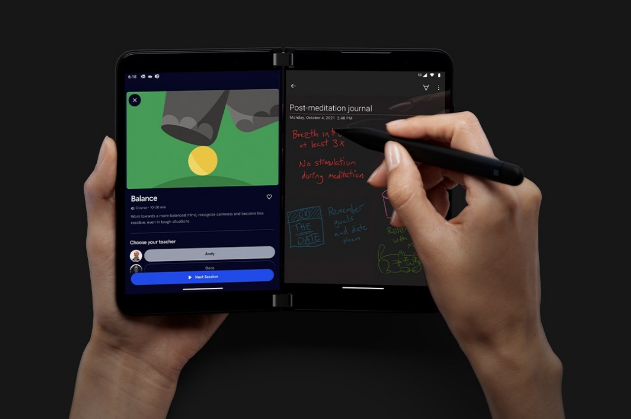
The School of Jobs and the smartphones that followed have conditioned our minds to use one app at a time, deftly switching back and forth between apps and screens as needed. This is admittedly very limiting, especially if you’re used to the multi-window world of desktops and laptops. There might be some who wish they could do things at the same time or see two apps simultaneously, and it’s exactly for that use case that the Surface Duo was designed. To be more specific, the dual-screen device is made for highly productive people who find themselves always switching between two or three apps.
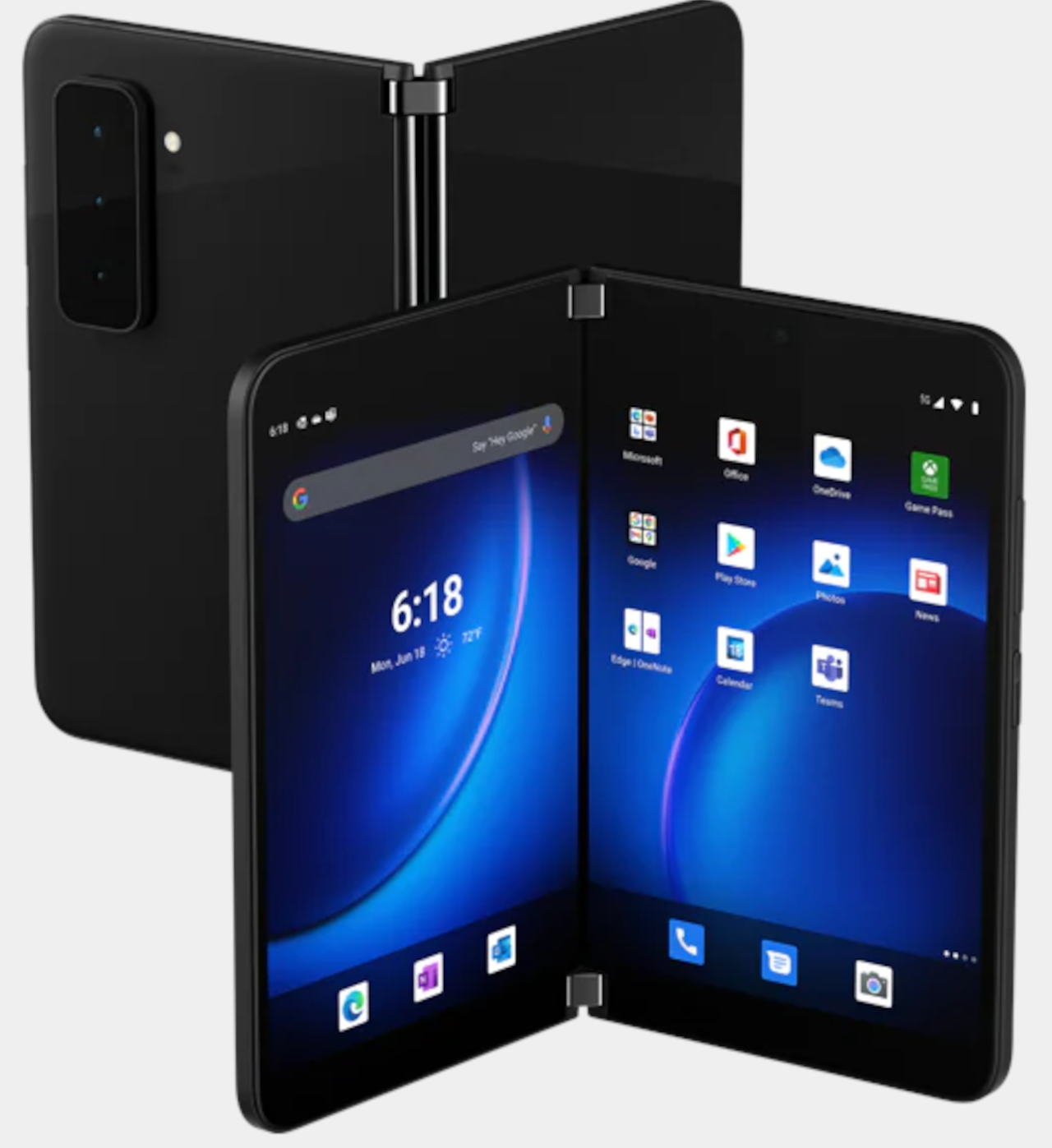
The subset of mobile users that regularly do this, however, might be very small. Microsoft is clearly focusing its marketing on business users who’d have different documents or apps running at the same time to compare or even share data. There is also the case of some more social users who might be chatting away while watching a video together or browsing the Web. These are definitely legitimate use cases, but not common enough to make the idea of the Surface Duo to be so popular that it would drive sales. Because while the device does enable using two apps side-by-side, the unfortunate truth is that these apps and the Android platform, in general, were designed for single-screen use and remain stubbornly so.
Growing Software Pains
Whether it’s iOS or Android or anything in between, mobile operating systems have been designed from the start with a single screen in mind. And while Android did actually have the foundations for multi-window support, few outside of the likes of Samsung ever took advantage of that and evolved it. Now iOS, particularly iPadOS, has left Android in its dust, and devices like the Surface Duo or even the Galaxy Z Fold are having trouble shoehorning a different paradigm into the platform.
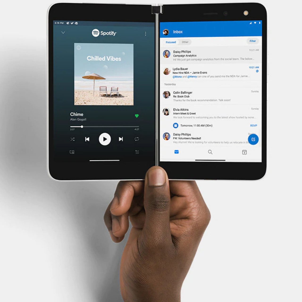
The first release of the modified Android system for the Surface Duo was pretty much disastrous, with plenty of instabilities and bugs marring the otherwise beautiful first-gen device. To its credit, Microsoft has been addressing those issues slowly but surely, yet the fact remains that Android apps always behave as if they’re the only show on stage. It doesn’t help that that stage doesn’t seem to push those actors to play well with others, even when all the facilities are there. It will take a Google foldable device for Android to really adopt all these features it already has, but that’s a story for another day.
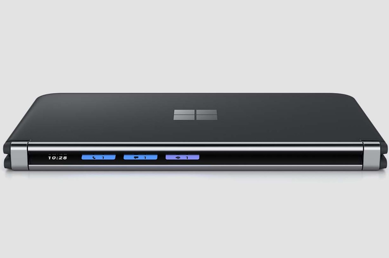
To be fair, even Samsung’s foldables have this kind of problem, only that the phone maker giant has been working on its solution for years. Those flaws are more pronounced on a younger device like the Surface Duo. Despite being primarily a software company, Microsoft still has trouble adapting Android to its needs. And, unfortunately, it doesn’t exactly have a track record in that aspect, either.
Software is Hard
Just because Microsoft is adept at making software doesn’t mean it’s an expert at everything. Some might even refute how good it is at software development in the first place due to innumerable issues with Windows and Office. That’s even truer with platforms that aren’t its own, particularly Android, which it has been using ever since it ditched the idea of any form of Windows on mobile. It hasn’t had much success then, and it doesn’t seem to be having better luck now.
To be fair, Microsoft has shown better performance with the Surface Duo 2, at least as far as pushing fixes is concerned. Unfortunately, even those fixes leave some things to be desired, and the software still shows some of the problems exhibited in the first Surface Duo. Given the fast pace of Android updates, Microsoft is clearly lagging behind on that front as well. Confidence in Microsoft’s ability to fix those software issues isn’t exactly that high, and the latest rumors only serve to validate those doubts.
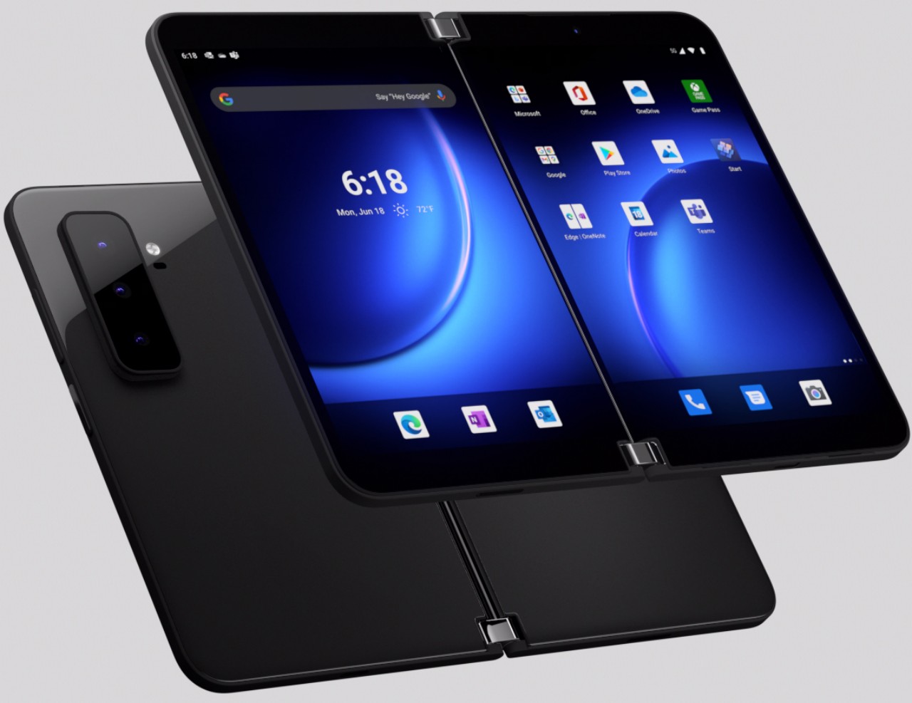
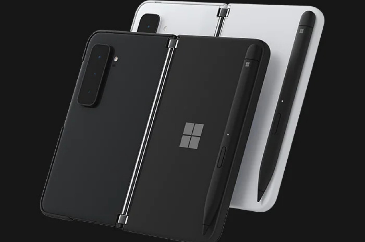
Microsoft switching to a single foldable screen for the Surface Duo 3 doesn’t make all those problems go away. It could, however, alleviate or even fix some of the problems, particularly when it comes to having to support two screens, something that Android at its core still doesn’t do well in the first place. Unfortunately, it does pretty much throw away all the rhetoric around the first Surface Duo devices, validating once again that Samsung’s design might have been right all along.
An Answer in Search of a Problem
The biggest problem with the Surface Duo design is that there was probably no problem, to begin with. While some will say that this applies to foldable devices as well, it’s even more poignant with a dual-screen mobile device. The Surface Duo 2 is slick, beautiful, and innovative. Unfortunately, it is also incomprehensible for the majority of consumers, even those that can actually afford one. Microsoft tried to offer a device that seemed less fragile than a Galaxy Z Fold but unfortunately slapped a price that is just as inaccessible anyway.

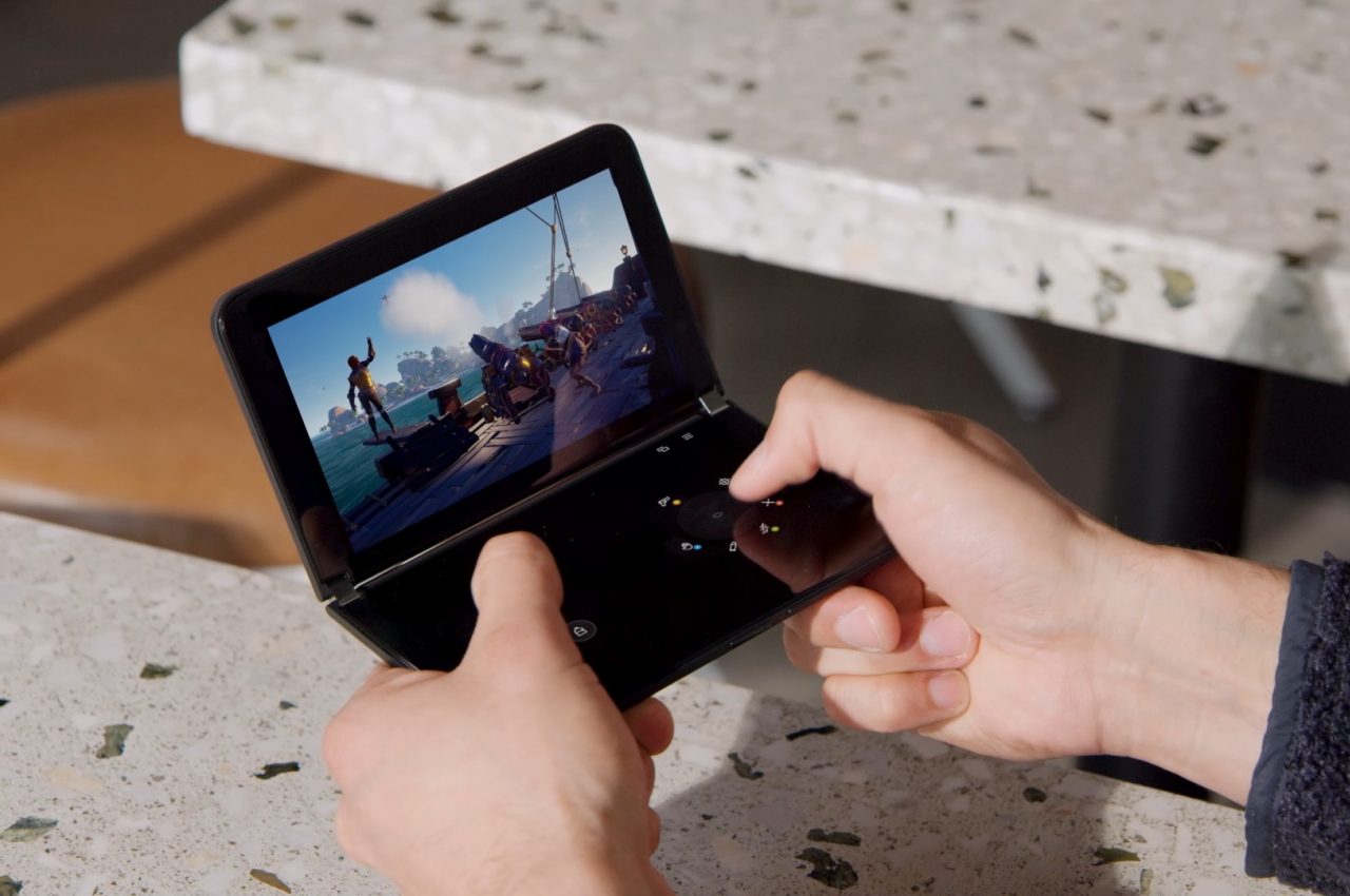
Microsoft did have a clear audience in mind, but it might have overestimated its own clout in that industry. It might have envisioned a large army of mobile users who depend exclusively on Microsoft apps and services, but that ship has long sailed. Without support for other “normal” apps, the overall experience was clunky, awkward, and sometimes even unusable. The Surface Duo 2 definitely has fans that are now disillusioned at the path that Microsoft is rumored to take, but those fans won’t be able to help turn the device into a profit.
While the Surface Duo 2 is admittedly an interesting innovation, at the end of the day, it’s still a product that has to bring Microsoft money. By turning away from the dual-screen design, the company is effectively admitting that it failed to accomplish that. The “innie” foldable screen first used by Samsung is by no means perfect, but it’s also more usable for both regular and power users. It remains to be seen how much of the Surface Duo user experience will remain in such a different device and whether or not it will even be worth investing in a Microsoft mobile device that could suffer the same fate as other Microsoft mobile devices.

The post 5 Reasons the Microsoft Surface Duo 2 Design Failed first appeared on Yanko Design.
0 Commentaires