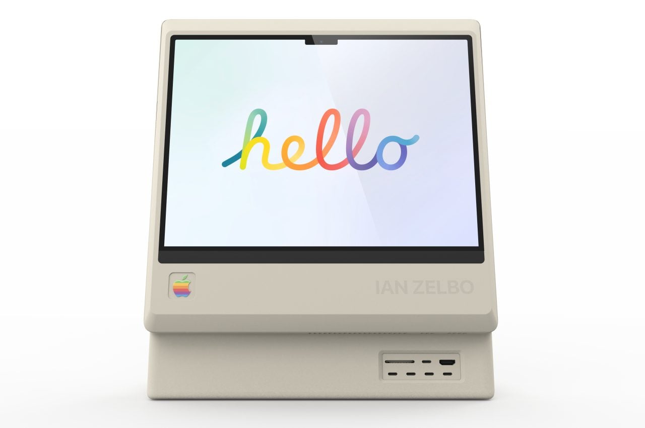
Everything old is new again, as they say, and one designer envisions the possibility of a Macintosh that tastefully blends the old and the new in a way that could make even Apple interested.
Nostalgia is a very strong emotion, as shown by the number of successful retro consoles and crowdfunded projects launched in the past few years. Going down memory lane is quite effective for people who were there to witness events first-hand, but it also serves a different function for those who weren’t around back then. It gives them an insight into the minds of the past and the thinking that lead to the products of yesteryears. More importantly, they also serve as inspiration for new ideas, like this Macintosh concept that brings the past to the present in some interesting ways.
Designer: Ian Zelbo
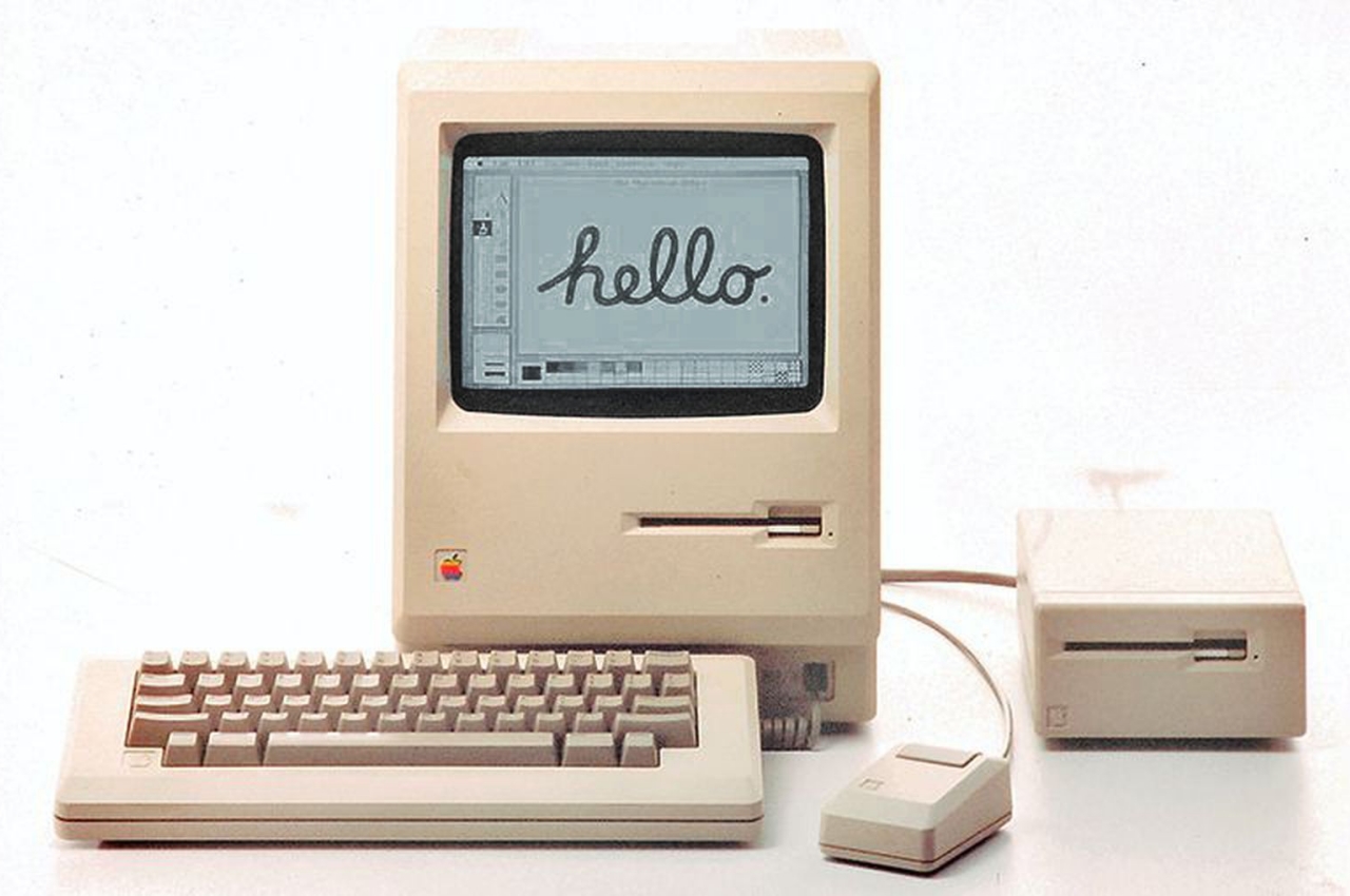
Even back in its earliest days, way before the iPhone or even the iPod, Apple was already turning the consumer electronics market on its head. Although it unsurprisingly looks dated by today’s standards, the original Macintosh already prefigured what would become Apple’s forte. It offered something that wasn’t just a tool but a well-designed, thoughtful, beautiful, and more human product.
Ian Zelbo wasn’t around when Apple launched the first-ever Macintosh in 1984, but he was well aware of how that product sent ripples that would be felt even decades later. Likewise, what started out as an almost tongue-in-cheek joke and homage to the landmark product ended up sparking interest and discussion over the Internet. After all, nothing fuels the imagination more than something Apple would never do yet still remained within the realm of what is possible if it ever decided to do so.
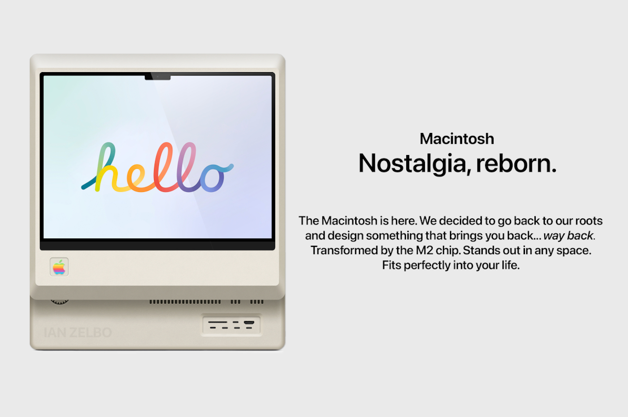
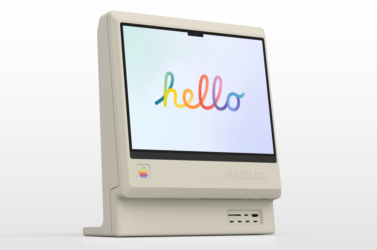
From the front, the Retro Macintosh clearly looks like a blast from the past. The screen extrudes forward from the body just like the original Macintosh with the array of ports sitting below it. The rainbow Apple logo, something that the company would never use today, also sits in the original place on the lower-left corner of the display. And while Apple has wholeheartedly embraced white for many of its products, the off-white hue is a clear nod to the computers of the past.
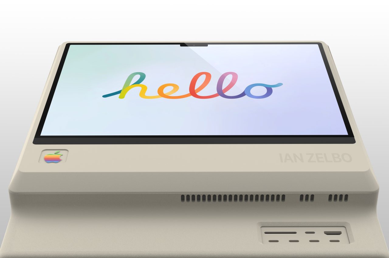
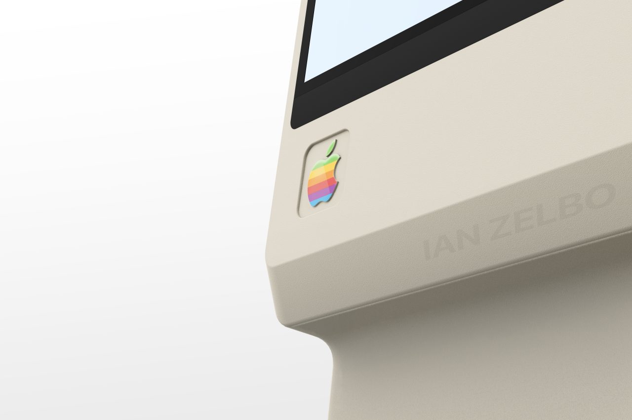
At the same time, this concept isn’t just the 1984 Macintosh with a colored screen and USB ports. Unlike the hulking boxes of the 80s and 90s, this retro concept chops off most of the body, leaving only a comparatively slim chassis to hold the electronics. It is pretty much like a modern all-in-one iMac, albeit a bit thicker. It doesn’t have a slim stand that keeps the computer afloat, but there is a “foot” that extends toward the back to balance the Retro Mac while keeping in line with the computer’s unibody design.
It isn’t all praise for Apple’s design, though, at least not for some people. Zelbo didn’t miss the opportunity to include what is perhaps one of the most controversial new features in the latest MacBook Pros. There is a wide notch on the screen, something that Apple might also implement in future iMacs. Ironically, this small detail is the one thing that truly sets this concept apart from being a mere recreation of the original Macintosh, embracing Apple’s design language throughout the decades. After all, nothing says “modern” than having a notch on your screen.
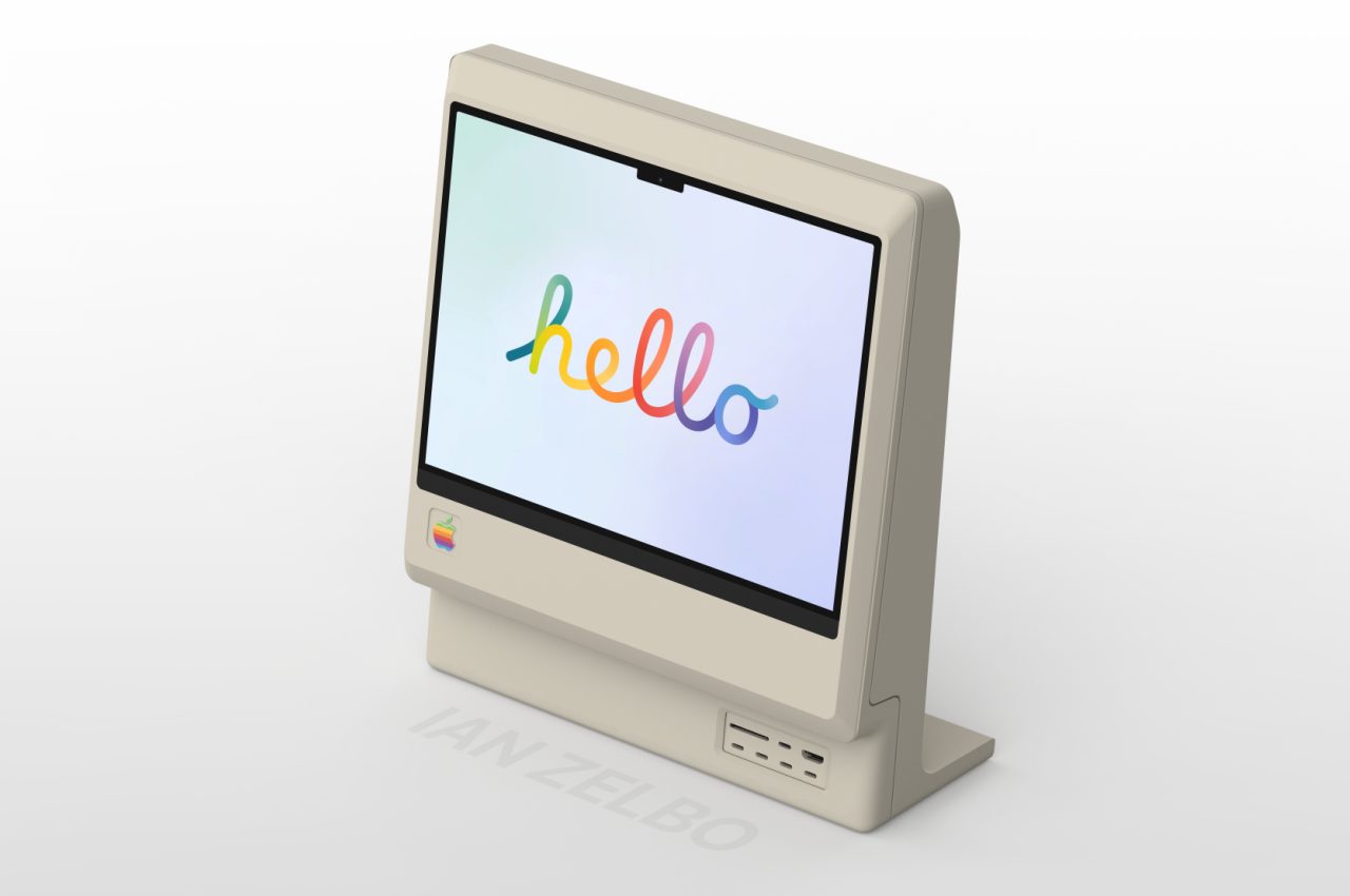
There is, however, one aspect that conflicts between the two generations of Apple computers. While the iMac and even the Mac Pros hide their ports, this retro concept puts them up front, just like the original Macintosh. While this isn’t as clean and tidy as current Macs, this “old” design has the benefit of providing easy and immediate access to those ports.
“While I was not born in time for the launch of the Macintosh, I can appreciate how influential it was,” says the designer. “I wanted to see what the Macintosh would look like today by blending the nostalgic design with Apple’s current design trends. While it started out as a play on Apple’s recycling of past designs, I truly love the result.”
Apple will most likely never make such a product, of course, not even to celebrate the Macintosh’s anniversary and its significance in history. The concept, however, is still a fruitful exercise in testing how Apple’s designs can actually stand the test of time and how different aesthetics can blend together, even if they’re decades apart. Fortunately, we live in a time when it’s possible and feasible to actually make something like it, and it might only be a matter of time before someone does try to hack together a Retro Macintosh that actually works, unofficially, of course.
The post Retro Macintosh concept is the perfect fusion of nostalgia and modern Apple design first appeared on Yanko Design.
0 Commentaires