Smartphones are trying to stand apart from each other but end up looking like one another, but OPPO has seemingly stumbled upon a form that is both unique but also soothing to the eyes and the mind.
Smartphones are probably the last thing you’d consider to be a calming product. Quite the opposite, these are devices immediately associated with work, communication, games, and the Internet, activities and things that are anything but calming. Even Apple’s iPhones, regarded by some as the epitome of good phone design, are not something its fans would call soothing. That’s what makes the OPPO Find X5 Pro’s design one-of-a-kind in that it actually evokes those emotions, at least when you look at it from the back.
Designer: OPPO
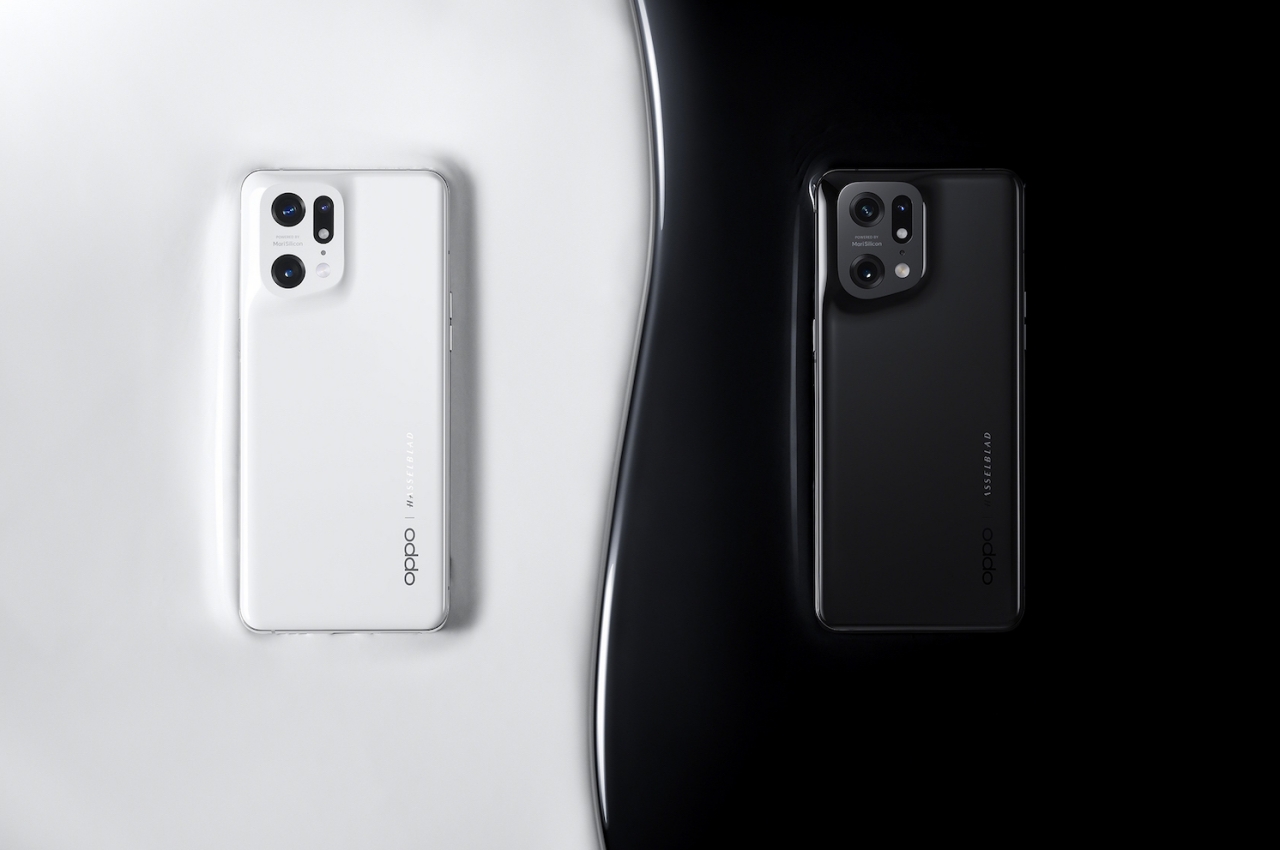
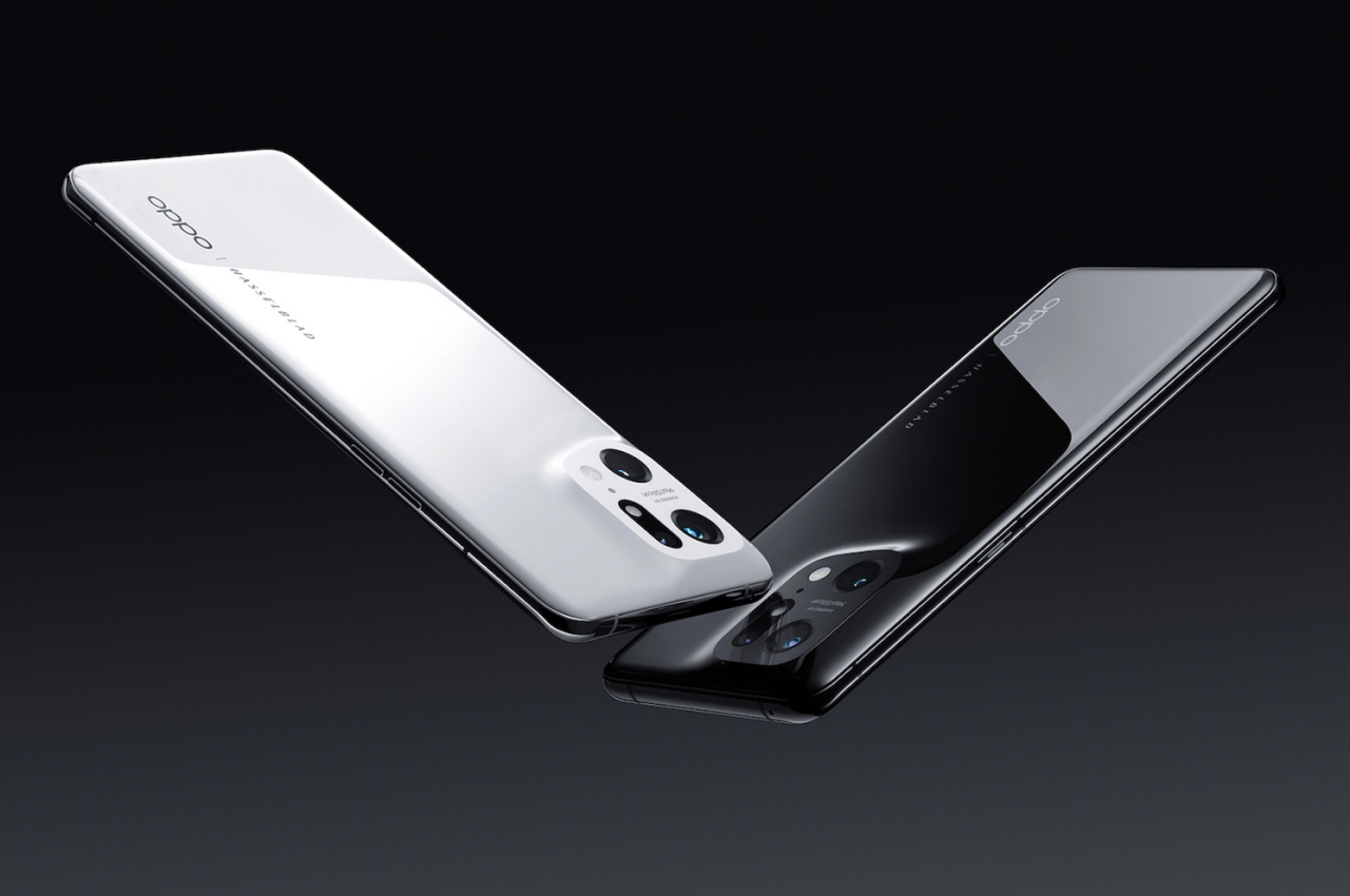
Most phone owners will see the front of the device the majority of the time, though all that other people will see is the back of your phone. That’s why many phone makers pay special attention to the design of that part of the phone, and many cases and stickers exist to embellish it. To some extent, that rear is the part of the phone that shows its personality the most and also reflects the owner’s personality the most.
In that light, the OPPO Find X5 Pro can easily be pegged as a design-conscious phone. Sure, there are tons of “designer phones,” including exorbitant editions from the likes of Caviar, but the phone embraces one of the biggest trends in design circles that very few phones can boast of. While many phone brands would claim their latest flagship to be minimalist, OPPO’s latest product exemplifies it.
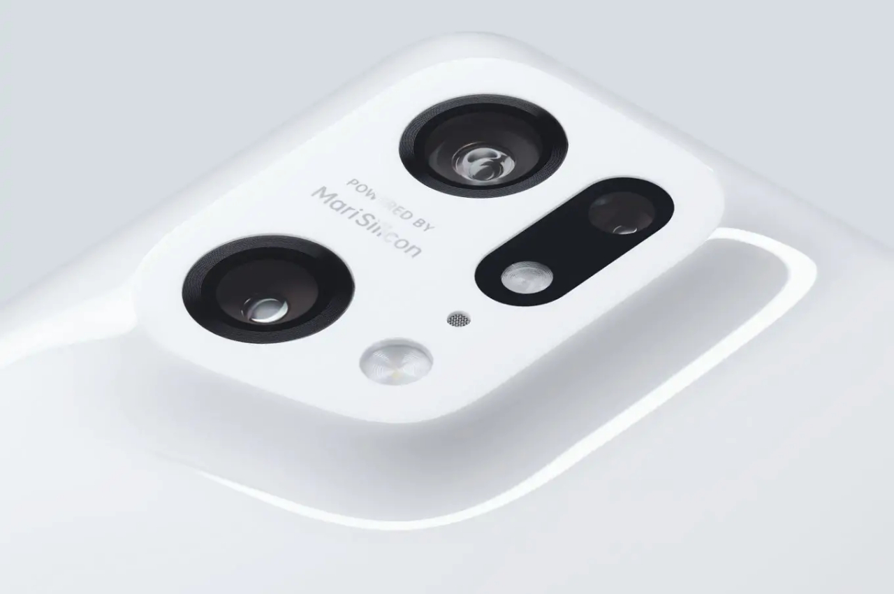
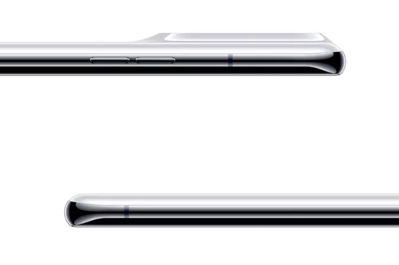
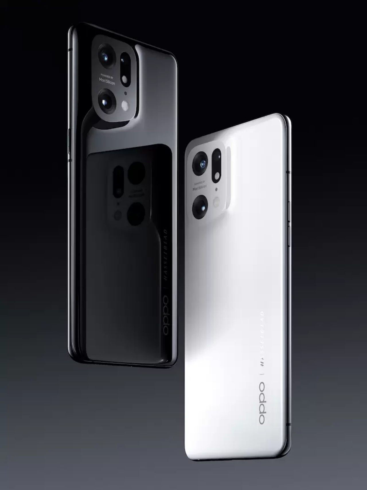
The Find X5 Pro doesn’t have a camera bump in the traditional sense that it has been designed on other phones. There is no distinct and separate part that houses the camera hardware, only a literal bump that gently slopes up like a perfectly smooth dune. There are no other marks on the back of the phone except for the customary OPPO brandings.
The effect is that you have a design that’s visually whole and unbroken except in the camera holes. Even then, there are no protruding parts that break that illusion. That slope’s elevation is so gradual and smooth that, at certain angles, your eyes might be tricked into thinking there isn’t a bump at all. Contrast that with other phones whose camera arrays are like screaming for attention. Even the Galaxy S22 Ultra, which does remove the bump, has distinct circles for the cameras that leave your eyes jumping from one point to the next.
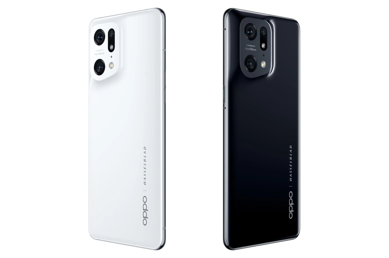
It’s easy to take this design shift for granted, and some buyers definitely will. When OPPO introduced the first iteration of this design language last year, however, it was trying to evoke those exact emotions of calmness and serenity with a visually minimalist and holistic design. OPPO’s choice of pure white and pure black colors also helps in radiating a Zen-like character, and its strategy seems to have finally paid off this year.
The OPPO’s mission to provide a comforting experience in the midst of the uncertainties of this age doesn’t stop at the looks. The Find X5 Pro uses ceramic for its back instead of the typical glass, a material that is not unheard of but not commonly used because it is harder to handle during the manufacturing process. Ceramic, however, has certain advantages over glass, and not just in durability.
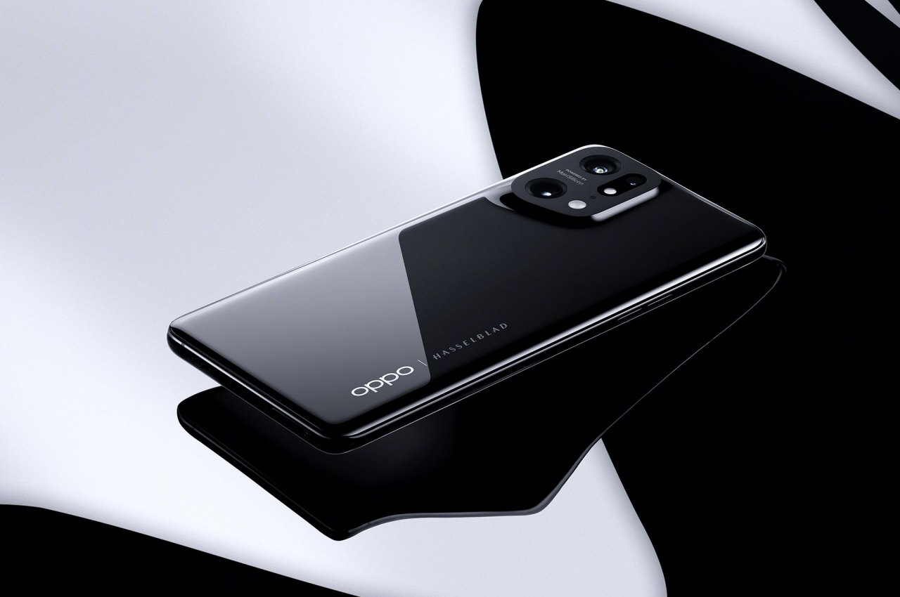
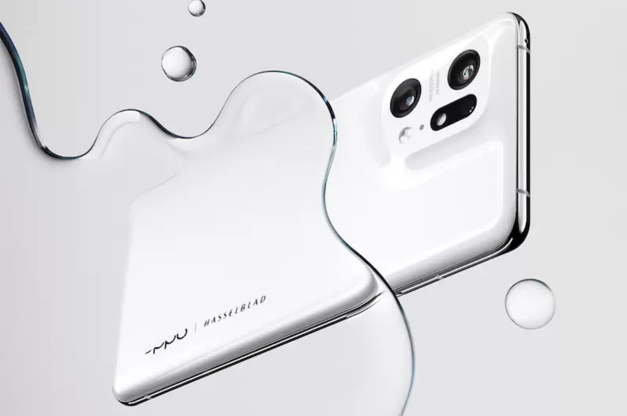
As a tactile material, ceramic is warm to the touch, unlike cold glass. At the same time, it doesn’t get too hot when the phone works overtime. Bottom line, it adds comfort and warmth when holding the phone, which helps achieve that design goal even when you can’t see the back of the phone.
This doesn’t mean that the OPPO Find X5 Pro is all about aesthetics and design, though. As a true premium flagship, it crams some of the best hardware in its sleek body. It also has quite a formidable set of cameras, making it a tempting tool to add to a designer’s arsenal.
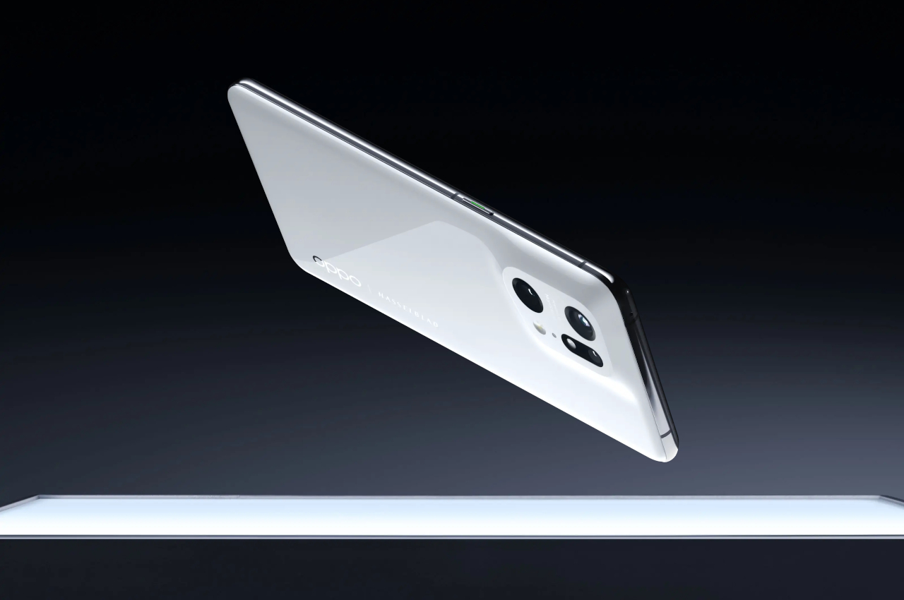
Almost all smartphone makers will naturally wax philosophical about their designs and their advanced manufacturing processes. There’s no denying that, even with those bulky camera modules, some are actually beautiful to behold. There are also others that appeal to certain design inclinations, like a cyberpunk-themed phone or a gaming phone that mimics a colorful gaming PC. Most phones are designed to excite. Few are made to calm.
The OPPO Find X5 Pro was intentionally designed to address not just the technical pain points of people today but also the emotional ones. Removing the conventional metal plate that houses the phone’s cameras isn’t an earth-shattering change, but the little modifications here and there do add up. In this particular case, it has helped create a design that looks whole and unbroken, creating a stabilizing presence in the middle of a fast-paced and fast-changing world.
The post OPPO Find X5 Pro design that brings a bit of calm to a chaotic mobile market first appeared on Yanko Design.
0 Commentaires