It is pretty much everything the leaks said it would be, but now Samsung might be caught in a bit of a bind moving forward.
Thanks to a plethora of leaks that started way back in September last year, Samsung’s latest flagship smartphones didn’t come as much as a surprise. The Galaxy S22 Ultra, in particular, turned out to be exactly what they said it would be, a successor to the Galaxy Note line in everything except the name. This brings quite a few big design changes that are ironically too familiar, but it does make one wonder if this new direction muddles Samsung’s product design story more than consolidates it.
A Tale of Two Galaxies
For those unfamiliar with Samsung’s innumerable smartphones, the company has always had to top-of-the-line brands, the Galaxy S and the Galaxy Note families. In the beginning, the two were easy enough to distinguish because of clear design differences and features. The Galaxy Note phones set themselves apart by not only having a stylus but also by using extra-large screens. Once ridiculed by Apple, “phablets” as they were called, have now become the norm, and the line delineating the two have become blurrier every year.
Every year, Samsung has been rumored to ditch the Galaxy Note brand because it overlapped too much with the Galaxy S series. Those rumors came to a head last year when the Galaxy S21 Ultra sported a stylus, albeit one that had to be stowed away separately, and when no new Galaxy Note phone was launched for the first time in a decade. The Galaxy S22 Ultra pretty much cemented that by looking less like a Galaxy S and more like a Galaxy Note.
This could put Samsung in a conundrum for the future of its phones. If it does retire the Galaxy Note line, and it is likely to do, will it adopt this duality of designs for the Galaxy S phones for the coming years? Wouldn’t it be more prudent to just adopt a single design language? That remains to be seen next year, though, but I wouldn’t put it past Samsung to keep this dichotomy for a while.
Subtle Differences
The differences between the two are even more pronounced this year because the two designs are used in the same brand. The smaller Galaxy S22 and Galaxy S22+ have an almost iPhone-like look this year, with the usual flat display matched with flatter edges. Granted, the sides still have a bit of curve to them, but not as pronounced as in previous generations. Given how Samsung is often accused of following Apple’s lead, this subtle change won’t be lost on its critics.
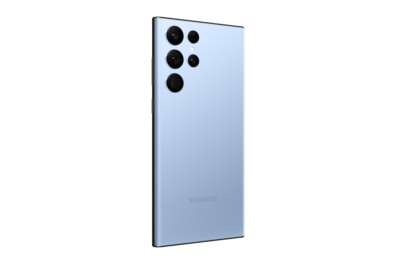
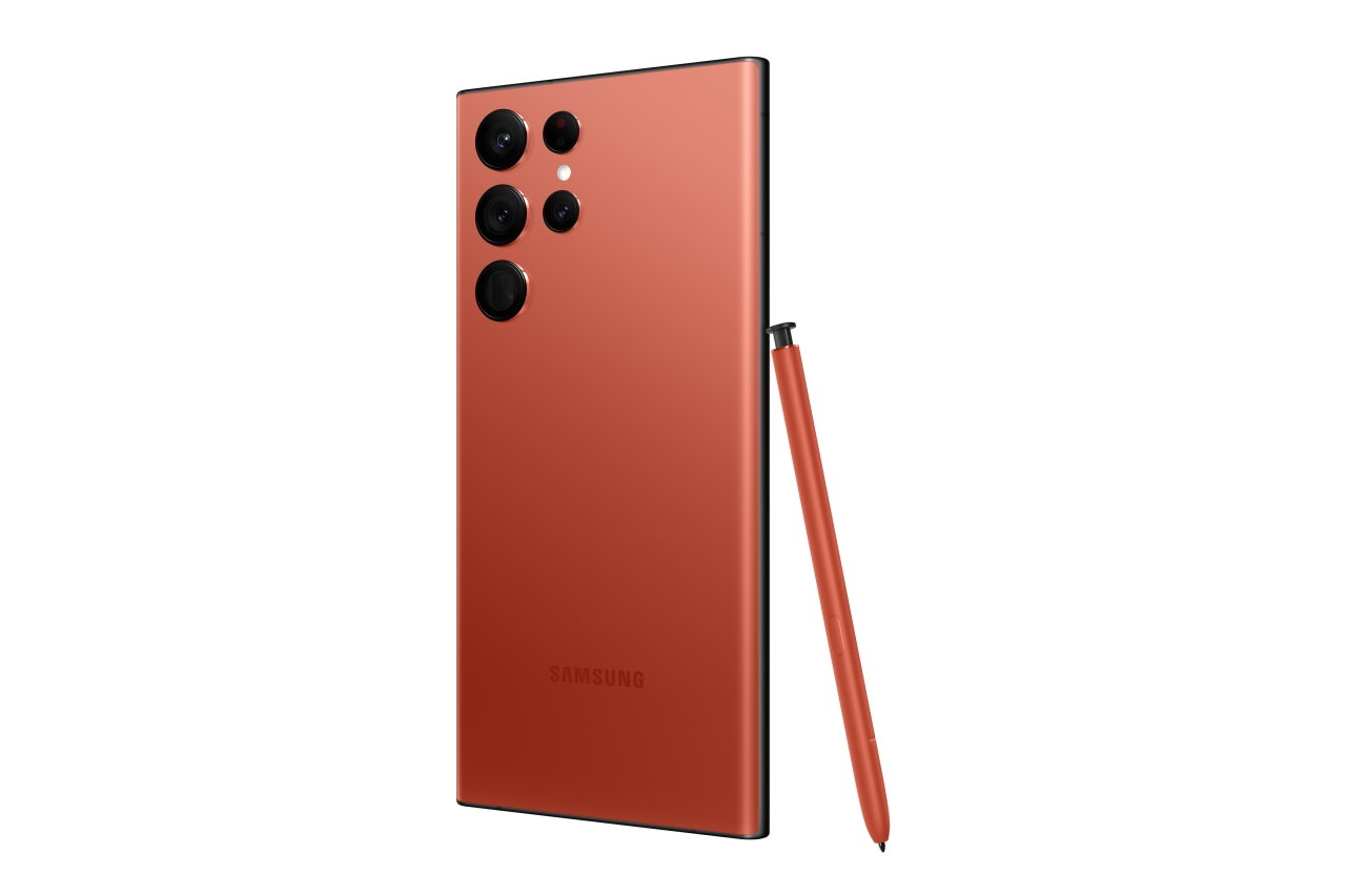
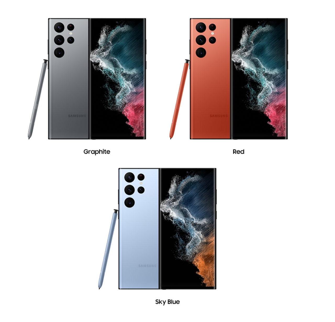
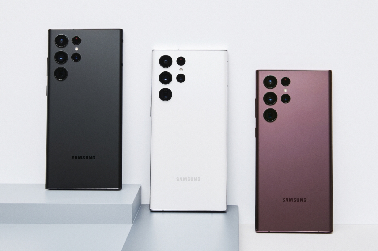
The Galaxy S22 Ultra easily sets itself apart with its size and design. It is the largest of the three and is perhaps Samsung’s largest premium Galaxy to date (it is shorter but wider than its immediate predecessors). It comes with a curved edge screen and very curved edges, which isn’t exactly new and might even give its target audience some problems (as we’ll note later). It is, to some extent, a nod to the past, but there are also some designs that are somewhat new, at least for the Galaxy S flagship.
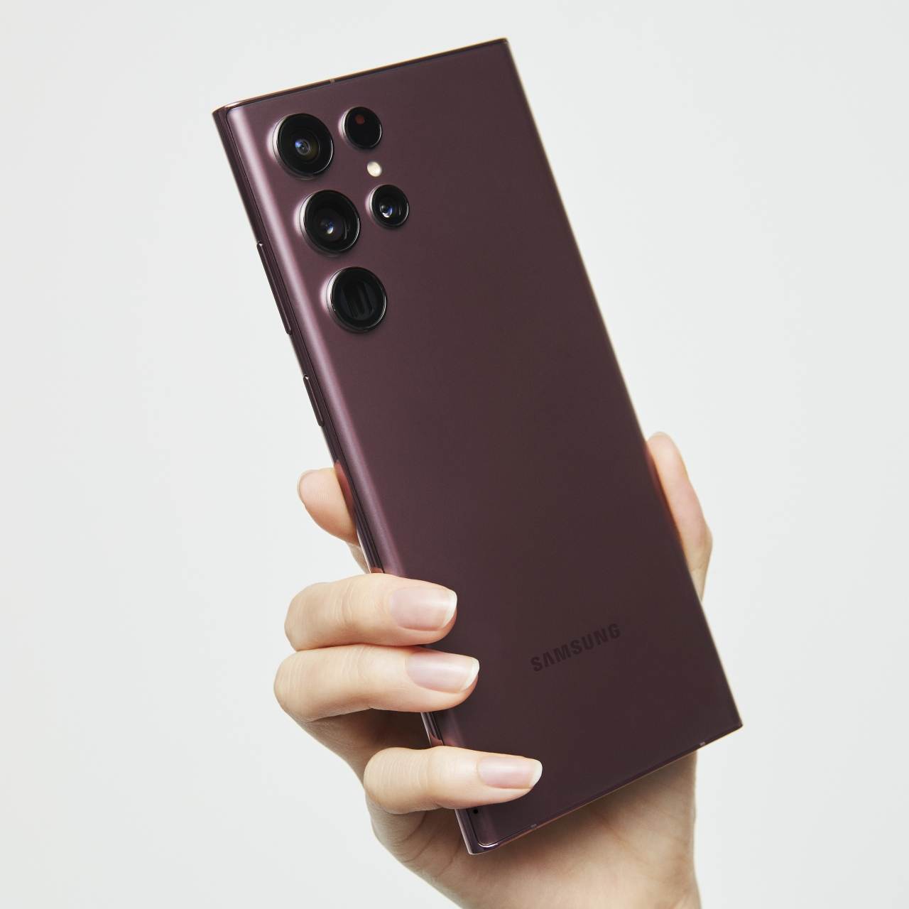
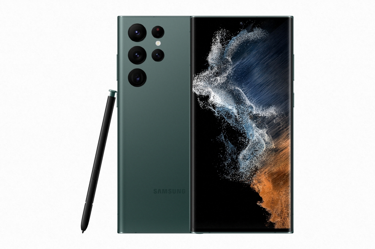
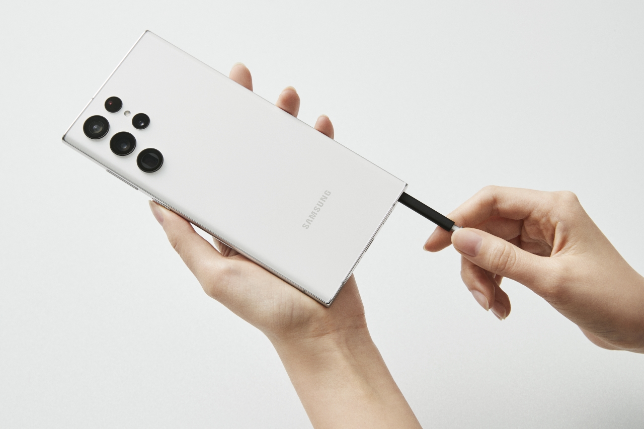
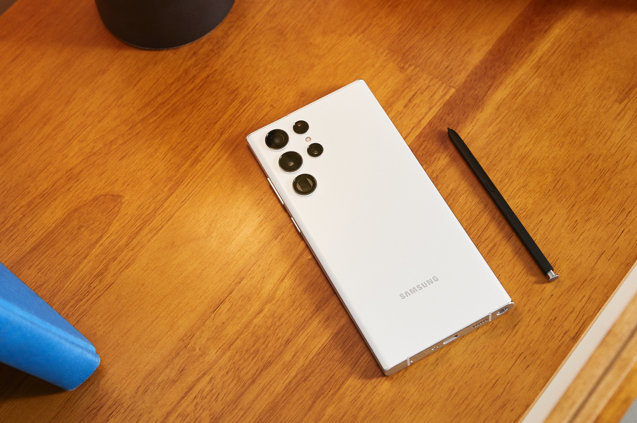
The biggest one is that the S Pen stylus now has a silo inside and won’t require extra accessories to keep it close to the phone. It’s a double-edged sword, though, since users will have to contend with a thin stick to use as a pen. It’s not the most ergonomic for prolonged use, and heavy users might find themselves buying and keeping a bigger S Pen anyway.
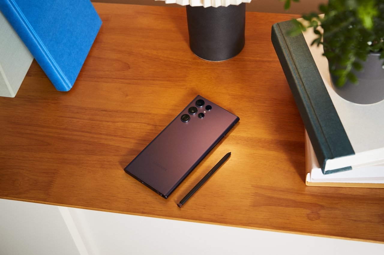
One new design detail about the Galaxy S22 Ultra is that it doesn’t have a camera bump, leaving the camera as small, individual islands of their own. While it does away with somewhat controversial camera structures that have become obnoxiously big, it might cause some concerns over how vulnerable those lenses might be. Conversely, those protrusions might also be cause for concern over how they might scratch surfaces they’re lying on, like wood.
Designed for Creatives
The Galaxy Note line has traditionally been aimed at professionals or “prosumers,” people who would have had use for a stylus for note-taking in particular. Over time, Samsung has tried to play up the S Pen, which is powered by technology from the famed Wacom, as a creativity tool, and it makes its biggest spiel with the Galaxy S22 Ultra this year. There is, of course, all the hardware you can ever ask for in a smartphone, but that only serves to power the actual experiences that creatives, including product designers, might need to do their work on the go.
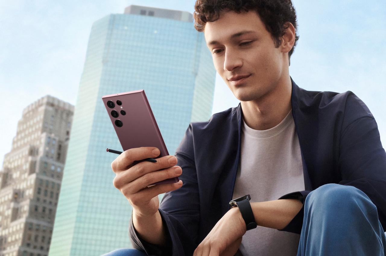
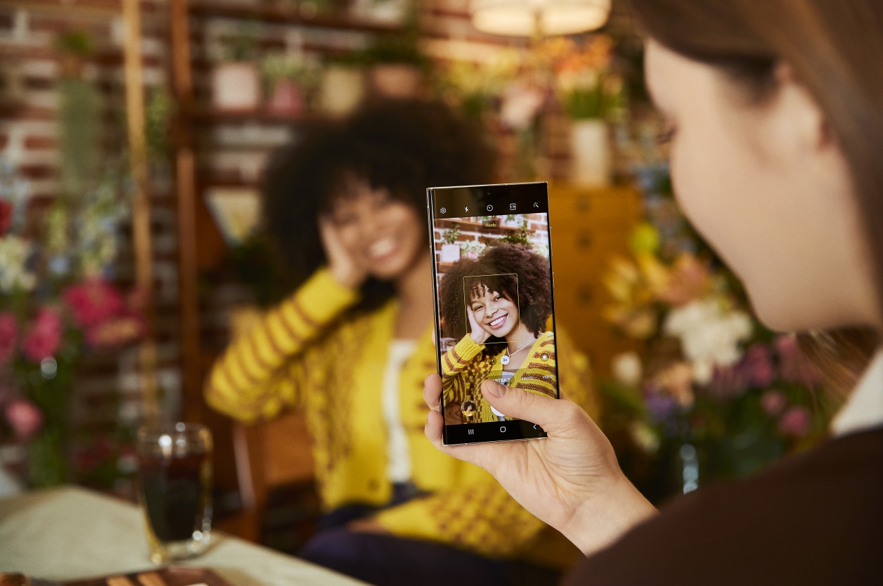
The S Pen, of course, can be used for note-taking as well as sketching. The larger screen of the Galaxy S22 Ultra affords more space, at least for thumbnails and rough ideas, things you would sometimes do on the back of an envelope, a napkin, or a small pocket notebook. The powerful cameras and photography software also allow designers to quickly snap up photos of interesting objects and designs they come across.
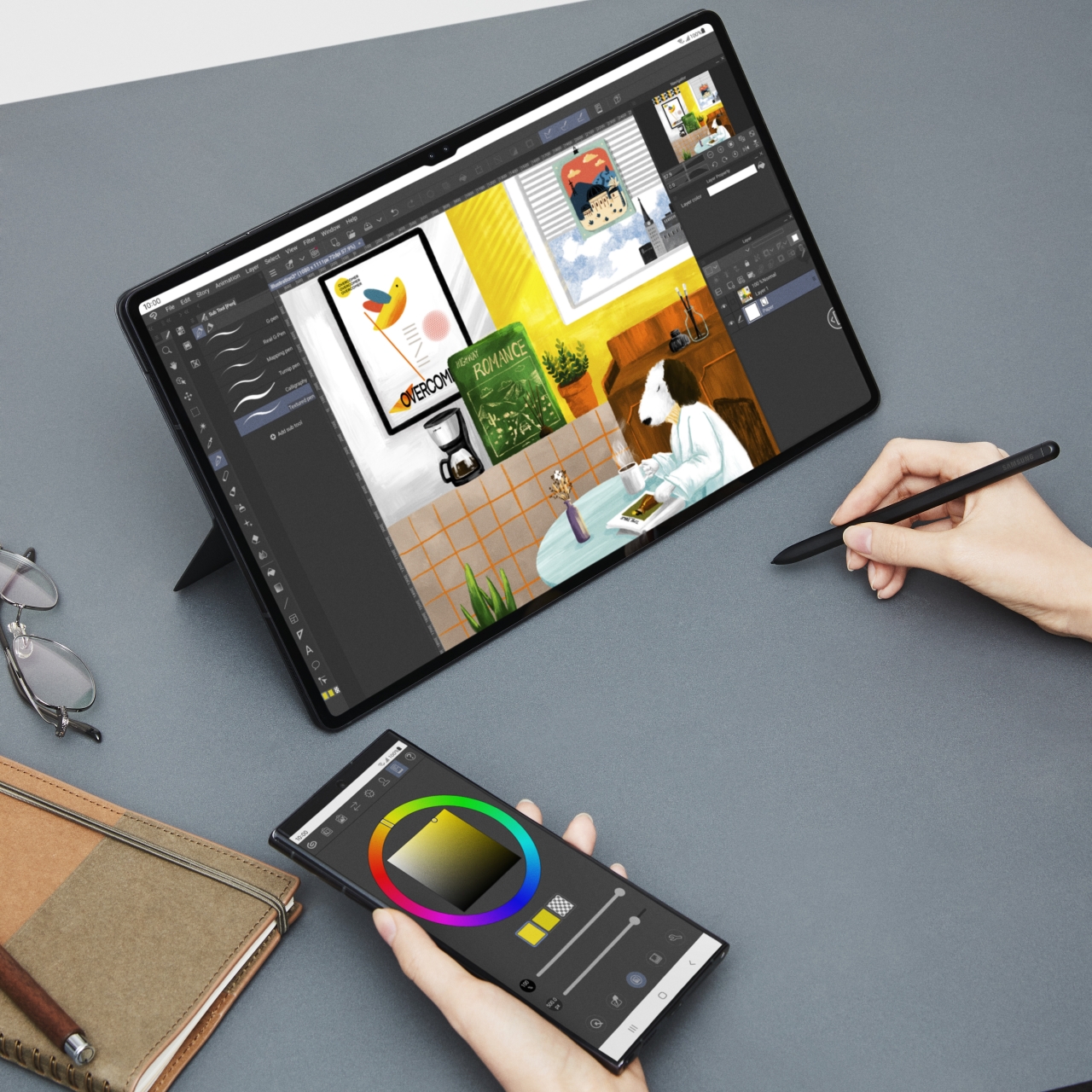
Samsung, however, is also playing up the phone’s utility as an extension of its other new product, the Galaxy Tab S8 tablets. A special connection between the two devices transforms the phone into a dedicated screen for tools in apps like Samsung Notes and Clip Studio Paint. This would move almost all UI controls from the larger screen, leaving only the canvas you need to work on.
Sustainability Promise
One thing that’s new and common to Samsung’s newest line of devices is a stronger push towards sustainability. Samsung has committed to using plastics recycled from discarded fishing nets, starting with this year’s lineup. It also tried to reduce its packaging even further to reduce the materials produced and used, which adds up to reducing carbon emissions in the long run.
Although not directly related to using sustainable materials and processes, Samsung also made a rather big promise that does contribute positively towards reducing e-waste. Extending the period that it will officially support these devices means that owners get to keep them for far longer. It’s still not up to Apple levels, mind, but it still goes beyond what most manufacturers offer, including Android maker Google. This means that it would take much longer before we see the Galaxy S22 Ultra and its siblings being thrown out or replaced, something that eventually adds to the amount of electronic waste and manufactured materials in the long run.
Designer: Samsung
The post Galaxy S22 Ultra design turns Samsung’s flagship phone on its head first appeared on Yanko Design.
0 Commentaires