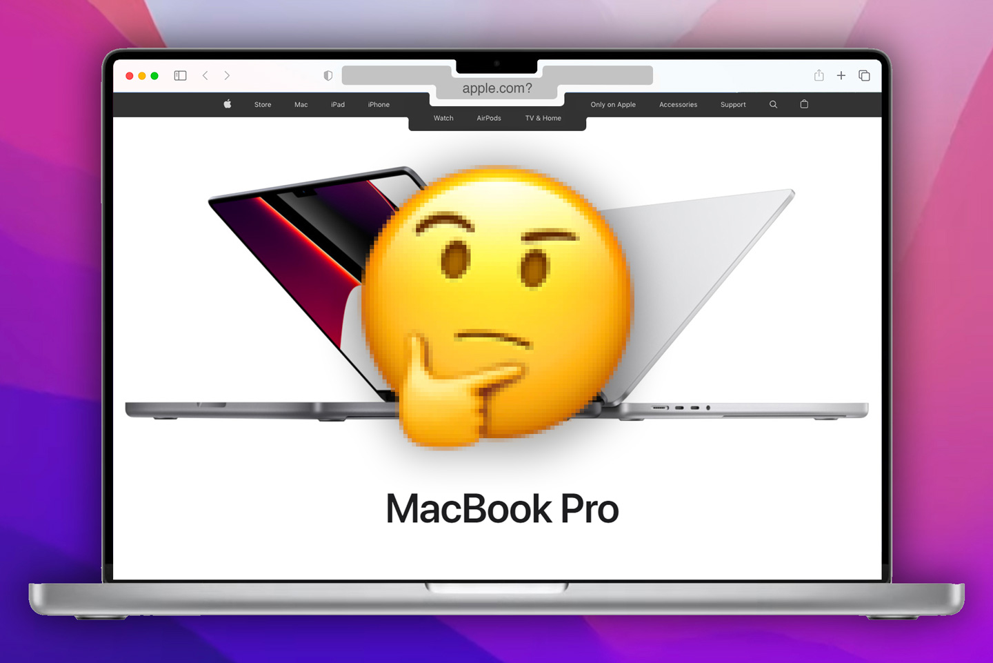
The upper part of a laptop screen is often reserved for mission-critical digital elements like menus and toolbars, search bars, filenames, internet browser tabs, and other important information. Putting a notch there is just counterintuitive and downright senseless.
The notch was supposed to be temporary. It was supposed to eventually be replaced by a hole punch camera, or by a transparent display, but it was never supposed to stick around for so long that it manifested itself onto another range of products. Putting a notch on the iPhone could be classified as innovation back in 2017 (complex facial mapping and recognition on a handheld device… pretty impressive), however, carrying it forward to the laptop feels like a lazy cop-out. Hilariously, the notch on Apple’s M1 Pro MacBooks doesn’t even do FaceID (there’s a TouchID Key on the Keyboard for authentication)… it’s there because someone at Apple thought slimmer bezels would look nice, echoing a rare Jony-Ive-level of narrow-minded thinking that gave us the iPhone Bendgate, the odd Magic Mouse charger, and the lightning connector on the backside of the 1st Gen Apple Pencil.
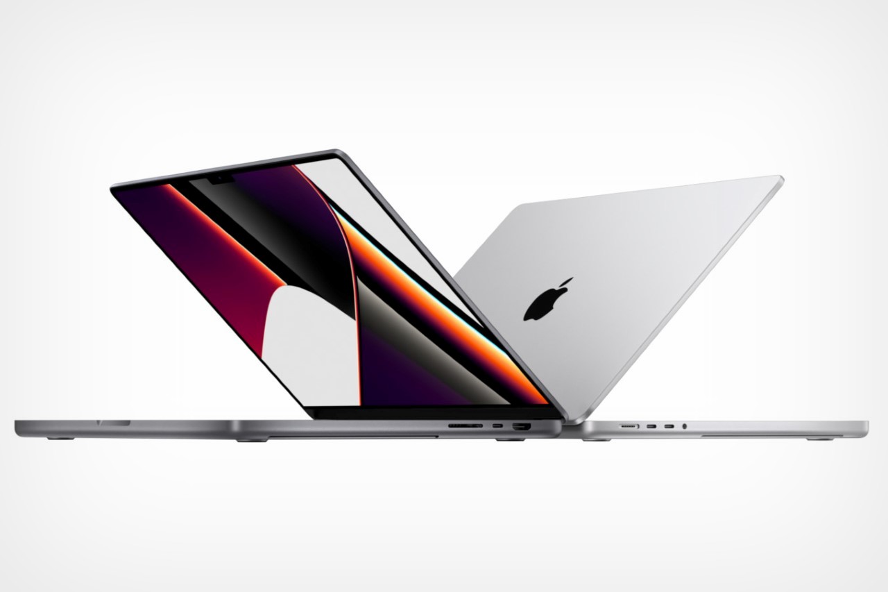
Now Apple’s most obvious solution was to simply turn the upper bar into a black no-go zone while using programs in full-screen, so the notch doesn’t eat into the software’s interface elements. You don’t need viral internet star & bastion-of-human-sensibility Khaby Lame to tell you that this basically proves that the notch was absolutely unnecessary to begin with. Through the duration of the keynote, Apple’s team spent a grand total of 9 seconds highlighting the notch (without ever using the word ‘notch’), and even in those 9 seconds, all that VP of Product Design Kate Bergeron ever mentioned was that the upper bezel was made 60% thinner… a feature that’s only purpose was to make the overall screen on the MacBook Pro bigger. Nothing else.
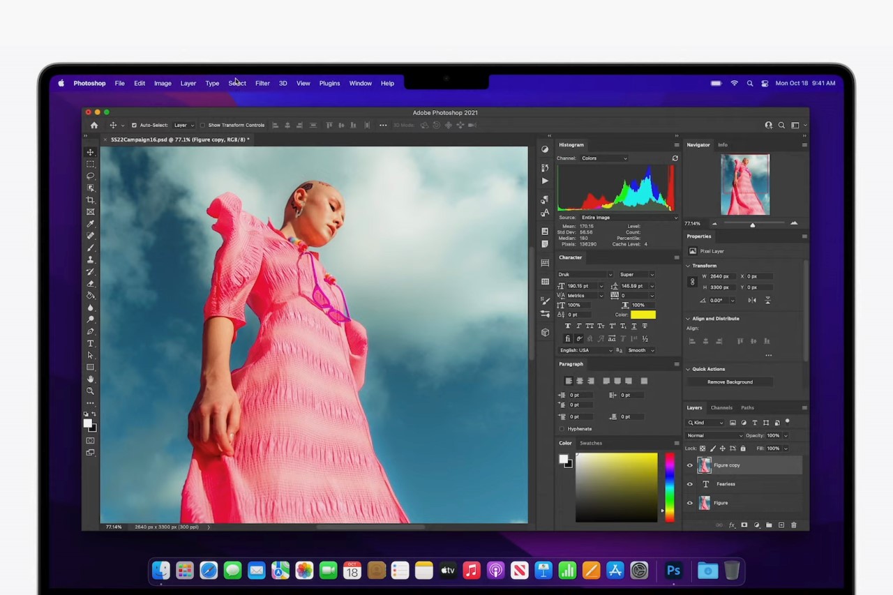
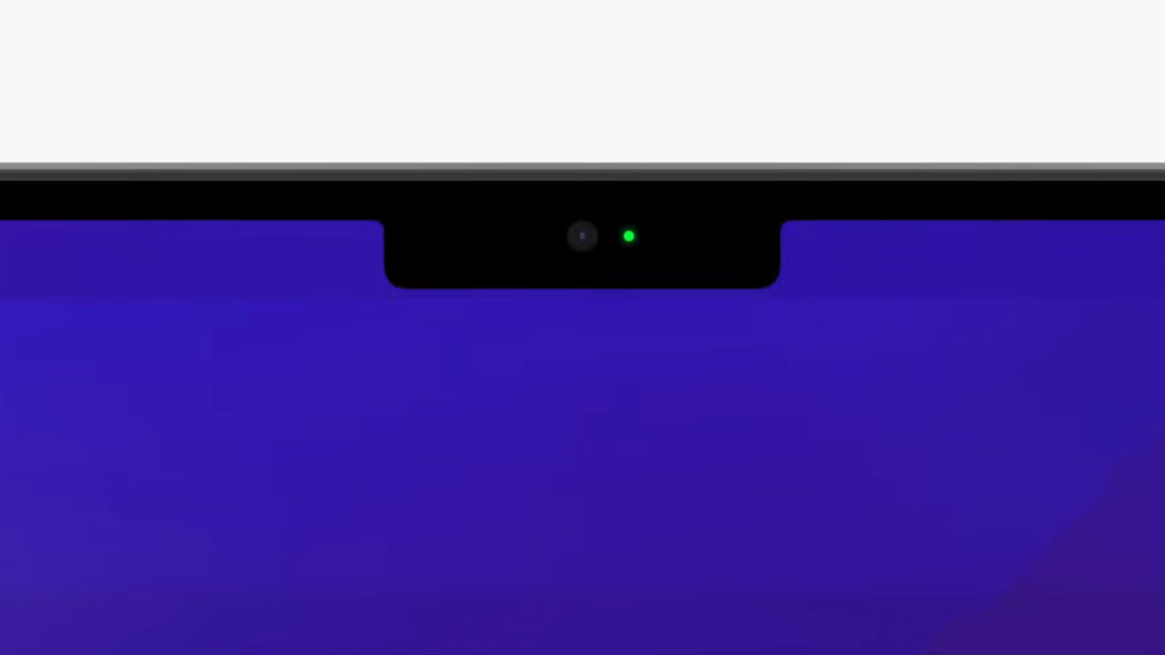
So what’s inside that notch? Well, just a camera. One single 1080p camera. This means the MacBook Pro has a notch, but doesn’t have the benefits of it, i.e., FaceID or Memojis. One can’t help but feel baffled and slightly short-changed here. From what I can tell, the notch is visible ONLY on your desktop and when you have multiple windows open… but when you maximize a task or program, the top of your display turns into a black bar, making that entire strip of screen useless for 99% of your time using the laptop. Apple does this with its own apps too – Safari, Logic, Facetime – going to show that even its own apps can’t account for the notch.
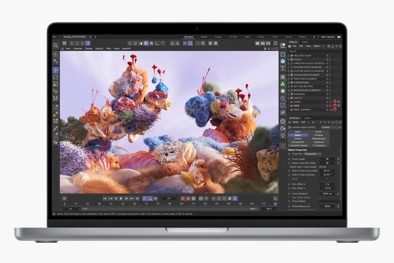
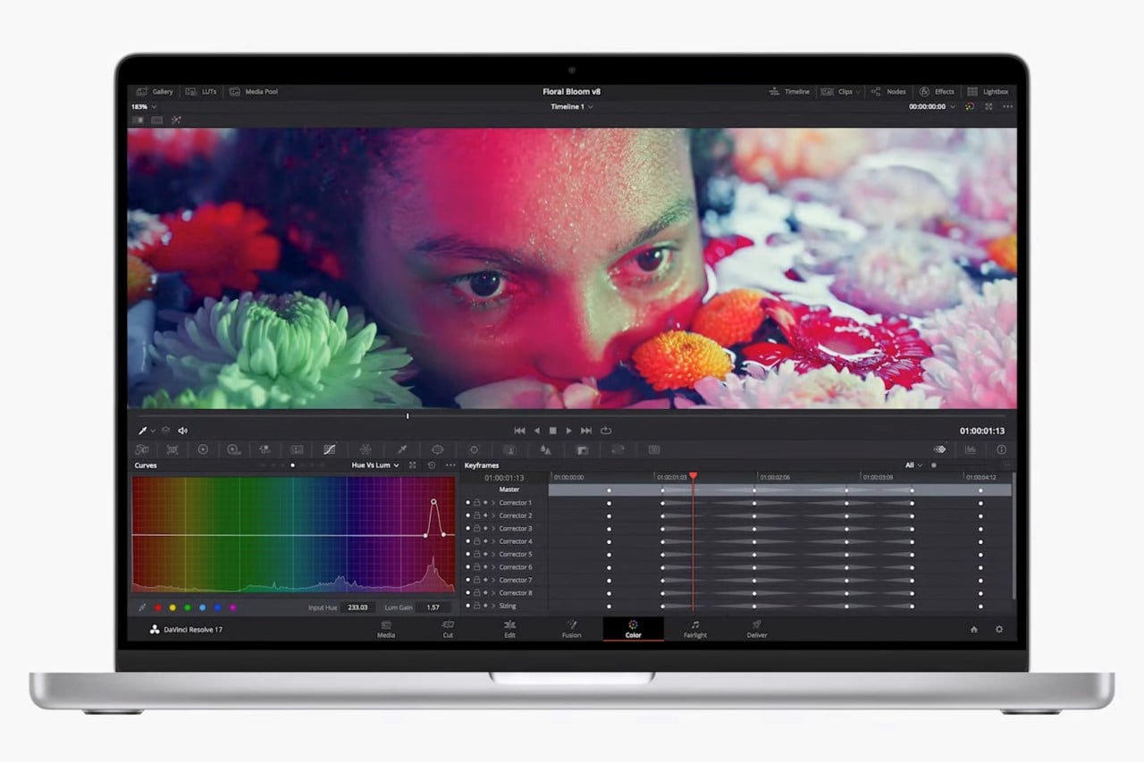
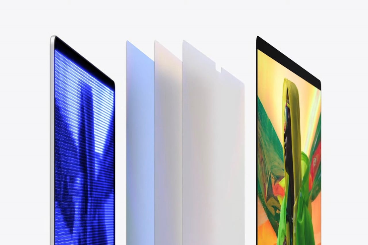
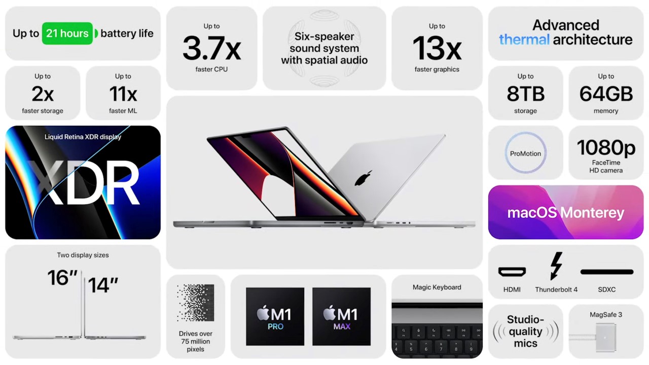
It’s a shame that the notch is the only glaring problem I have with the laptop. It sits there continuously triggering me like talking to someone who is blissfully unaware that they have spinach stuck in their teeth. If you can look past the notch, the laptops are great. The new M1 Pro and M1 Max chips push the laptop’s performance and efficiency off the charts, giving you a laptop that’s VOLUMES faster than even its older iterations. The new laptops use Liquid Retina XDR displays and come with powerful speakers that fire both upward and downward for stellar audio. The ports finally make a comeback too, so did MagSafe charging, and the TouchBar’s gone the way of the dodo, being replaced by a row of function keys. The laptops come with up to 8 mind-numbing terabytes of storage and 64 GB of memory, with the M1 Max chip having 10 CPU cores and 32 GPU cores, making the laptop an absolute beast of a machine while still having a respectable 21 hours of battery life thanks to how efficient the new chips are. If you can look past the notch… the new Apple MacBook Pros have a lot to offer. I for one, am patiently waiting for the notch’s demise.
Watch the 2021 MacBook Pro introduction video below.
0 Commentaires