In just hours from now, the Apple crew take the stage to unveil the iPhone 13 (whether it will also feature a Mission Impossible-style intro with Tim Cook rappelling down into a secret facility with a latex mask is anyone’s guess)… and truth be told, we pretty much know what to expect from the new iPhone, from better battery life to stronger glass, perhaps a smaller (yet omnipresent) notch, better cameras, better display, better software, and possibly even satellite connectivity… thanks, not to overwhelming consumer feedback, but rather to supply chain leaks.
Apple’s approach to designing phones has always been a “we know what’s best for you” one, a stark difference from other companies like OnePlus who intently listen to their communities and design phones based on what their customers overwhelmingly want… and while that isn’t a knock on Apple, it’s resulted in a few popular features being introduced WAY longer than the competition – like wireless charging, widgets, 5G, and even bringing FaceTime to non-Apple devices LONG after Skype, Zoom, Google Meet, and Microsoft Teams became popular. So, what if, for once, Apple designed an iPhone purely based on a consumer wishlist? What would a customer-feedback-driven iPhone look like? Designer Andrea Copellino has a few ideas.
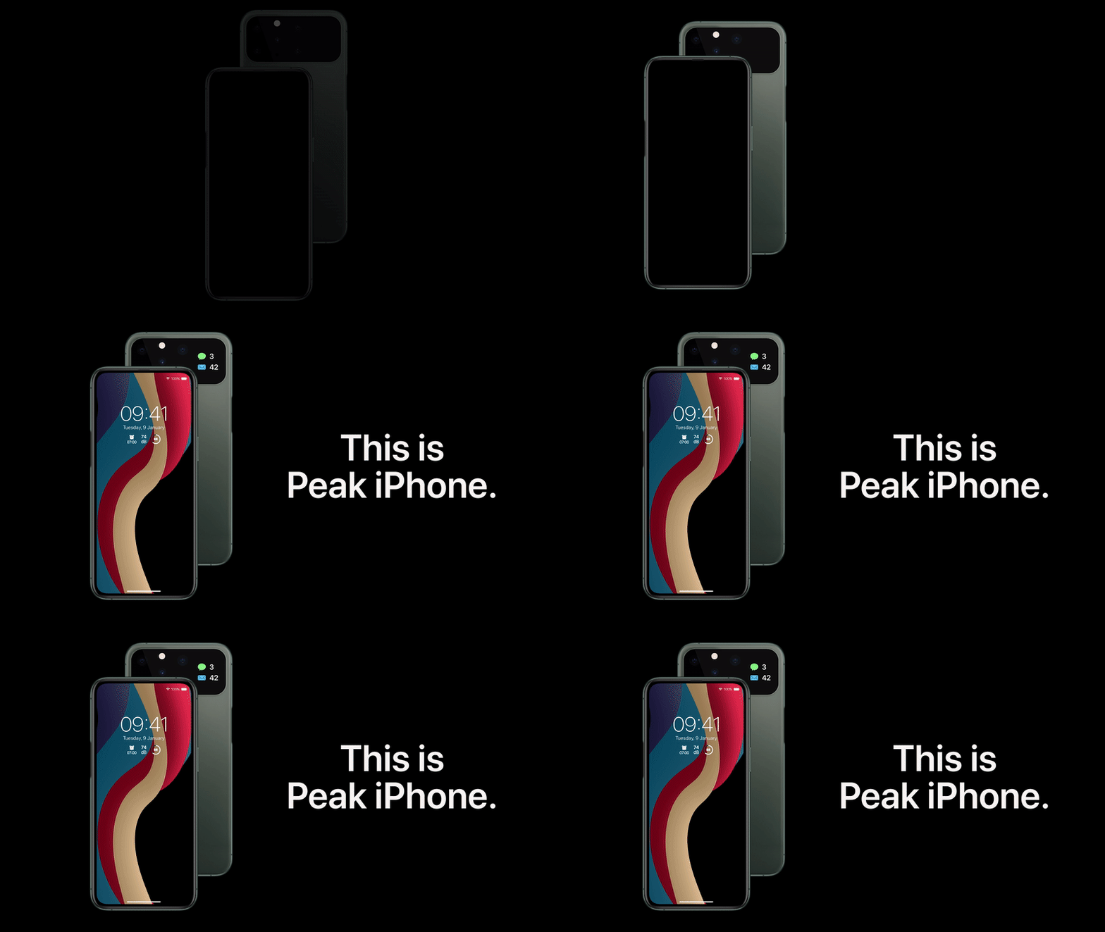
Copellino’s “Peak iPhone” stays mindful of a few things. It doesn’t employ innovation for the sake of it. No waterfall displays, no folding screens, no fingerprint sensor in the Apple logo, no headphone jack to make Apple look like it’s backtracking. The elements of Copellino’s Peak iPhone are simply external hardware features that take the original iPhone experience and amplify it. There are also a few internal hardware considerations that I’d like to see in the iPhone but they aren’t any different from the stuff MKBHD always talks about, like much longer battery life, a higher refresh rate display, possibly a migration to USB-C charging, and possibly the ability to add a memory card to your iPhone.

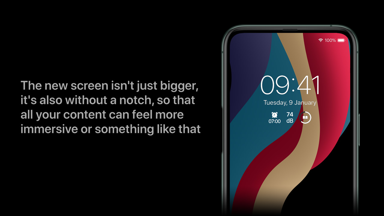
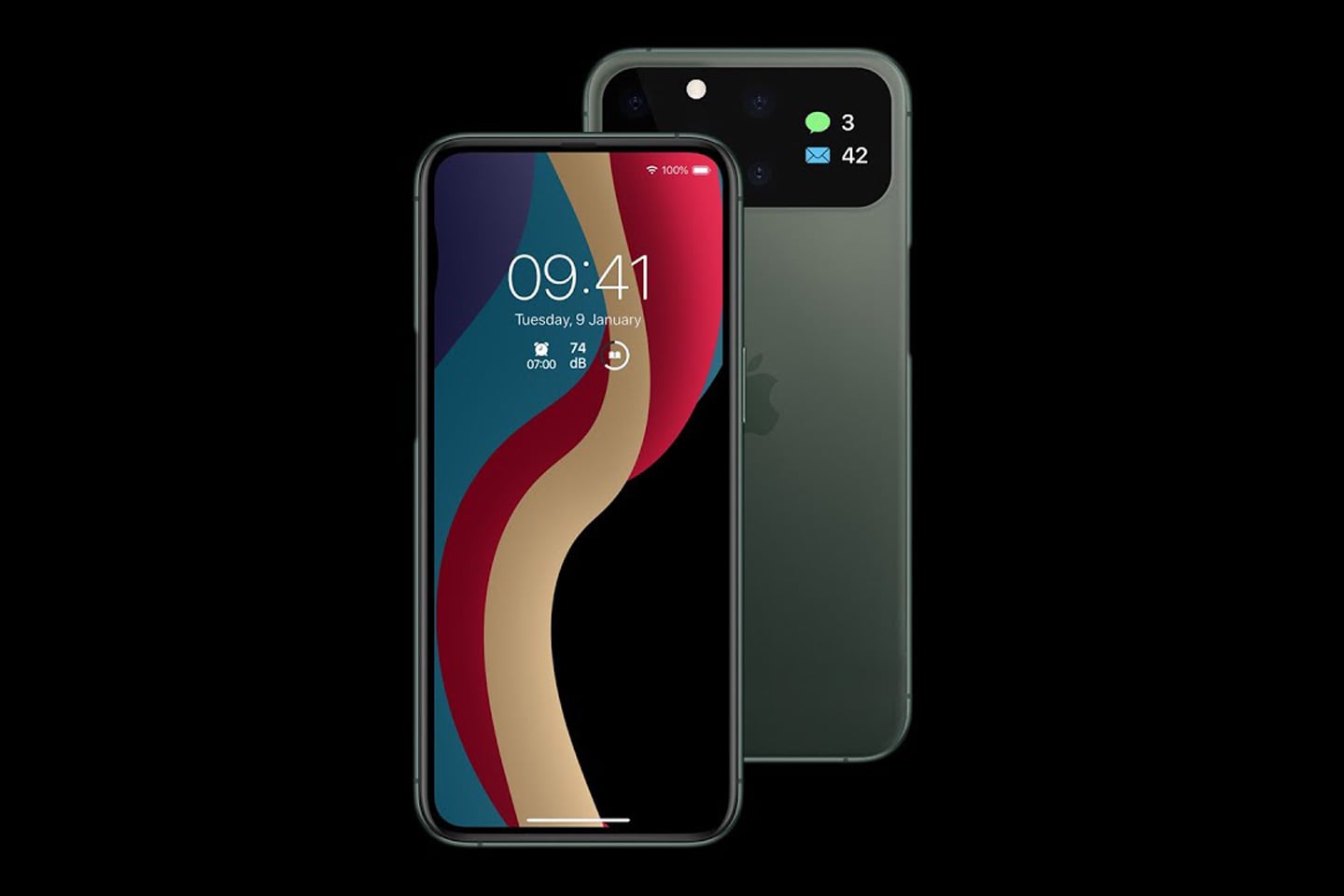
There are a few noteworthy changes to the front and the back. The front sports a slightly elongated display, pushing the screen aspect ratio from 19.5:9 to the more generally accepted 21:9. It also does away with the notch, offering a more expansive immersive display for viewing content. While Copellino hasn’t hinted at where the front-facing camera would sit, I’d honestly be fine with a hole punch (something that is expected in the iPhone 14 next year).
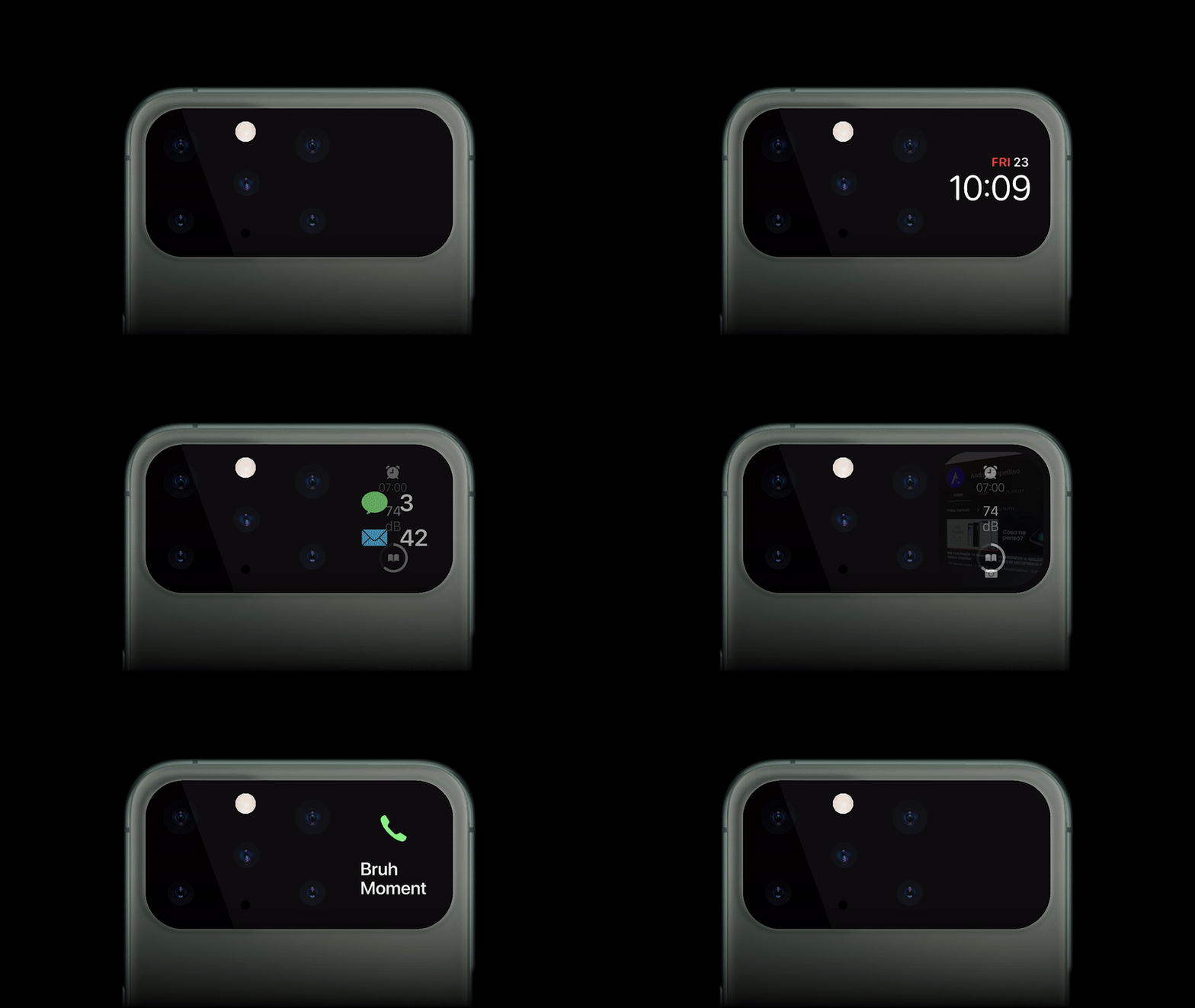
While the front looks devoid of a camera, the rear comes with a mini screen that does everything from sharing notifications, messages, alerts, the time, and even acting as a viewfinder for the rear camera. This effectively means being able to use the iPhone’s superior set of cameras to click better selfies, although how one would use the camera with apps like Instagram and TikTok is something that’s yet to be determined. Nevertheless, the presence of a rear screen does three things – it lets you interact with your phone without waking the main screen, it creates a more horizontal camera bump that lets your iPhone rest on flat surfaces without rocking, and lastly, offers a functionality-driven secondary display like the ones found in folding phones… except without needing a folding display. It goes without saying that checking your clock or notifications on the smaller screen helps prolong your iPhone’s battery too.
Perhaps my favorite upgrade to the iPhone is the replacement of physical volume buttons with a touch bar. Borrowing its user interaction from the AirPods, the Peak iPhone ditches the physical volume control buttons for a touch-sensitive recessed surface that you can slide your finger on to increase or decrease the volume. It’s elegant to look at, and not to mention, takes the annoyance out of pressing the volume button 10 times or holding it in place for 10 seconds.

All in all, the Peak iPhone makes enough of a leap forward while retaining what works. The flat-edge design is still there, although the absence of the notch really makes the bezels disappear. The back’s upgrade with the screen provides enough functionality without taking away the iPhone’s ability to wirelessly charge or support MagSafe accessories. Just give us a 120Hz screen and a bigger battery and Tim Cook can officially say “This is the best iPhone we ever made” and actually mean it!
Designer: Andrea Copellino
0 Commentaires