Call me a nerd, but I really do love museums! They’re powerhouses of knowledge, history, innovation, and architecture too. If you step into a museum, you always step out, 10 times wiser, and maybe a little sleepier! But that’s okay, all that intake of facts can be a bit exhausting. Now we know that the insides of a museum are always interesting, but their exteriors can be pretty cool too! And, we’ve curated a collection of some of the best-designed museums we’ve come across! From a modern art museum with a rolling green roof to a red rock African museum that feels martian – these interesting museum designs will have you itching to visit one!
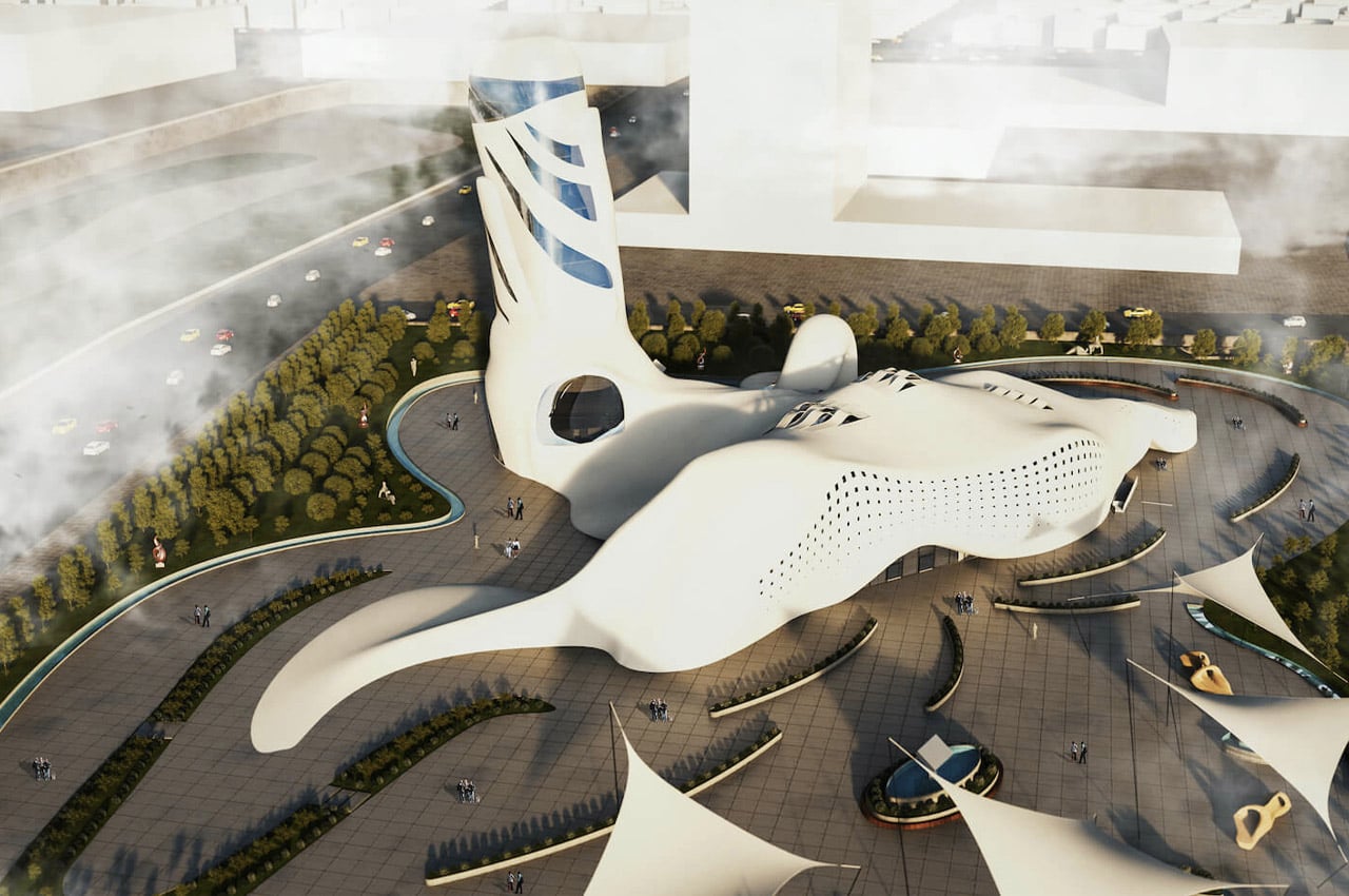
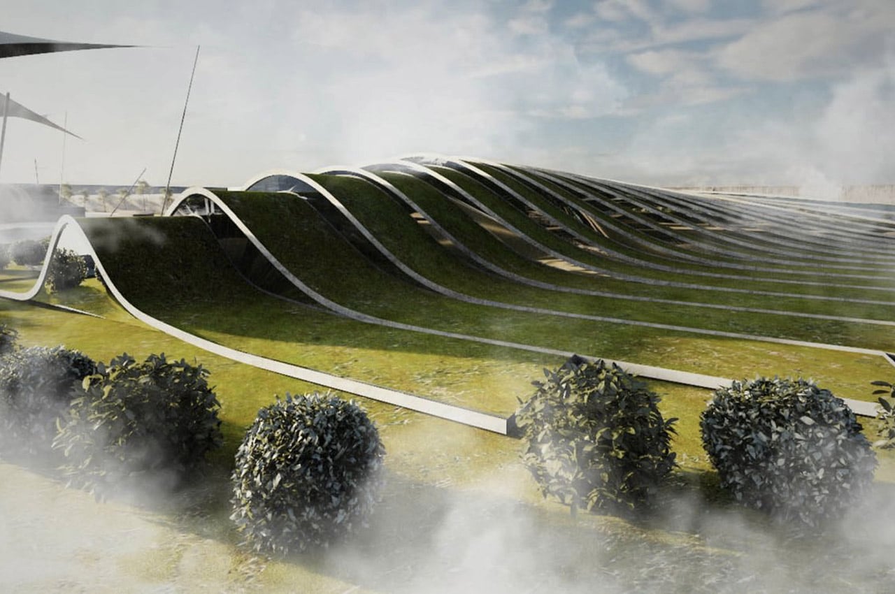
Known for designing bold, daredevil retreats stationed on the edge of mountain summits and cliffsides, Eshtiyaghi maintained the same mythical energy for his most recent rendering of Tehran’s Modern Art Museum. From an aerial viewpoint, Eshtiyaghi’s museum does not form any distinct shape, progressing past geometric, sharp angles for a gleaming white roof that slopes and bulges like a white tarp covering a wild landscape. The green space that surrounds Eshtiyaghi’s museum tightens the museum’s abstract energy with rolling green roofs that mimic the overlapping lines of soundwaves, offering a place to rest on its manicured lawns.
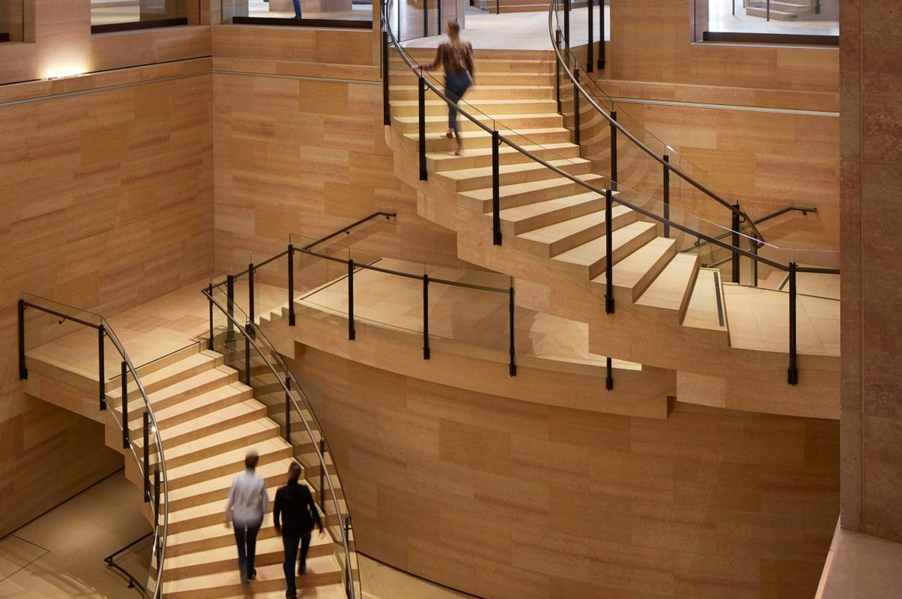
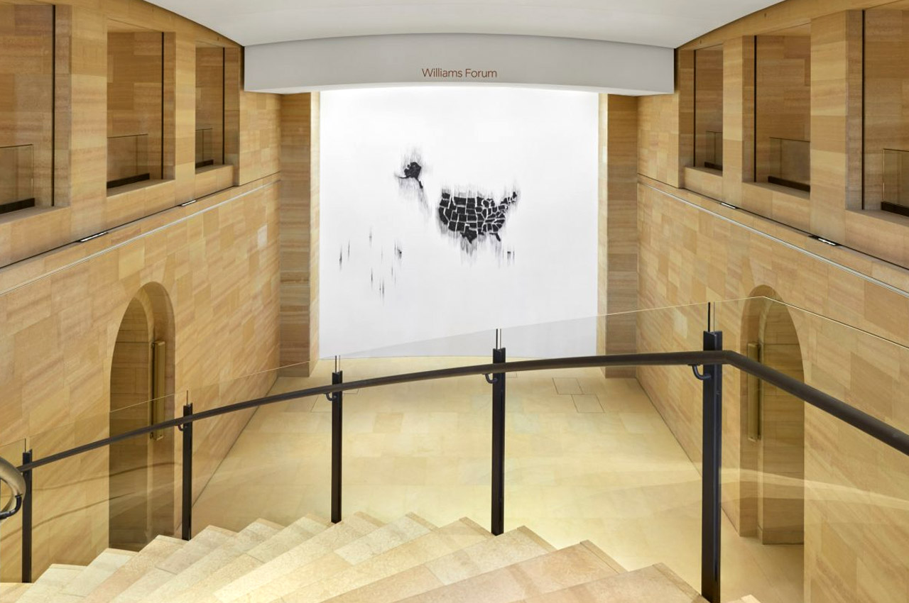
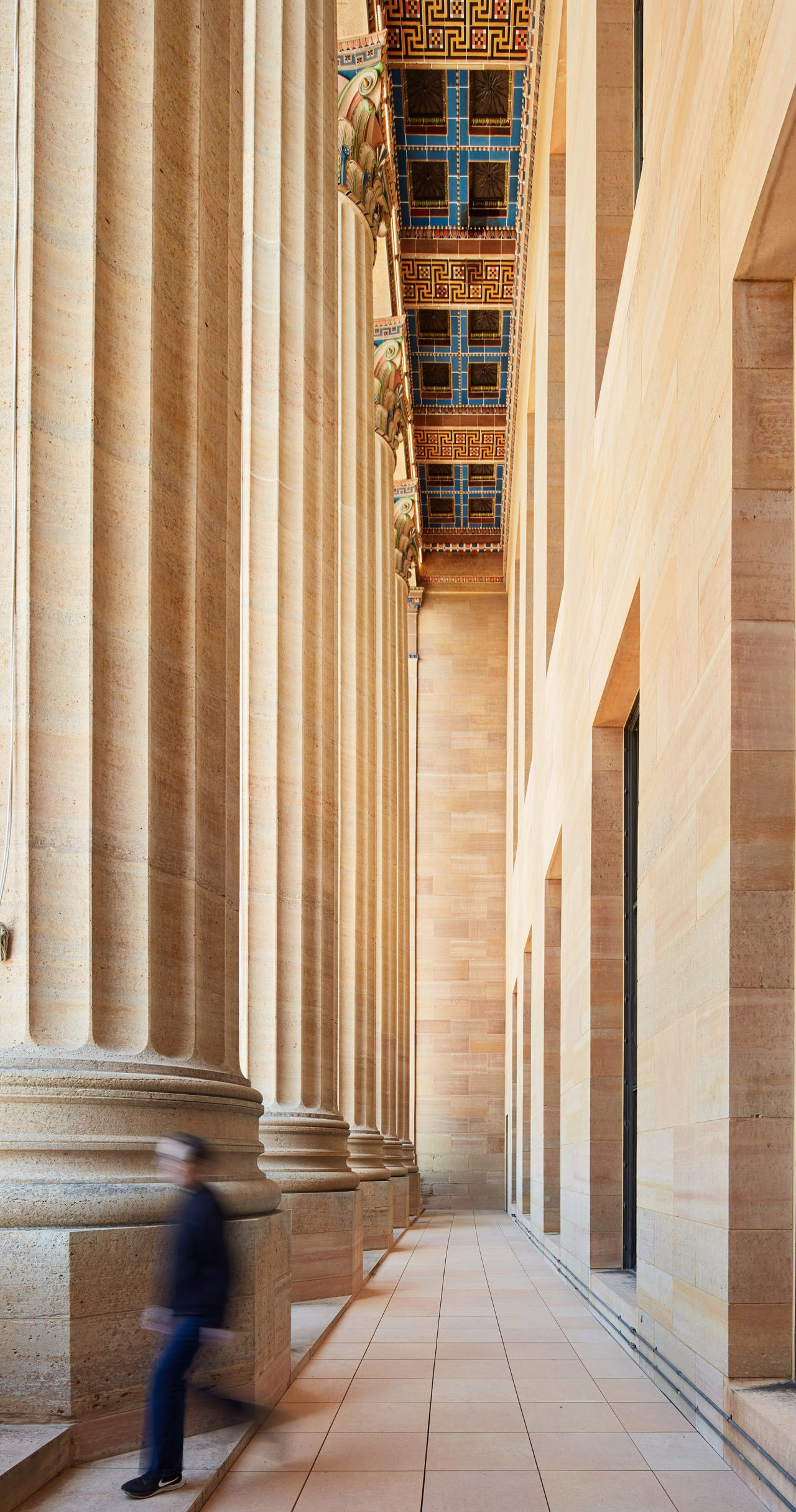
Frank Gehry revamped the Philadelphia Museum of Art in Pennsylvania by adding new galleries and public spaces to it. A four-year-long renovation led to the redesigning of the enormous space which is 90 square feet in total! Gehry maintained the use of Kasota stone, a golden limestone, which was used in the original construction of the museum while adding new and improved spaces as well. The result is a beautiful mix of the new and the old!
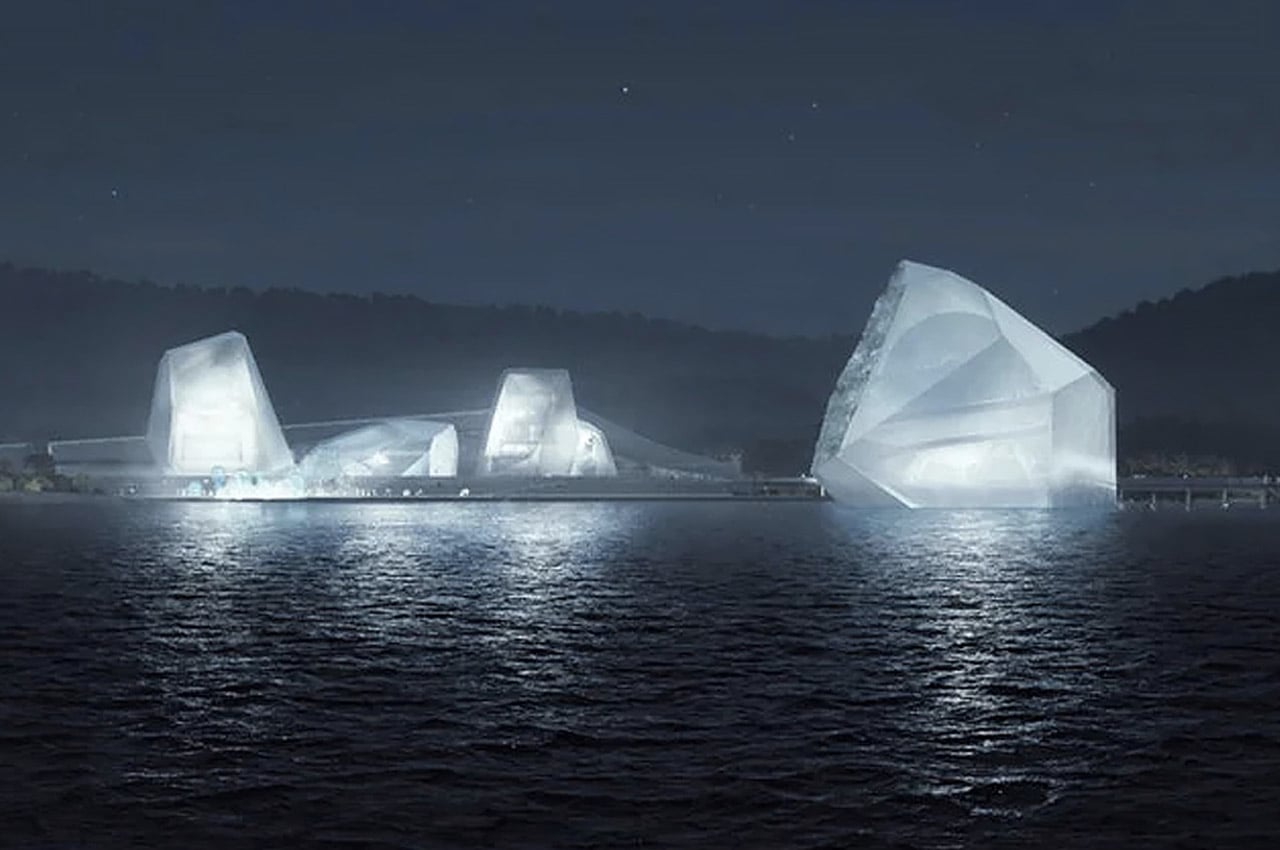
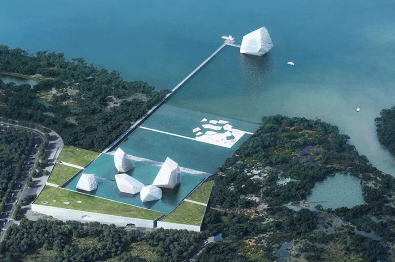
OPEN Architecture recently revealed the visual concept that made them finalists in the International Architecture Design Competition for the Shenzhen Maritime Museum. OPEN Architecture’s competition entry showcases six glass structures shaped to resemble icebergs stationed in Shenzhen Bay, which house curatorial rooms including the lobby, theater, library, and children’s education wing. Considering today’s global climate crisis, the designers behind the plan for the future Shenzhen Maritime Museum hope to bridge the urgency of climate change with an accessible means of learning more about it.
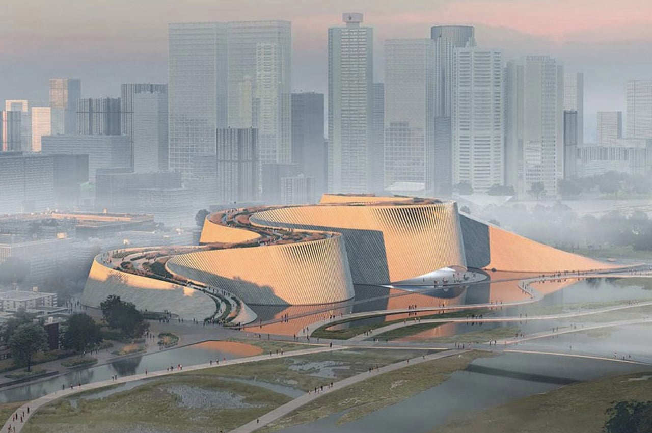
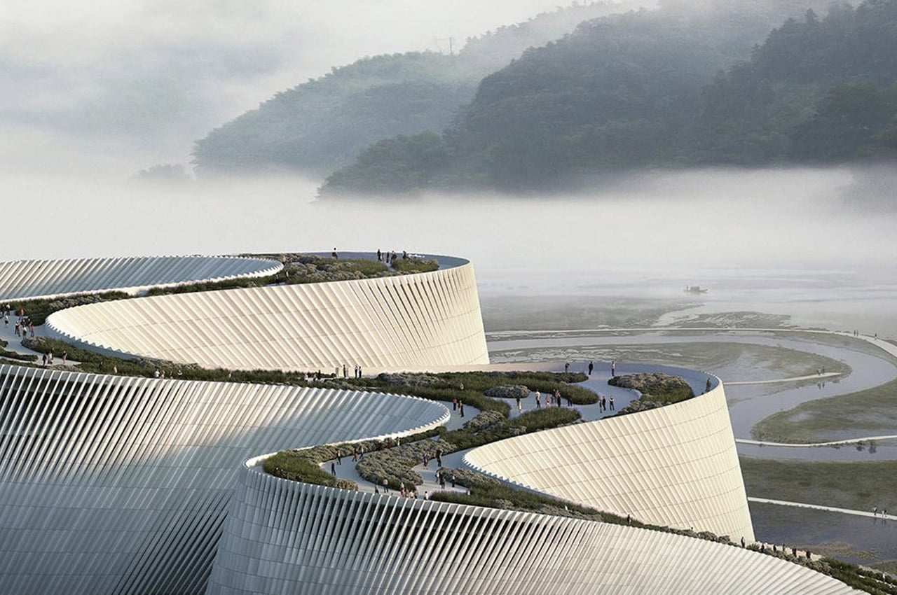
The ambitious structure is called ‘Delta’ after the Pearl River Delta and is designed to rise seamlessly from the river with an accessible green rooftop for visitors to soak in the natural setting. The roof is a public park that showcases organic geometries in the form of architecture. The dynamic shape has been inspired by a river stream that has a new view, a new bend, a new discovery at every turn. Similarly, the museum too will have different views at every turn overlooking the surrounding park, hills, and lake from the winding terraces.
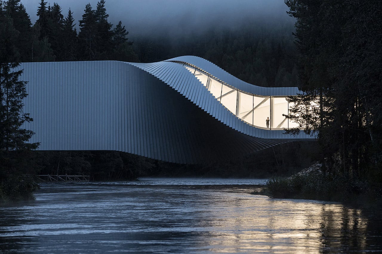
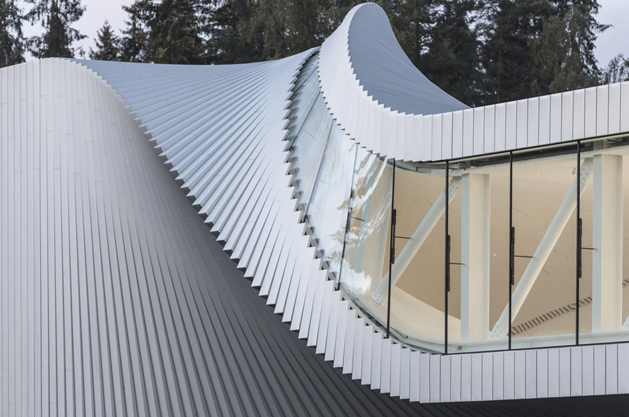
Spanning 15,000 square feet, sprawling across the beautiful Randselva river, in northern Europe’s largest sculptural park stands ‘The Twist’. Twirling through the air and combining two riverbanks, The Twist is “a hybrid spanning several traditional categories: It’s a museum, it’s a bridge, it’s an inhabitable sculpture,” says Bjarke Ingels, Founding Partner & Creative Director, BIG. Situated at the Kistefos Sculpture Park in Jevnaker, Norway, the project was first proposed in 2011 by the Bjarke Ingels Group and now in 2019, it is a striking reality.
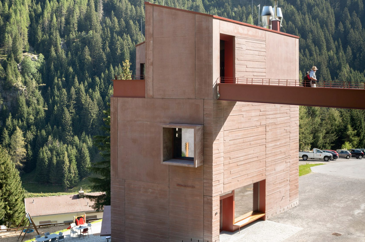
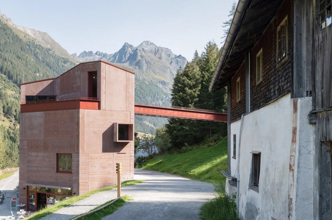
Daniela Kröss and Rainer Köberl completed the Ibex Museum in Austria. The beautiful red building looks almost like a small castle and celebrates the history of the Ibex – a native goat species of Pitztal, Austria. The architects wanted the building to be a landmark, hence designing it as a rusty red four-storey tower that would instantly grab attention! The red of the structure stands out against the lush green of the nature-filled backdrop!
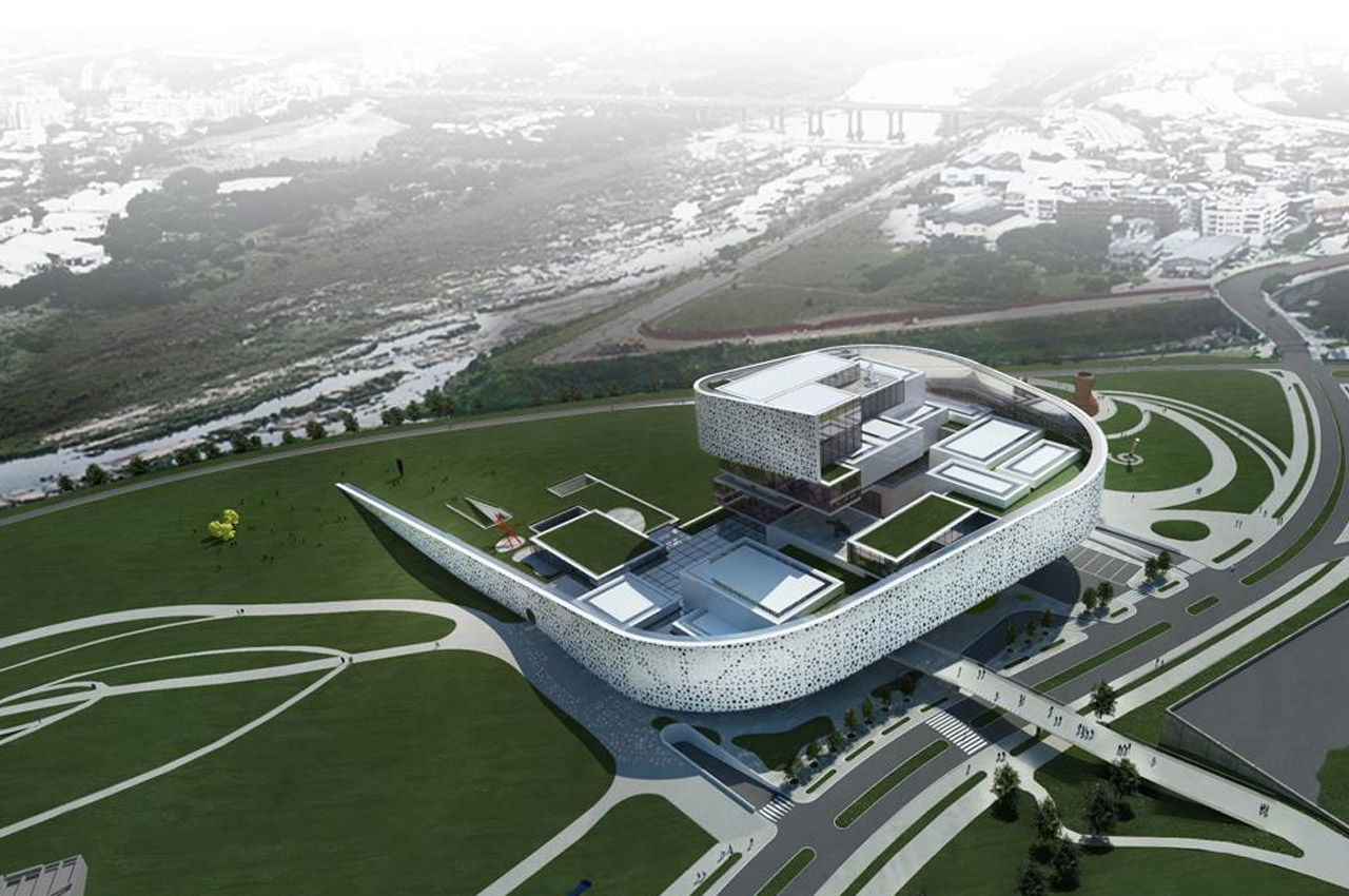
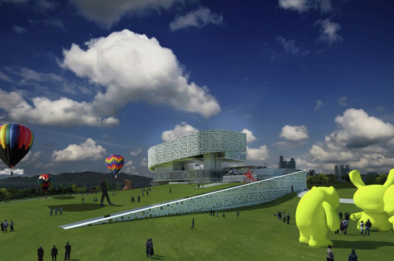
>The New Taipei City Museum of Art should propose a new paradigm for celebrating art in Taipei, one that brings lifestyle, art, recreation, and education together to celebrate a vibrant cultural identity for the community. The existing park located at the meeting of the Yingge and Dahan rivers within which the Museum sits is one that immediately reveals a dynamic juxtaposition between the constructed nature (the park environment) and the density and “urban” scale of the surrounding hillside context. The NTCArt proposes a dramatic physical redesign into the Yingge park landscape in the form of a line.
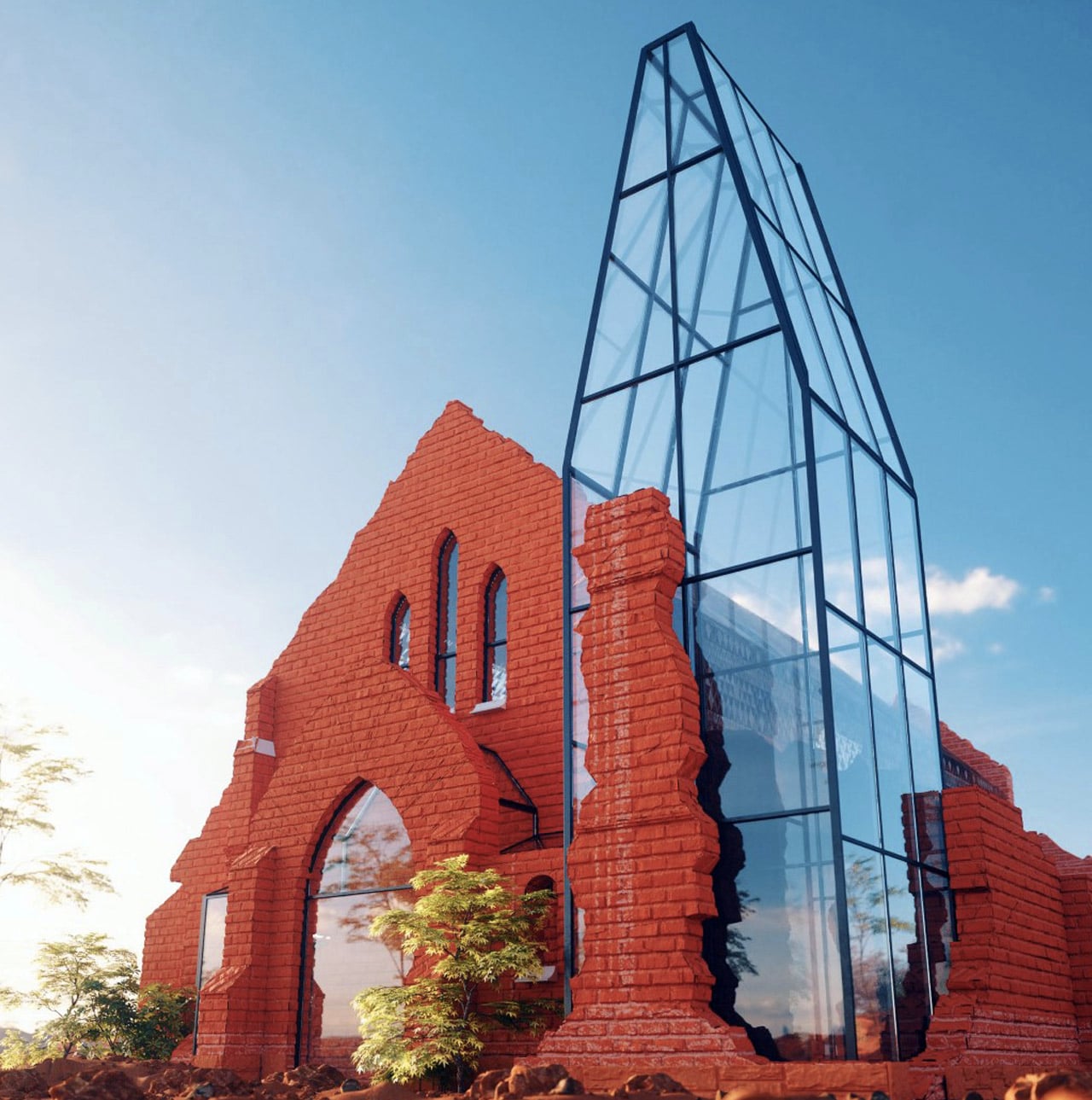
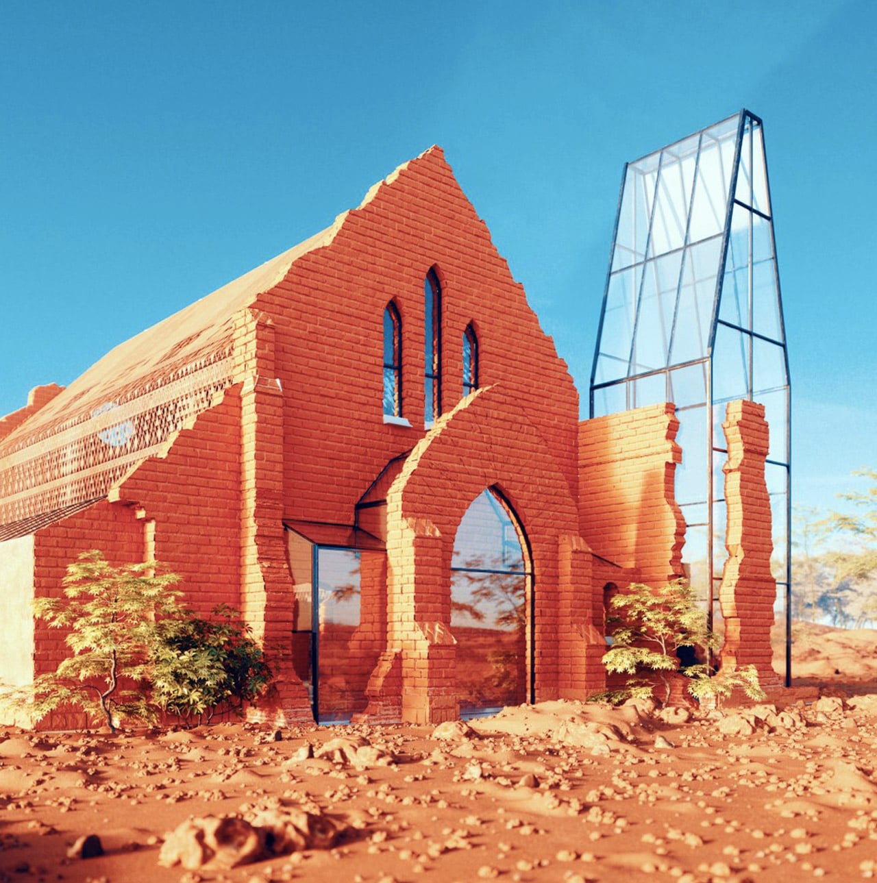
A combination of modern and traditional, indigenous and industrial, the restoration of the Old Palapye Museum truly feels otherworldly. Set in the heritage site of Palapye in Botswana, the building’s setting is highly reminiscent of a Martian landscape, surrounded by red soil and rocks. Amidst this lie the ruins of a burnt brick church built in 1891, standing proudly within perimeters of a rich historic site of the 19th century capital of the Bangwato tribe. Still holding immense cultural relevance, the building’s restoration (and subsequent conversion into a museum) aims at bringing attention back to the rich traditions and the ways of the Bangwato people.
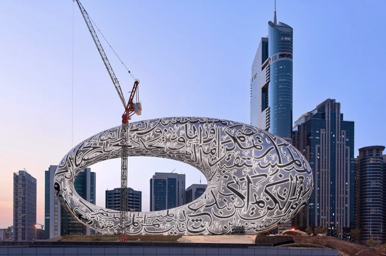
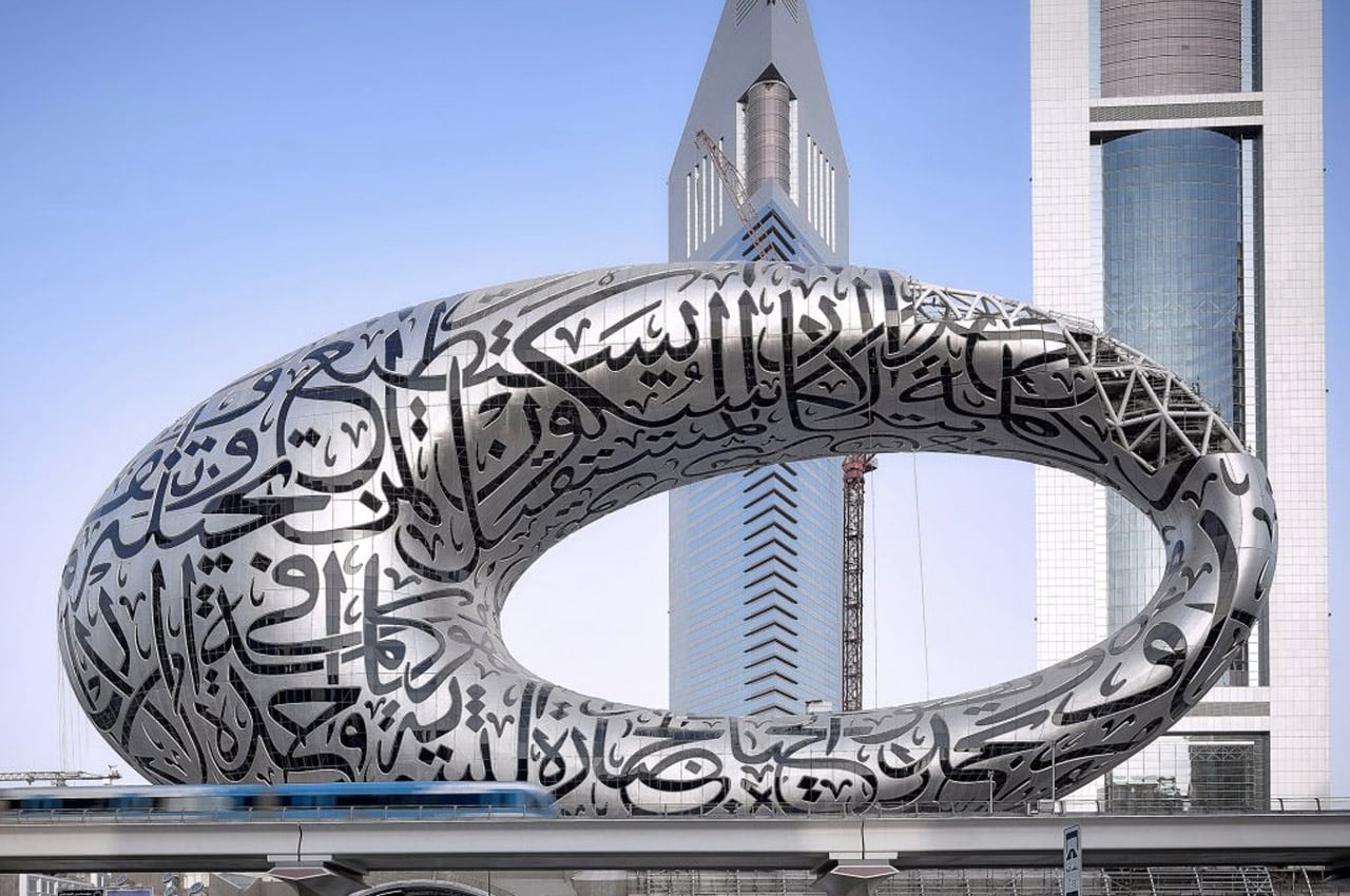
Designed by studio Killa Design, the Museum of the Future in Dubai exhibits an innovative design! The torus-shaped structure has been covered with calligraphy! The calligraphy is a poem written by the city’s ruler Sheikh Mohammed. The museum intends to inspire people who see the building, and encourage them to create, innovate and explore!
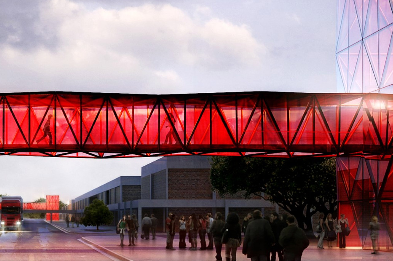
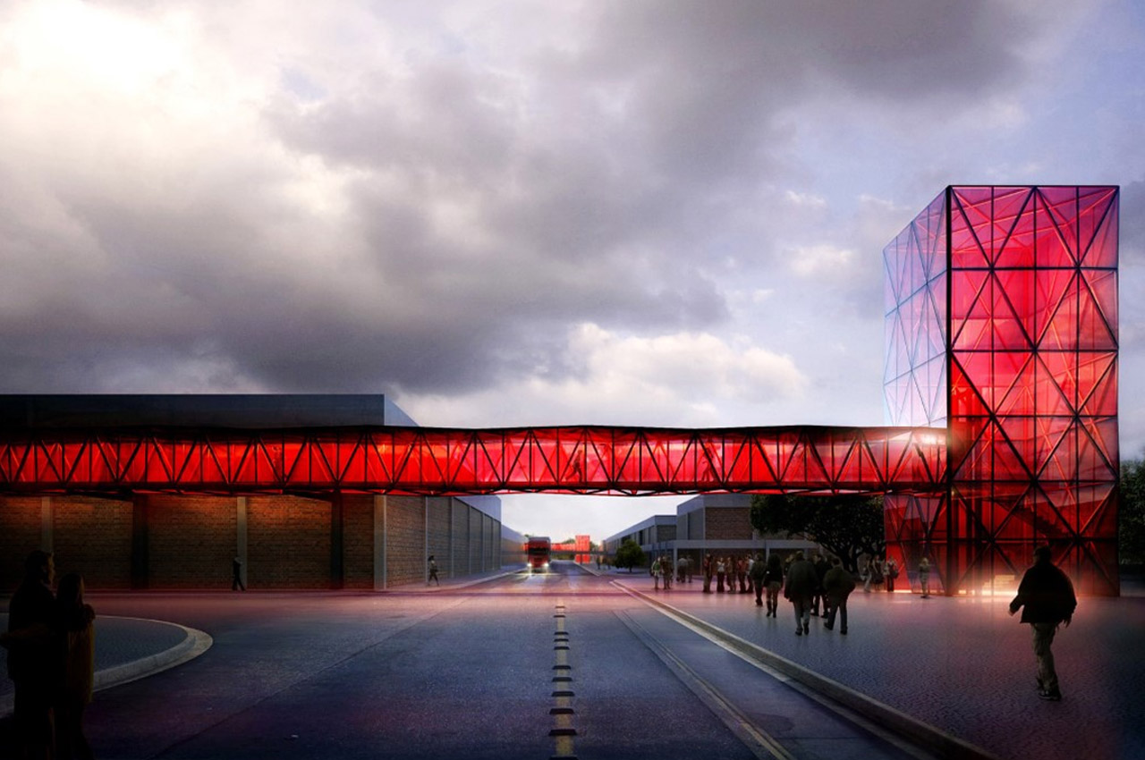
It would be much too literal to shape a chocolate museum-like actual chocolate, wouldn’t it? So designer Ricardo Canton decided to capture the allure and instant mouth-watering attraction of chocolate (or any candy for that matter) in his architectural style for the Nestlé Chocolate Museum. Borrowing from the rigid nature of chocolate candy bars, the museum’s very entrance and the sky-bridge that follows pretty much nails the brief by looking absolutely lick-worthy. The choice of red seems fitting too, given that red is one of Nestlé’s brand colors!
0 Commentaires